
CHALLENGE
Commerzbank required a flexible visual identity system capable of supporting communication across digital products, campaigns, presentations and internal brand applications.
The challenge was to create a more distinctive and human visual language within a highly structured financial environment – balancing clarity, scalability and recognisable brand character across multiple touchpoints.
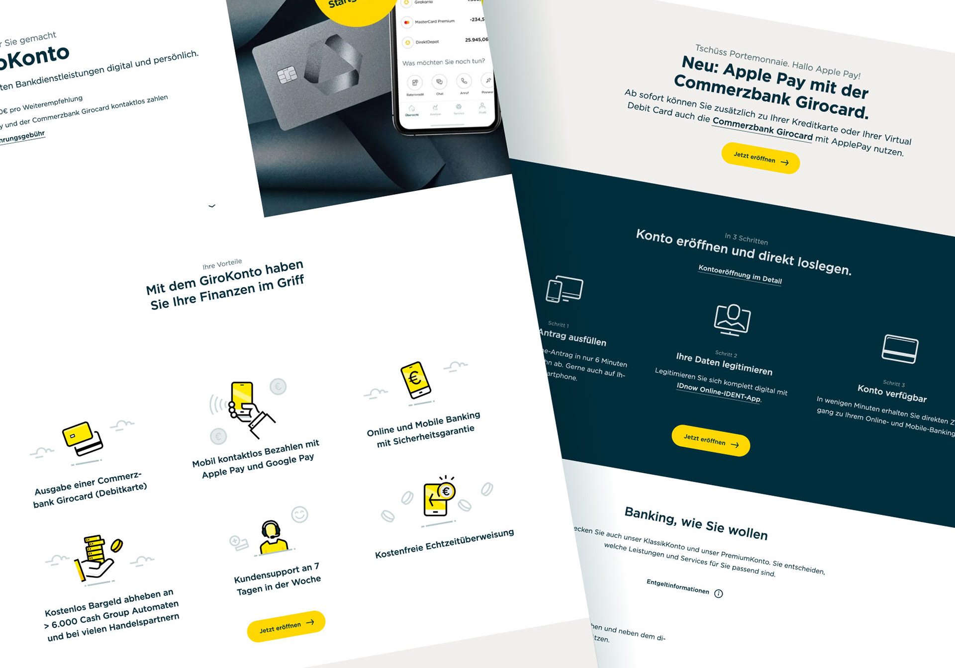
The system also needed to function consistently across motion, interface and editorial contexts while remaining adaptable for future digital products and evolving communication needs.
APPROACH
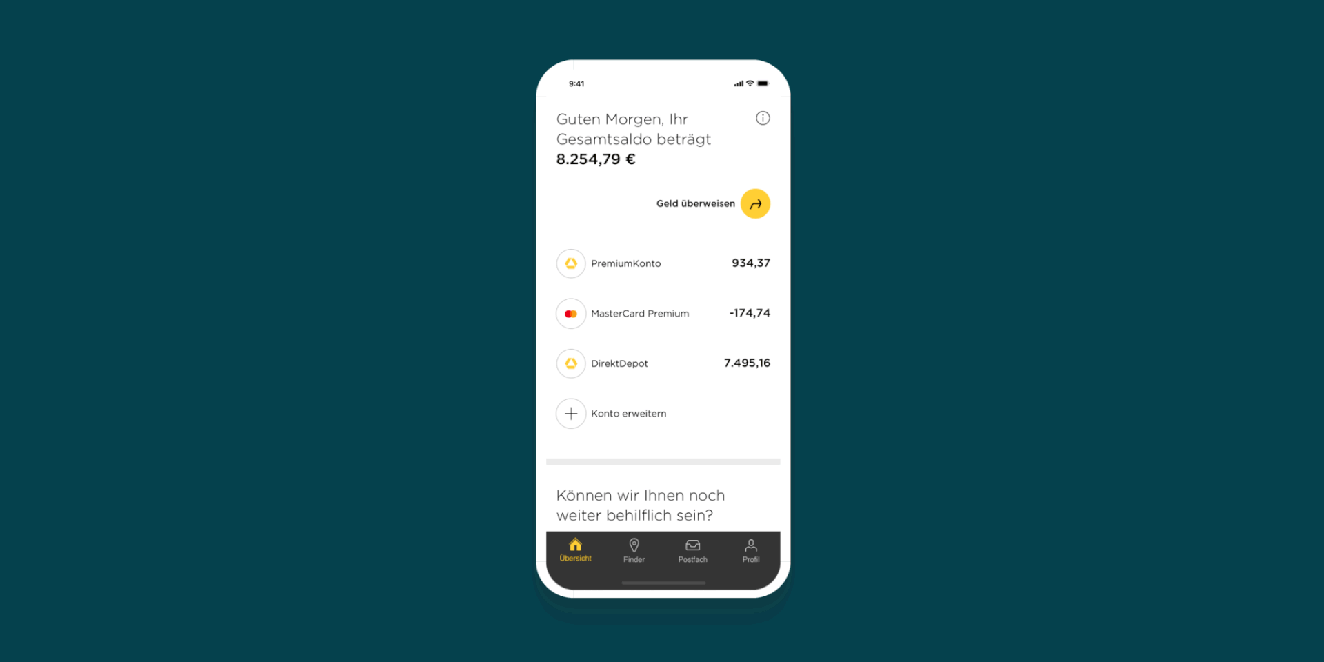
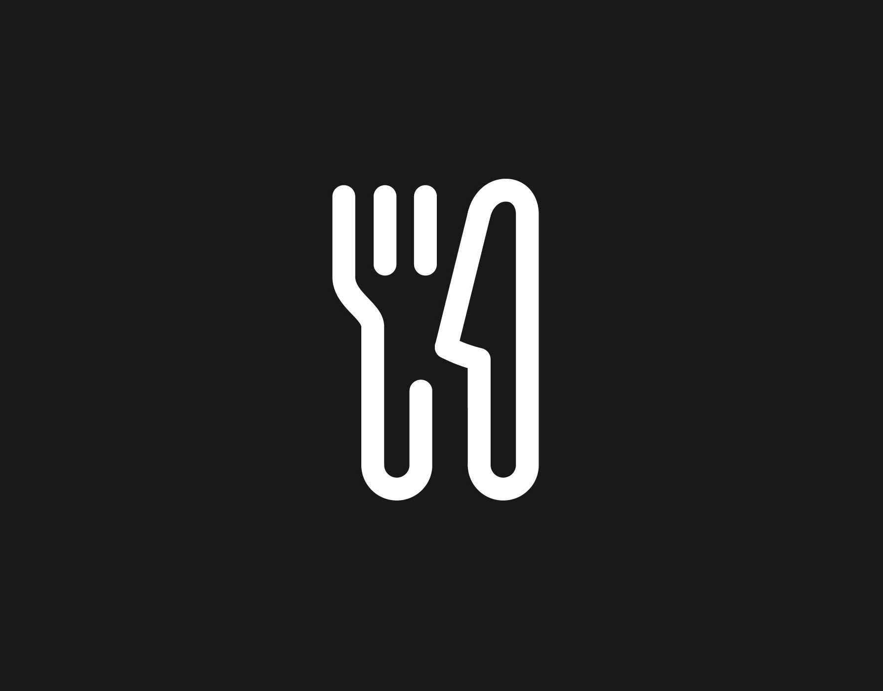
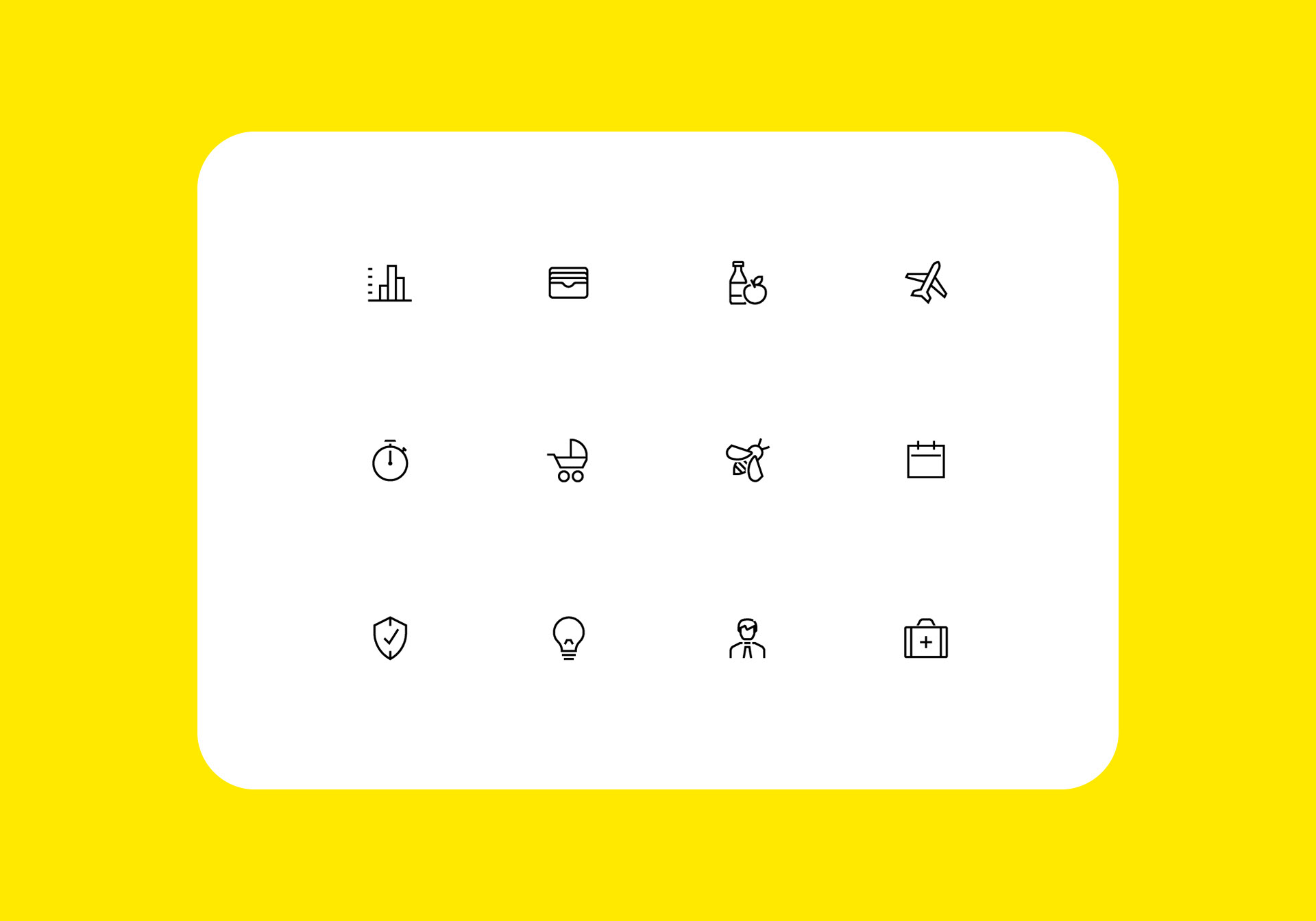
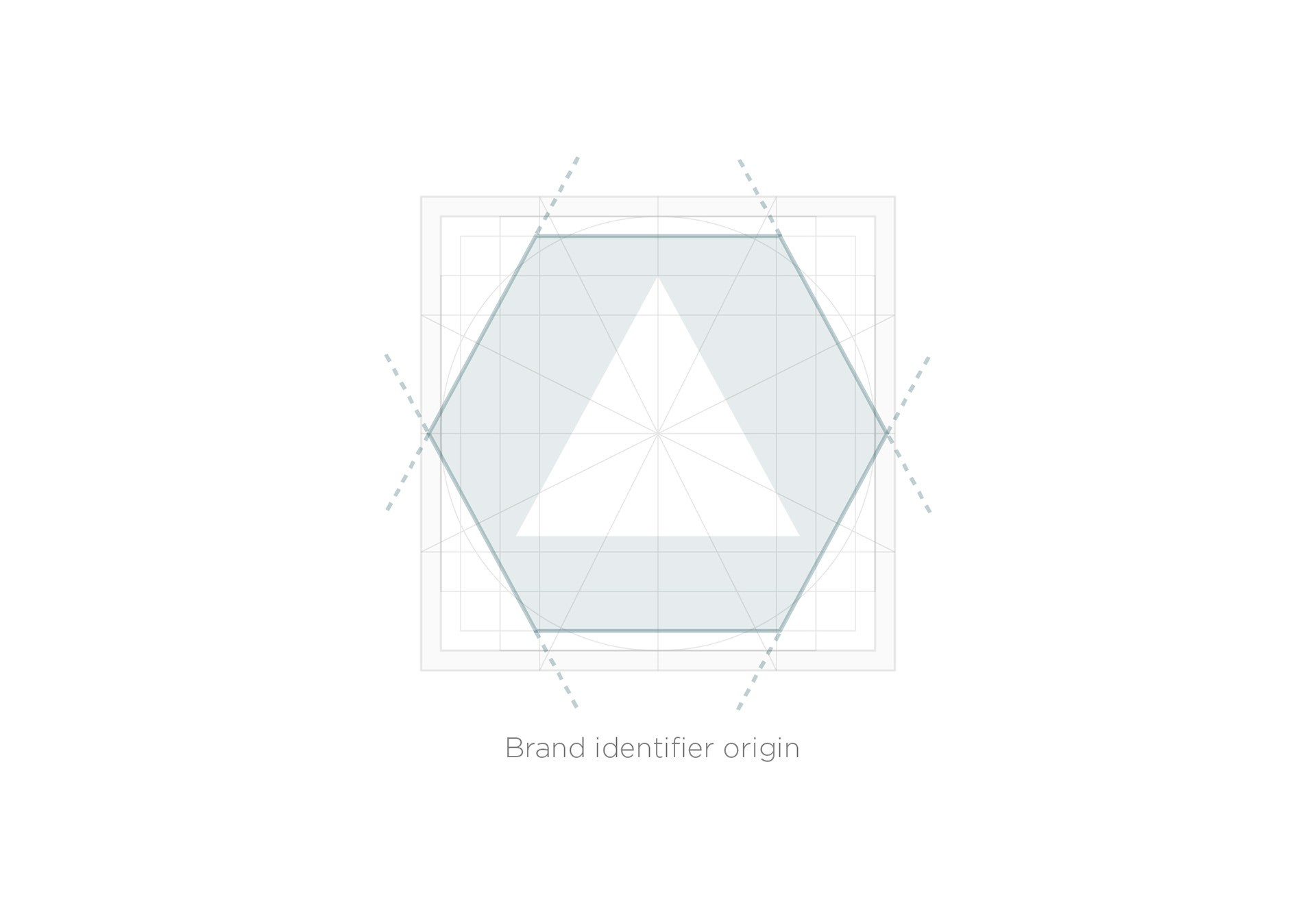
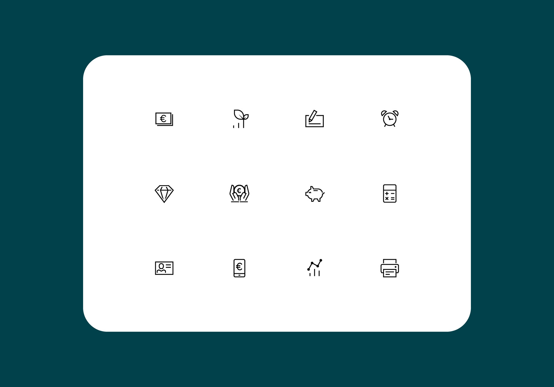
I developed an illustration-led visual system combining custom iconography, modular graphic elements and motion-aware brand assets designed to work across digital and physical environments.
The process focused on creating a scalable visual language that could move fluidly between product interfaces, presentations, campaigns and editorial communication while maintaining consistency with Commerzbank’s broader identity ecosystem.
Particular attention was placed on:
- illustration systems
- iconography consistency
- visual storytelling
- scalable digital assets
- motion-aware branding elements
- interface-friendly graphic systems
The resulting approach balanced structure and personality – introducing a more approachable and contemporary visual aesthetic without compromising clarity or functionality.
RESULTS
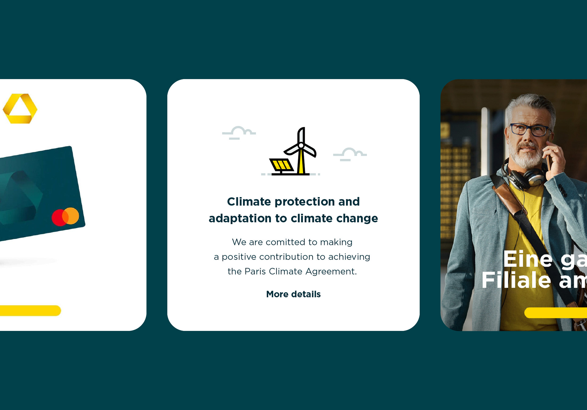
The final system provided Commerzbank with a more flexible and recognisable visual framework adaptable across campaigns, digital products, presentations and internal communication.
By developing reusable illustration systems, modular iconography and scalable visual assets, the project helped establish a more ownable and consistent brand language across multiple touchpoints and teams.
The system was designed to improve long-term flexibility and efficiency – reducing reliance on one-off asset creation while enabling future campaigns and digital products to maintain stronger visual consistency over time.
The more approachable illustration-led aesthetic also helped strengthen clarity and audience connection within highly structured financial communication environments.


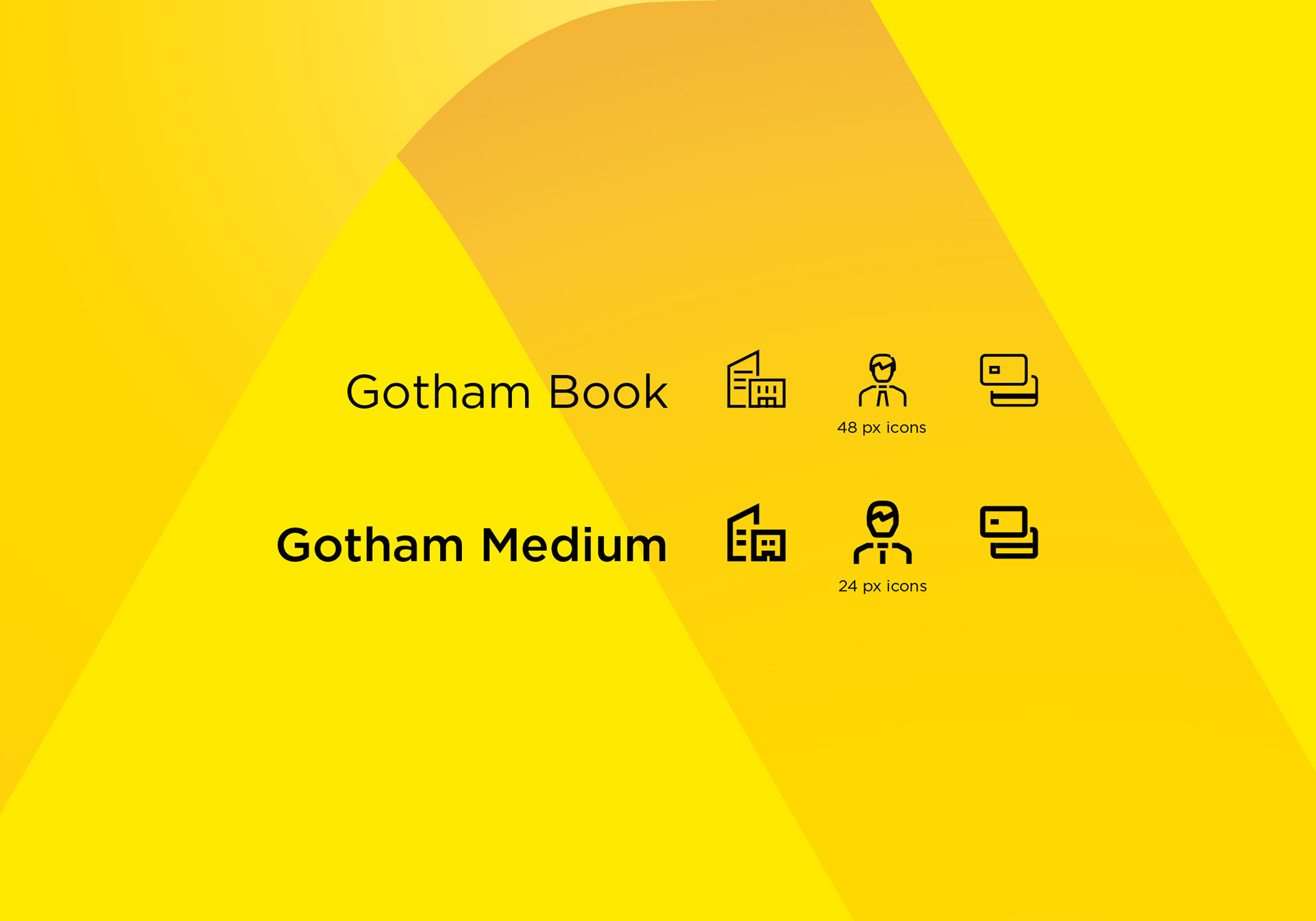
TYPOGRAPHY
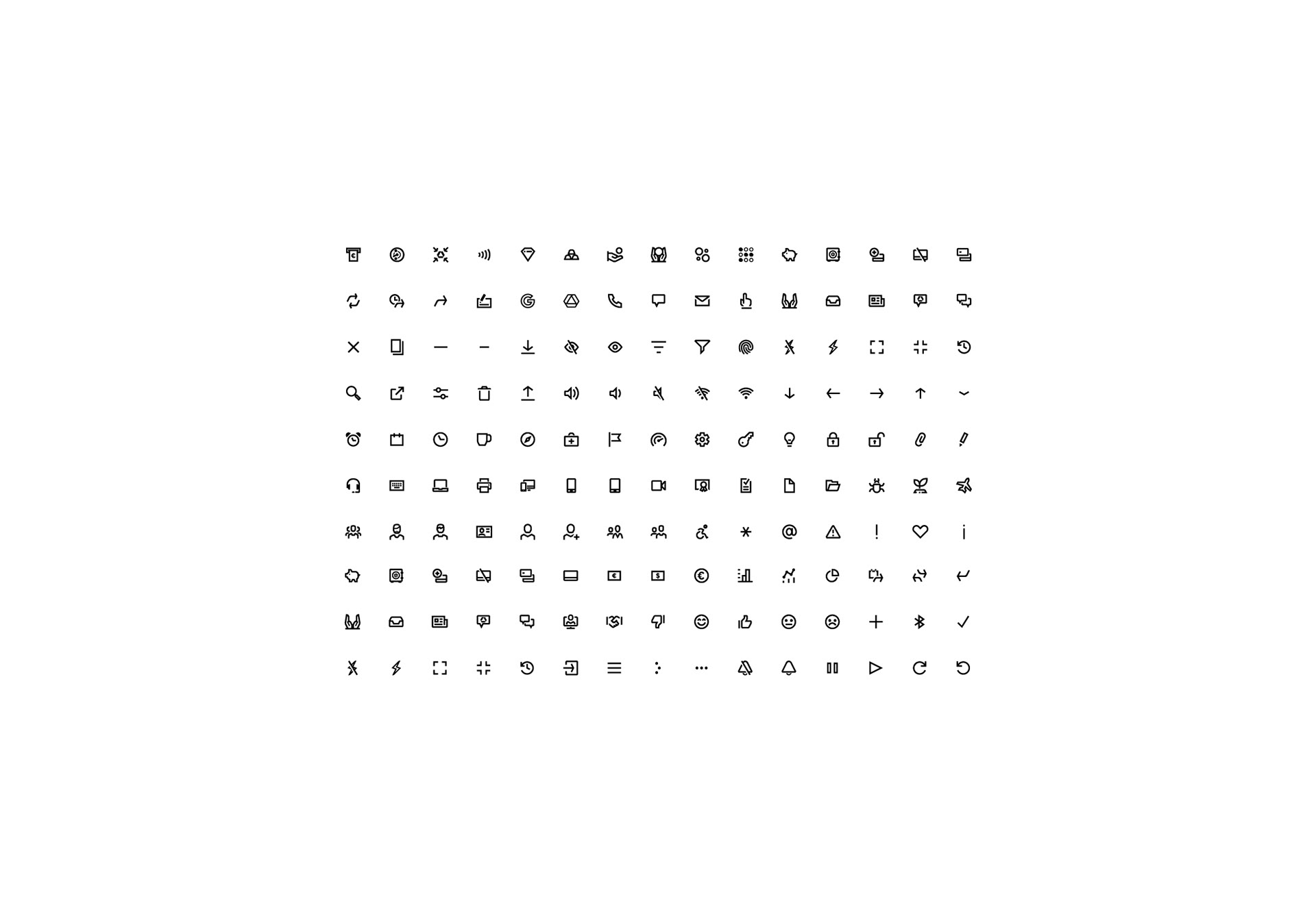
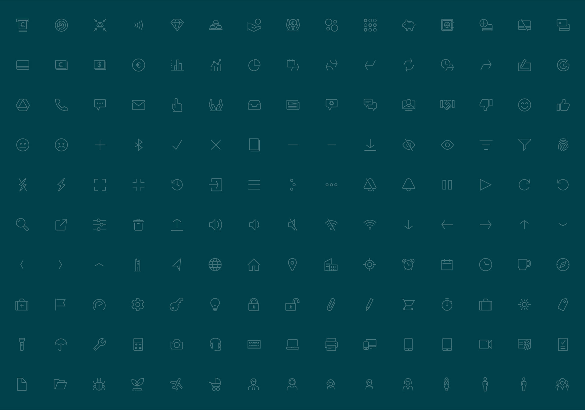
Commerzbank already utilsed Gotham across its brand ecosystem. To ensure visual harmony, the icon system was constructed to complement the most commonly used Gotham weights – Book and Medium.
The icon set was developed with three sizes to serve different use cases:
24 px and 48 px versions were optimised for user interfaces, offering clear readability and reduced detailing at smaller scale.
A 96 px version was designed as a versatile base for spot illustration, print applications and signage.

SUMMARY
Over two years (four part-time), I developed Commerzbank’s scalable icon and illustration system in close collaboration with Brand, UX, and Development teams. The work ensured a unified visual language across all platforms — mobile app, website, online banking (internal and customer-facing), and Service Terminals.
KEY OUTCOMES:
- 500+ icons in 3 sizes (24, 48, 96 px) and 2 styles (outline, solid) — 3,000+ assets
- 175+ spot illustrations (light + dark mode = 350+ assets) built from the icon system
- 50+ micro-animations for onboarding and system feedback
- Fully integrated libraries for Figma, Sketch, Adobe CC, and PowerPoint
This framework streamlined production, strengthened brand consistency, and supported a cost-effective approach to scalable design.