CHALLENGE
A visual language growing apart
A visual language growing apart
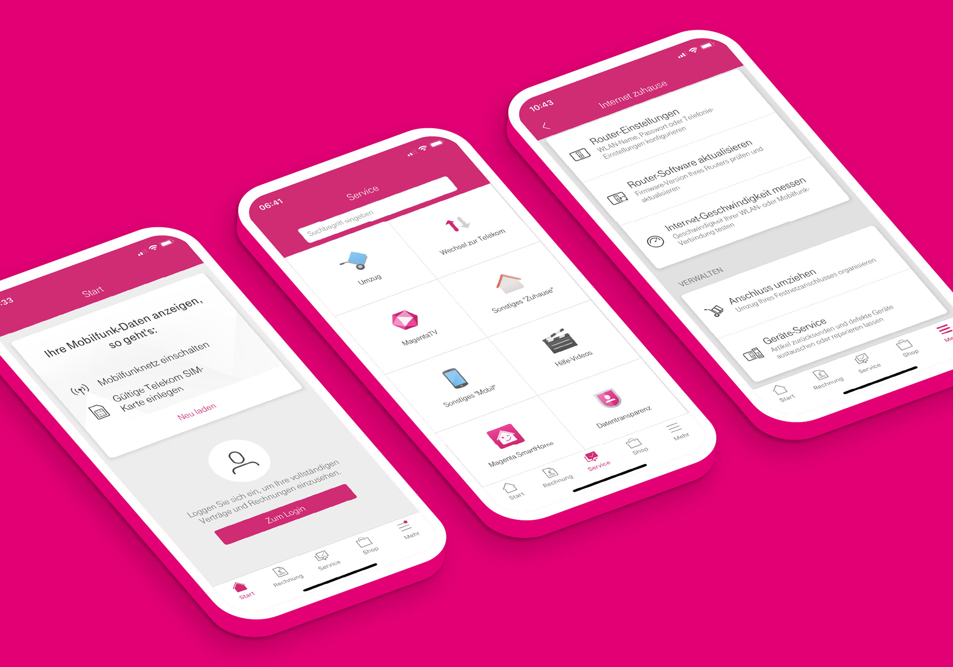
By 2013, Deutsche Telekom's icon library had grown across products, services and touchpoints.
So had the inconsistencies.
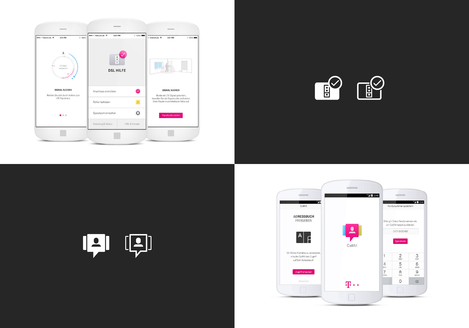
Different styles, duplicate assets and missing symbols made a shared visual language harder to maintain across software, hardware, retail, packaging and communication.
The task was not to create more icons.
It was to make the system work better.
APPROACH
Reduce. Align. Extend.
Reduce. Align. Extend.
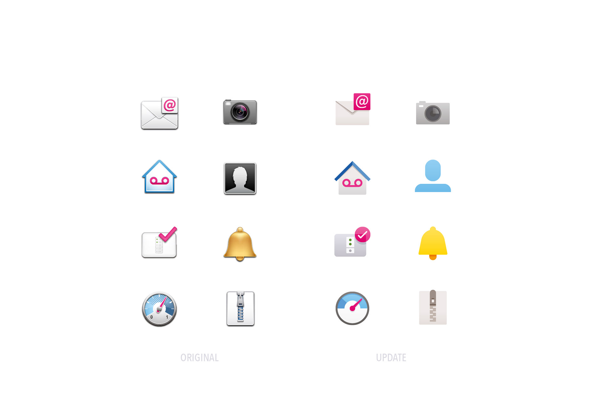
As part of Telekom's icon team, I helped audit, refine and extend the existing library between 2013 and 2015.
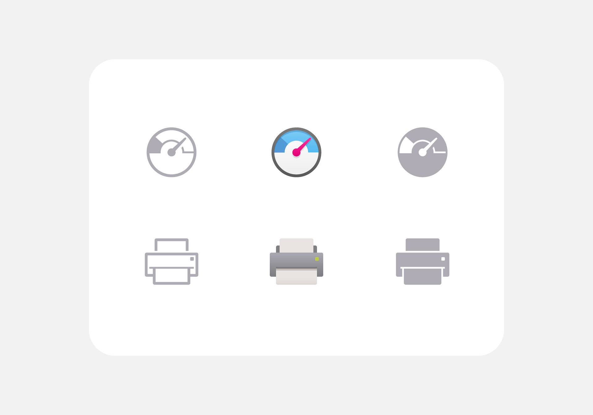
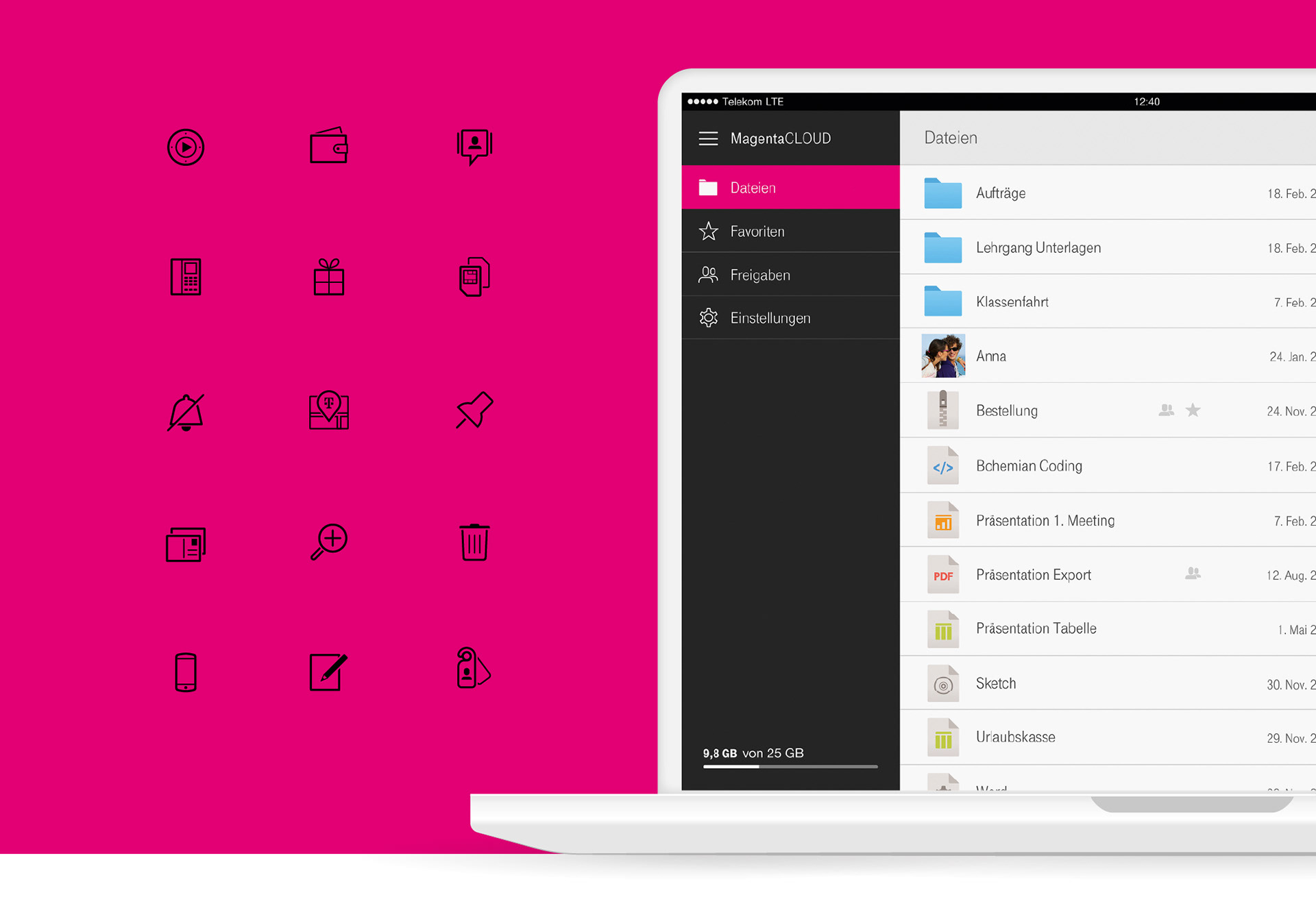
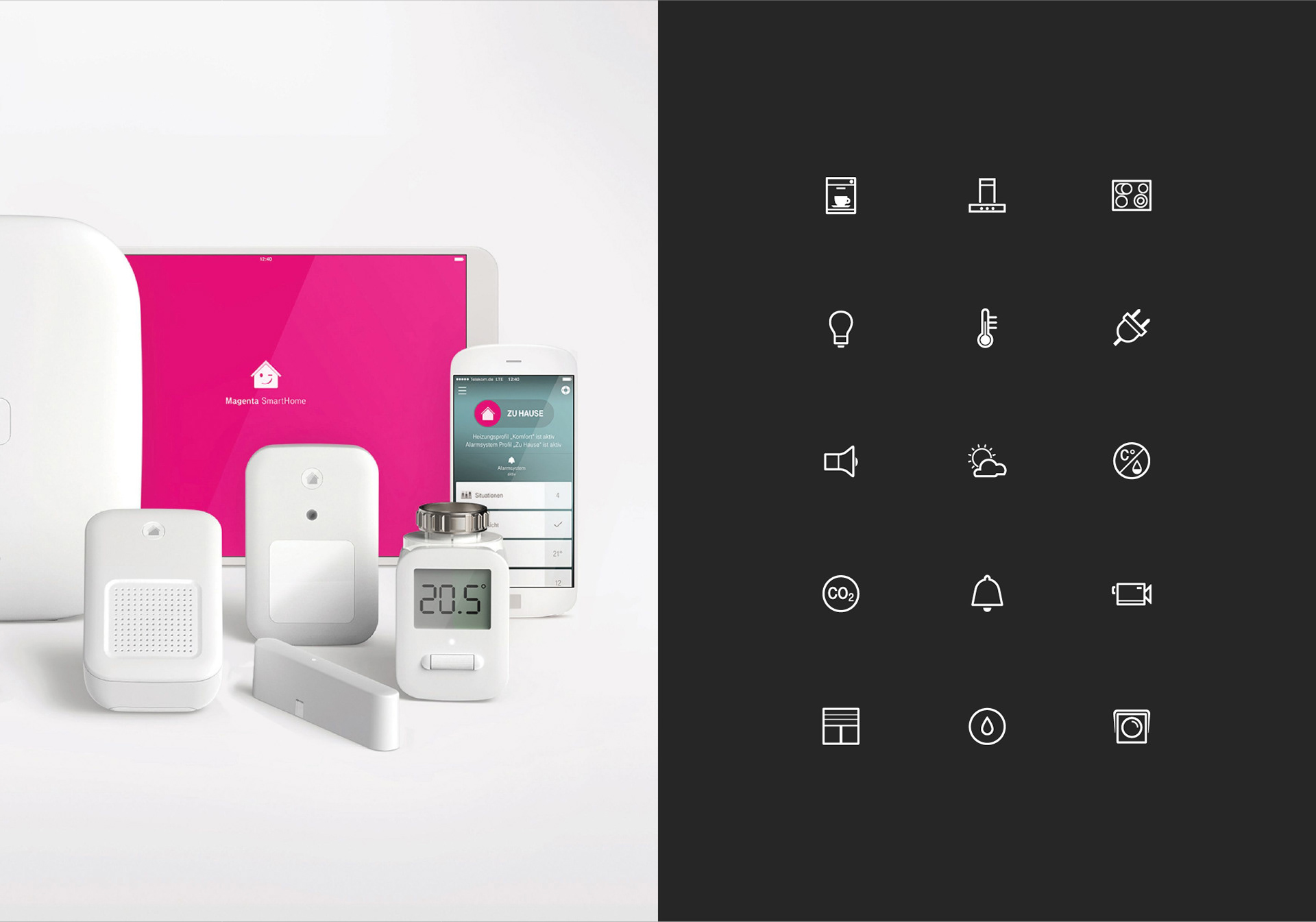
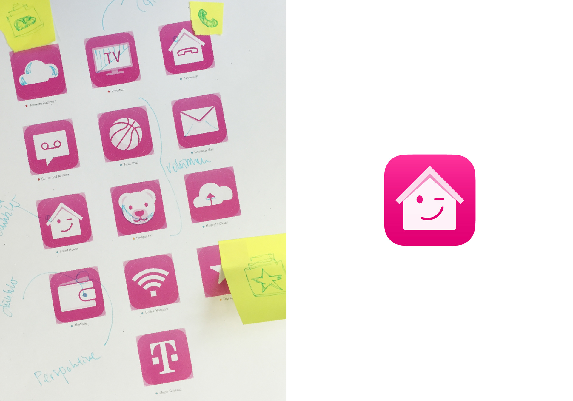
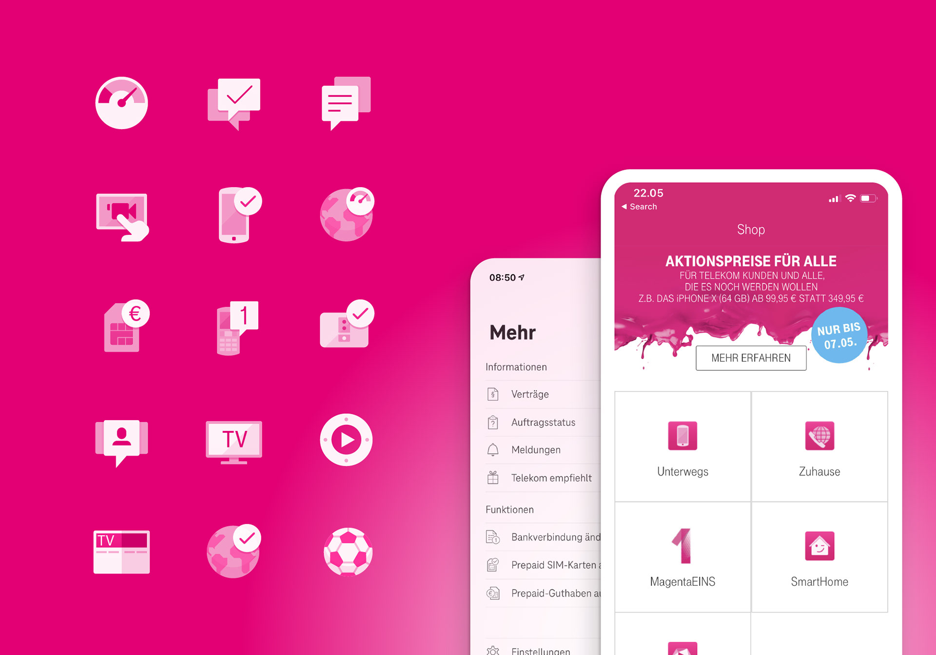
Existing assets were consolidated and redrawn around shared principles for geometry, proportion and visual weight. Solid and outline families were aligned. Missing symbols were added.
New requirements could then build on the same visual logic rather than starting again.
A reusable foundation for thousands of future design decisions.
RESULT
Consistency made possible at scale
Consistency made possible at scale
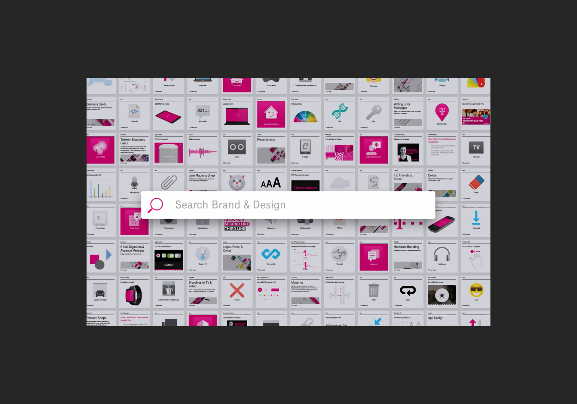
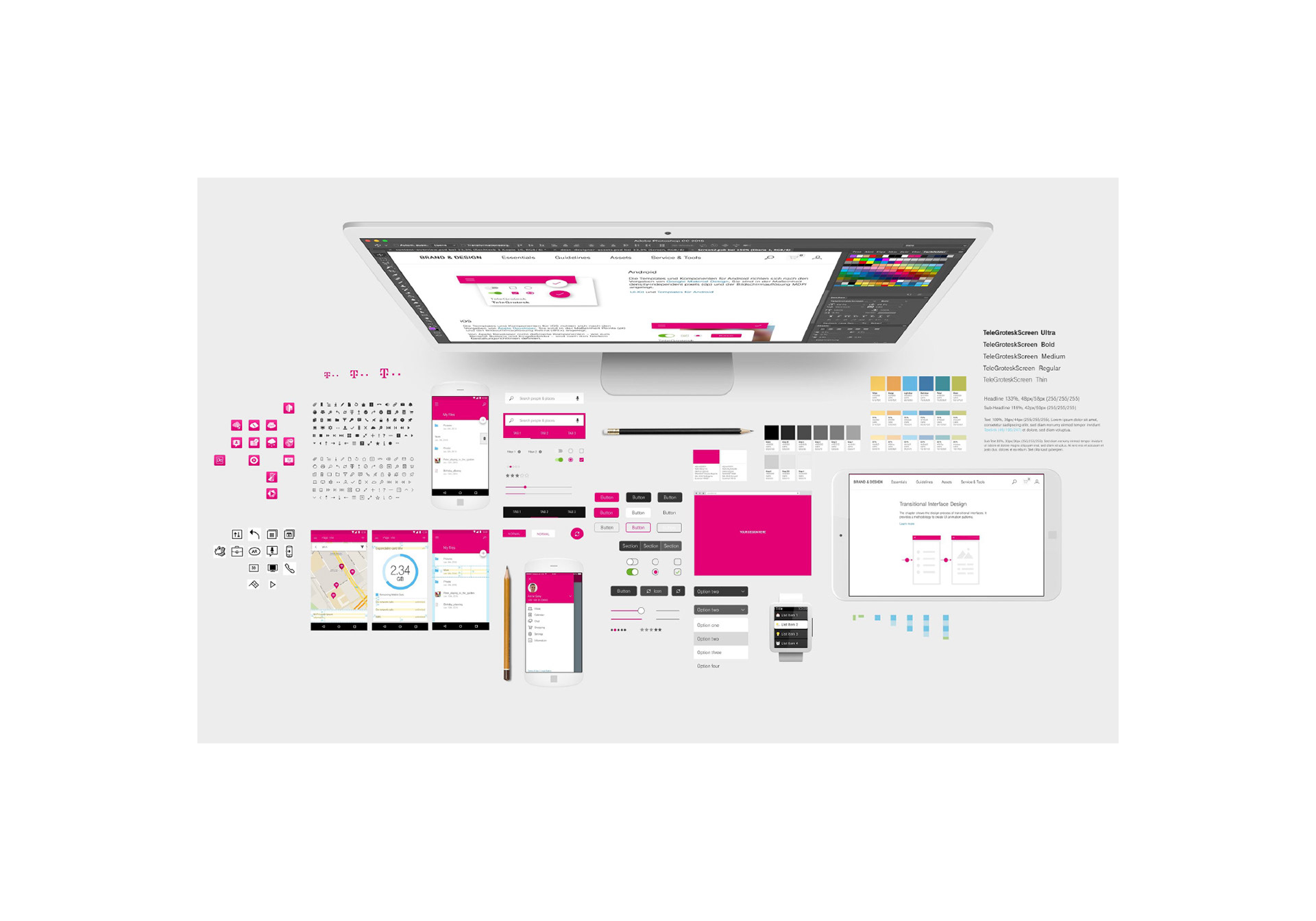
Telekom later formalised this thinking within its wider Brand & Design system.
Its Design Thinking Doing framework describes standardised components (including icons) as a way to speed up development, improve quality and cost efficiency, and create consistent, recognisable experiences.
By 2018, Telekom's Brand & Design platform covered more than 30 design topics and offered over 2,000 downloadable resources for an organisation of around 225,000 employees, alongside contractors and external partners.
The platform received an iF Design Award in 2019.
That same year Deutsche Telekom was named Red Dot: Brand of the Year, with the jury recognising the consistency, simplicity and immediate recognisability of its identity.
Brand Finance valued Deutsche Telekom at $46.26B in 2019, up from $33.19B in 2016.
No single icon creates that value.
But coherent systems make coherence easier to deliver.
But coherent systems make coherence easier to deliver.