CHALLENGE
Scandyna had acquired the intellectual property and design rights to the iconic Pod Speakers from Blue Room Loudspeakers – a British brand known for their iconic speakers and their involvement in electronic music through their own record label.
Following the acquisition, Scandyna faced a critical brand transition. They could no longer use the Blue Room brand mark, and needed to modernise their own wordmark without losing existing brand equity.
APPROACH
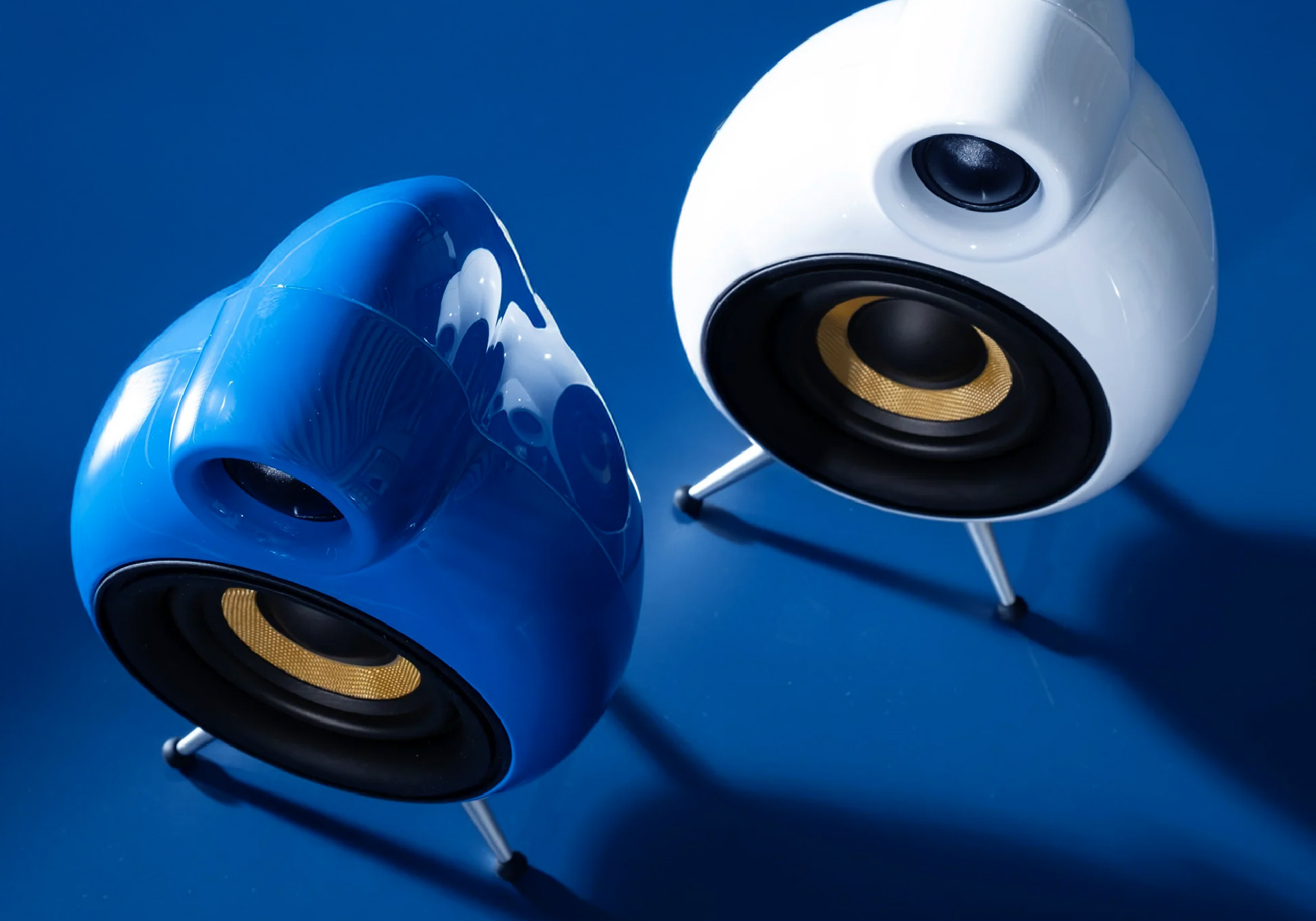
By analysing the design lineage of the PodSpeakers – from early prototypes in the 1990s through to Scandyna’s new product roadmap it became clear that the visual language needed to lean heavily into the design of the iconic PodSpeakers.
Sketches explored typographic and abstract variations inspired by the organic, rounded forms of the speakers. These were then distilled down to a clean contemporary Brand- and Wordmark.
RESULT
The refined logo was successfully introduced across Scandyna’s entire range of audio products – playing a critical role in repositioning Scandyna as an independent, design-led brand. The rebrand helped ensure continuity in customer recognition while laying the foundation for new distribution and marketing strategies globally.
BRAND MARK
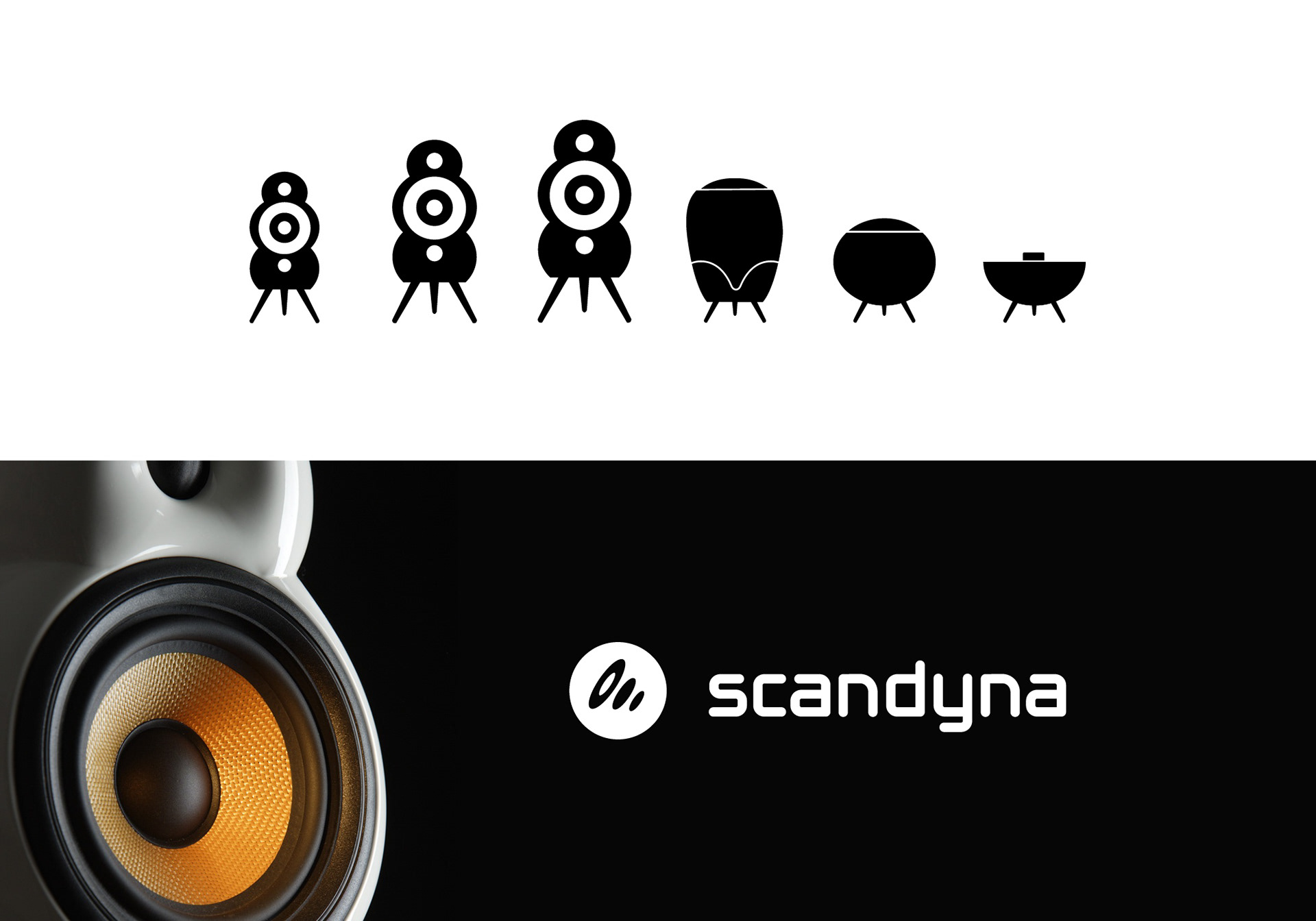
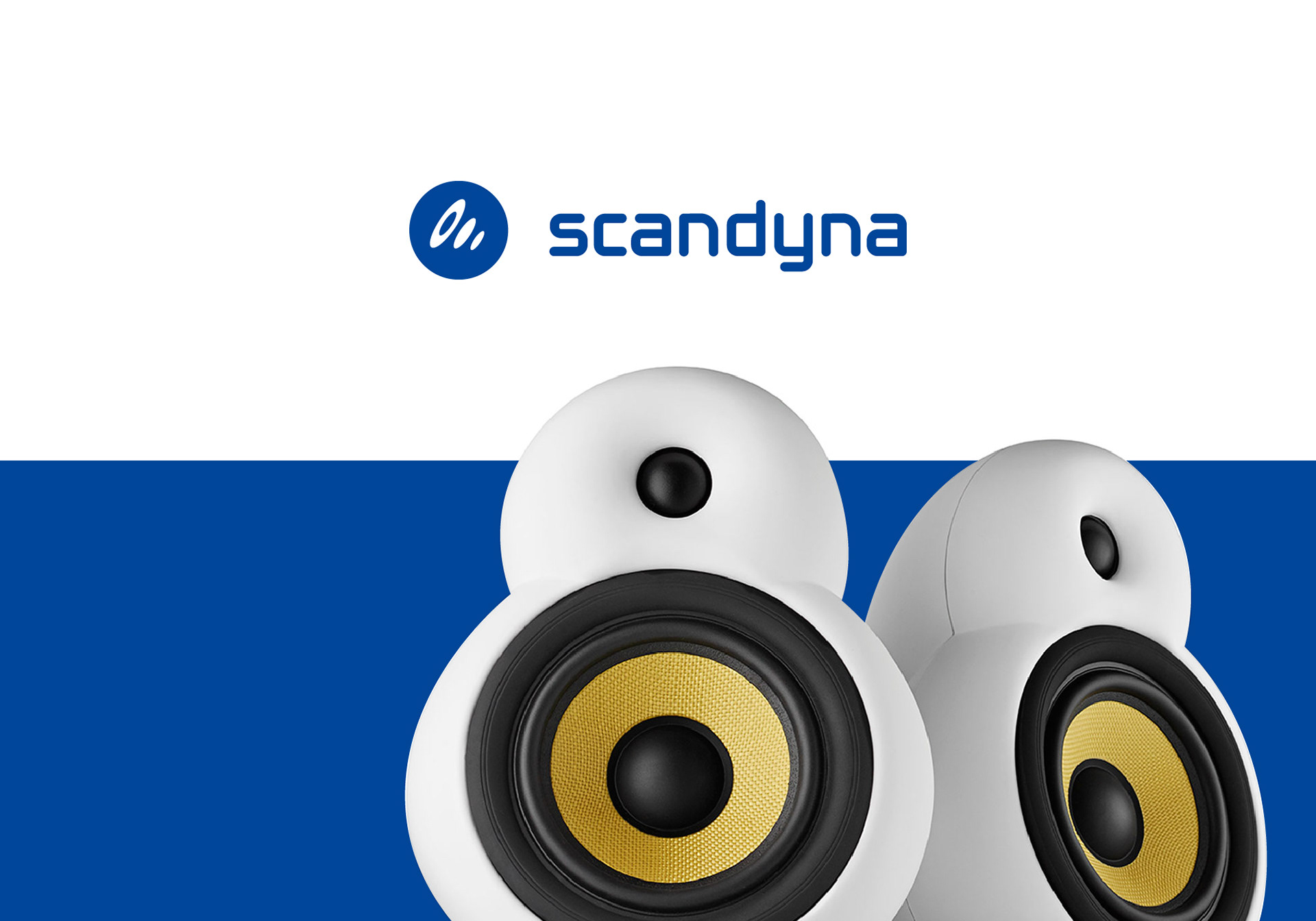
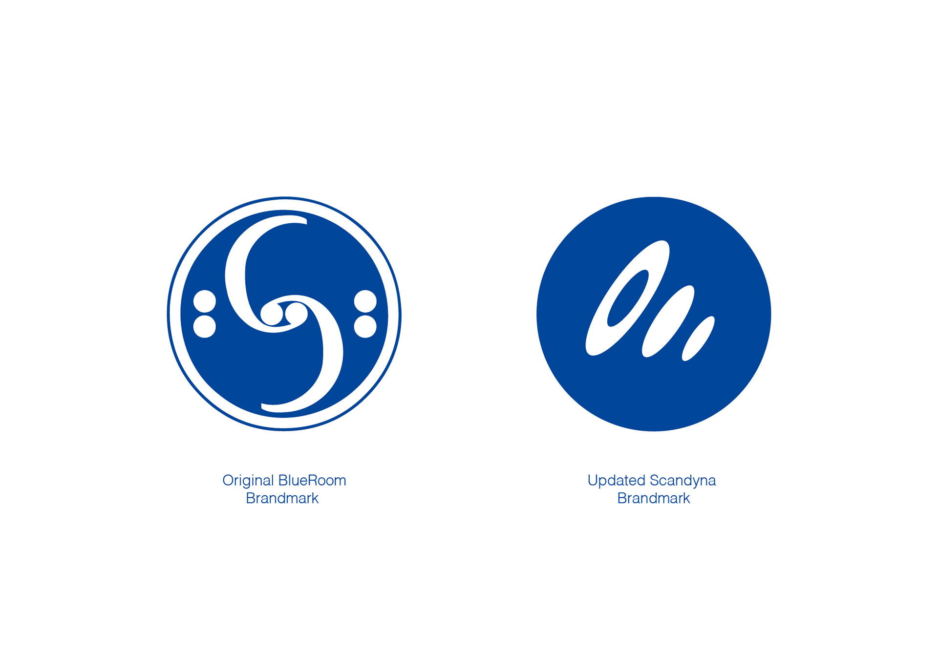
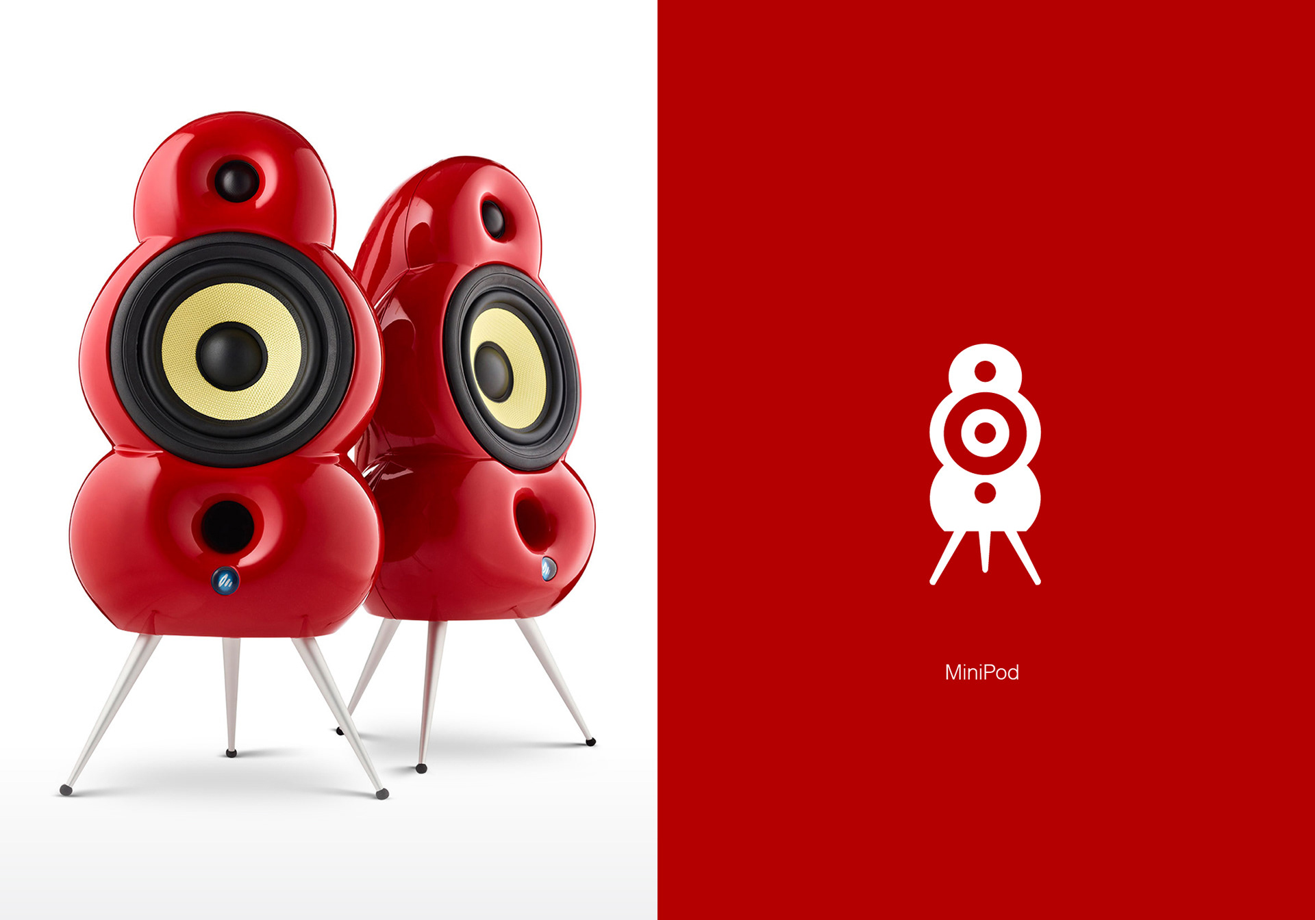
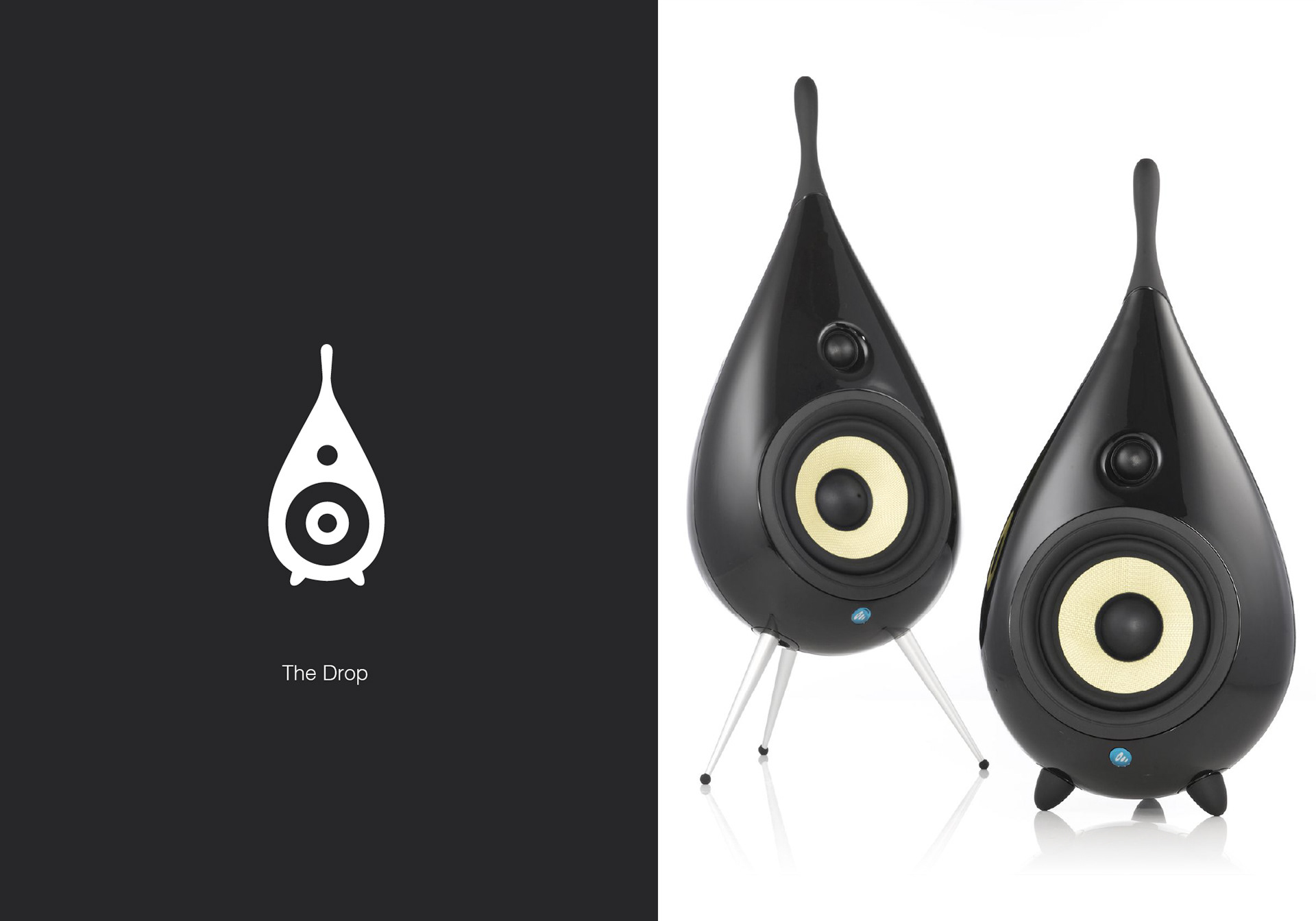
Since Blue Room was still using the original mark for their record label, it was important for Scandyna to introduce its own unique mark for the Podspeakers.
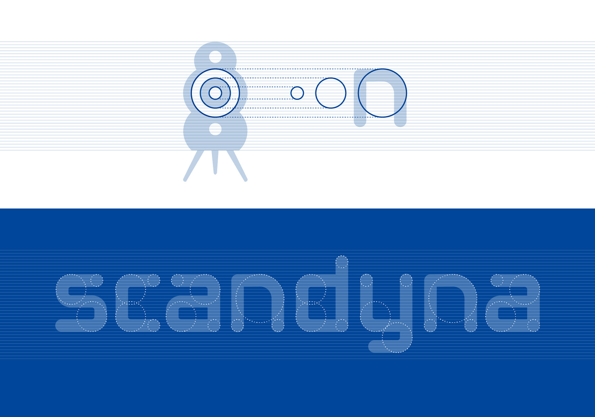
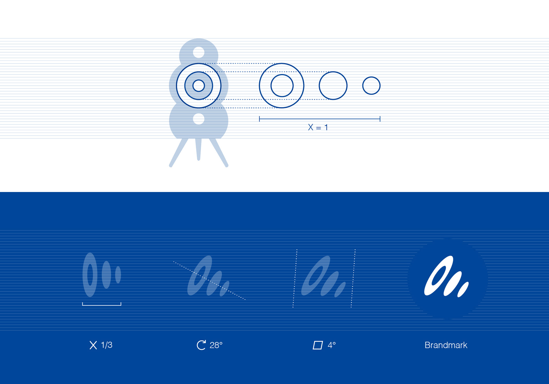
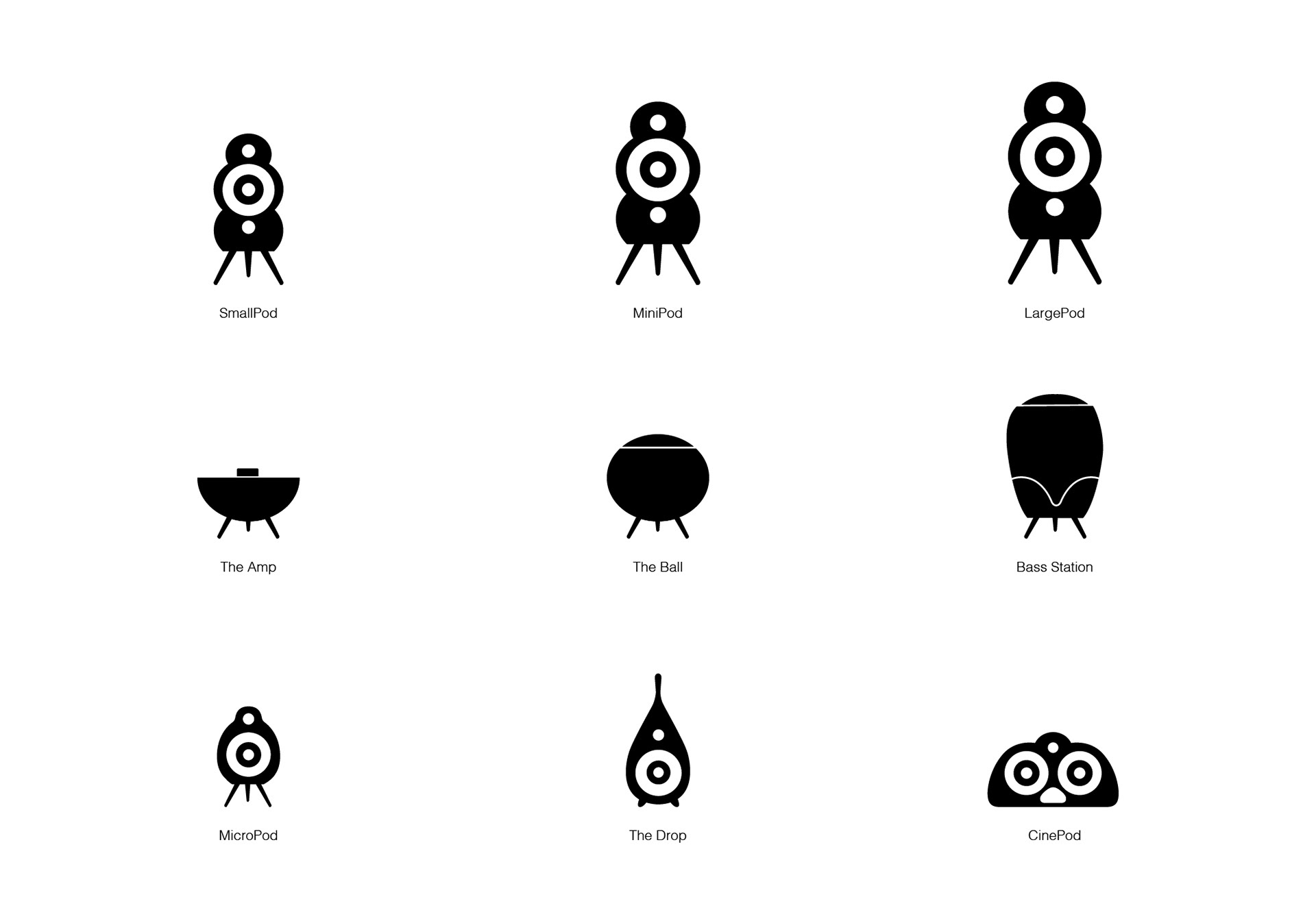
Inspired by the speaker’s core geometry, an abstract mark echoing the idea of sound radiating outward was crafted as a visual nod to audio energy in motion.
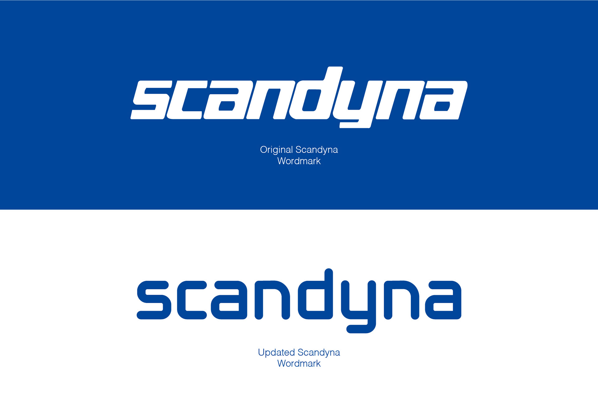
WORD MARK
The original word mark had been in use since the 1970s – reflecting an era when most speakers were housed in traditional wooden boxes. To better align with the new product range, the typography needed an update – one that honoured the original mark while modernising it, ensuring existing brand equity was preserved.
The solution was to redesign the word mark using core geometric shapes derived from the PodSpeaker itself. This approach provided the foundation for both the brand mark and the updated word mark. Legibility was significantly improved, while also creating stronger visual cohesion across product design, logo, and brand identity.