CHALLENGE
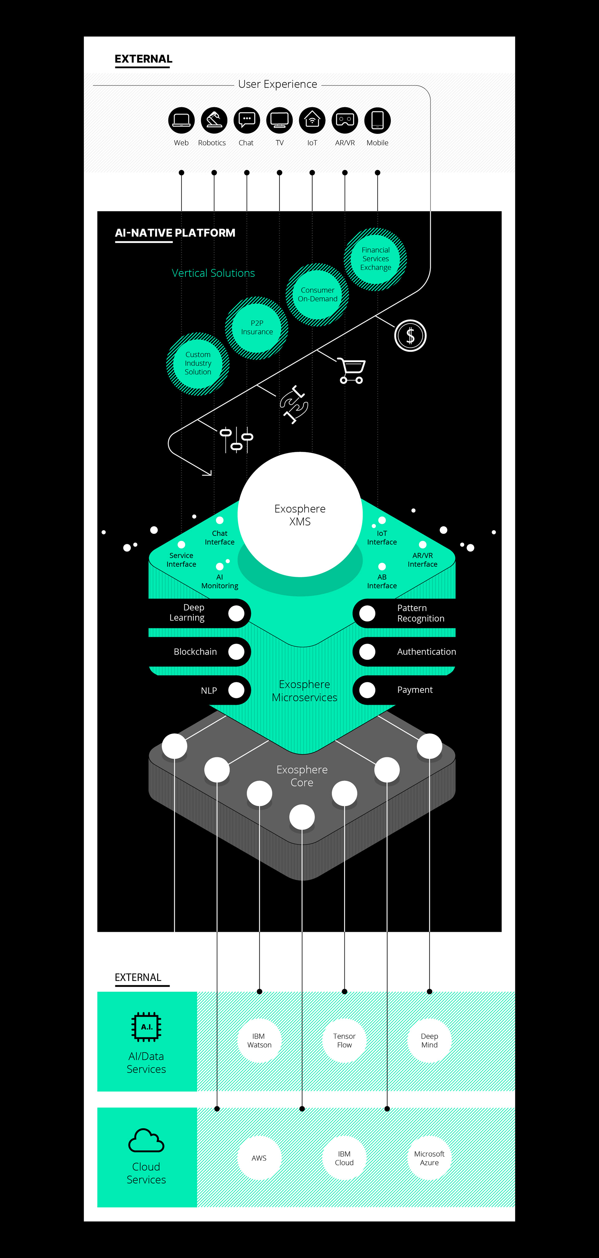
Visualising the Invisible: The client, a leading US-based AI-native product studio, required a comprehensive visual system to communicate their services. The primary challenge was twofold: creating a library of icons that felt grounded in their corporate identity, and developing a narrative illustration style that could explain complex software architecture without losing its minimalist edge.
APPROACH
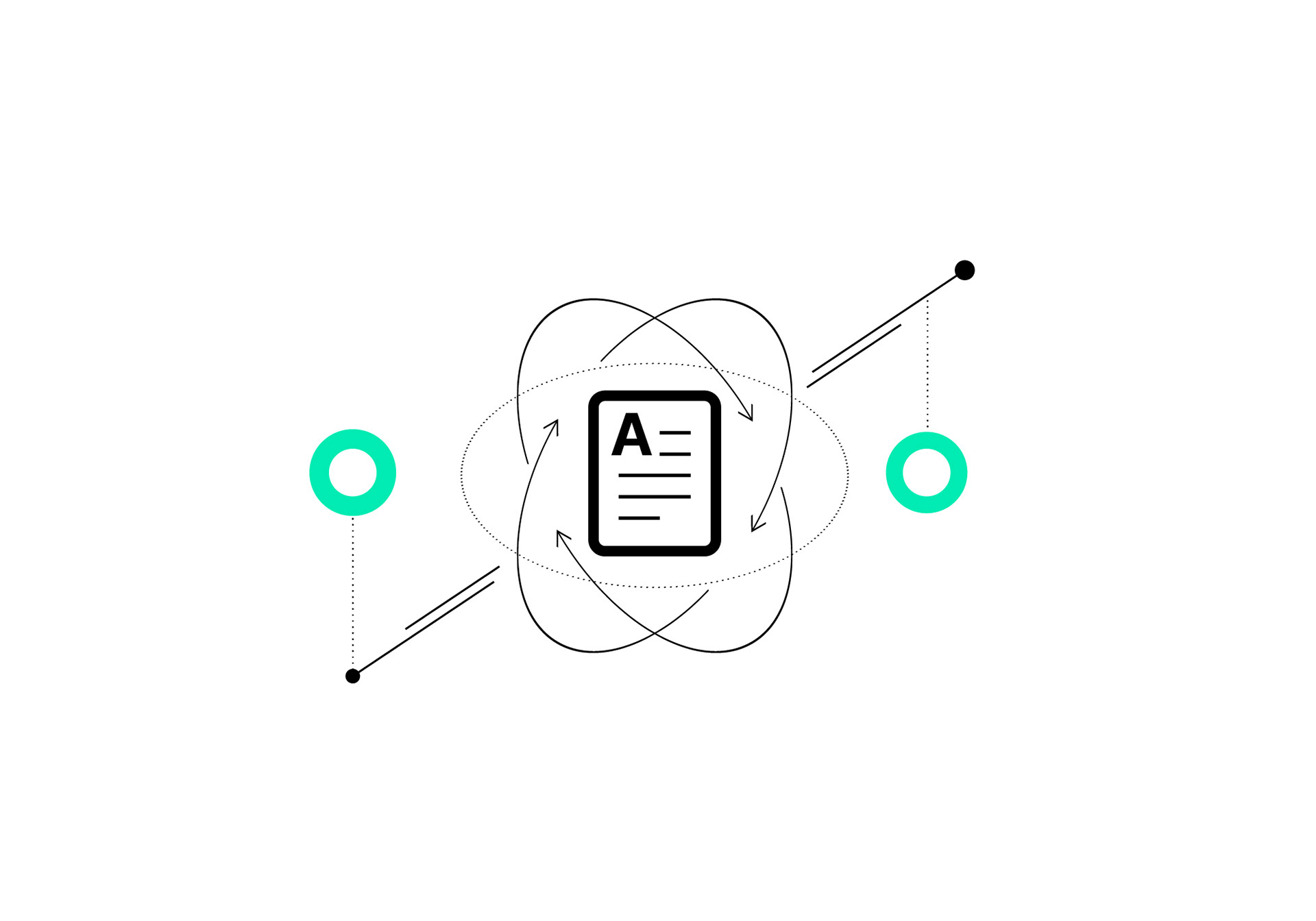
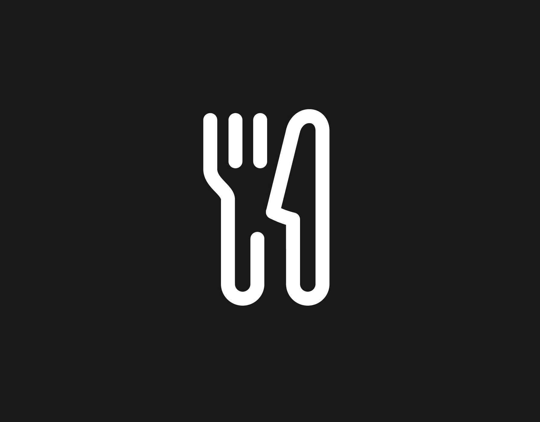
The Anatomy of a Stroke: The strategy was rooted in the company’s existing brand DNA – specifically their serif logotype. I deconstructed the logo’s proportions to inform a bespoke, dual-weight outline icon suite.
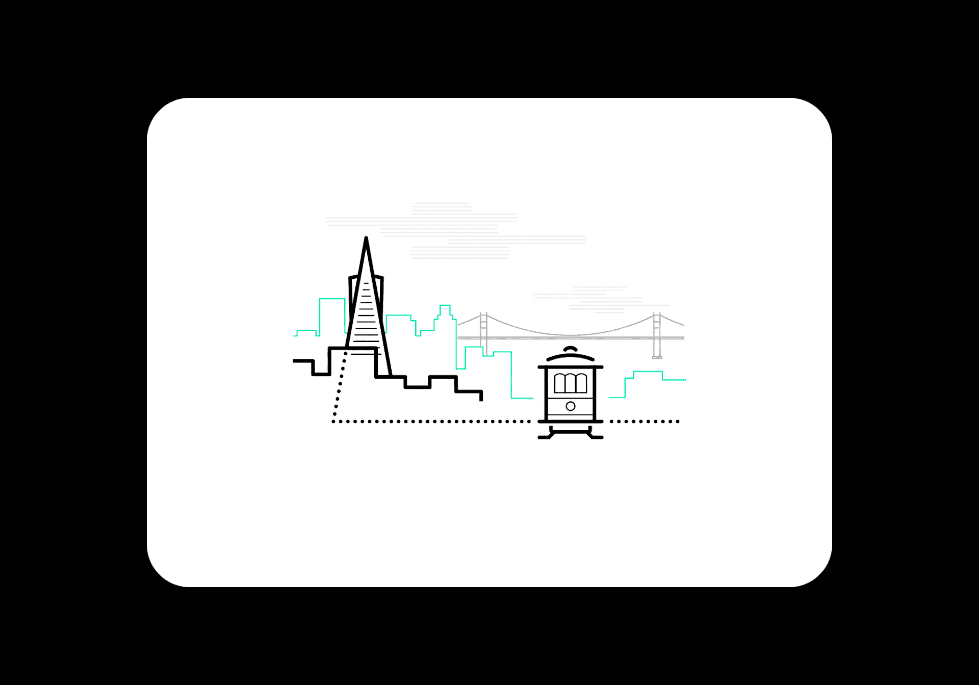
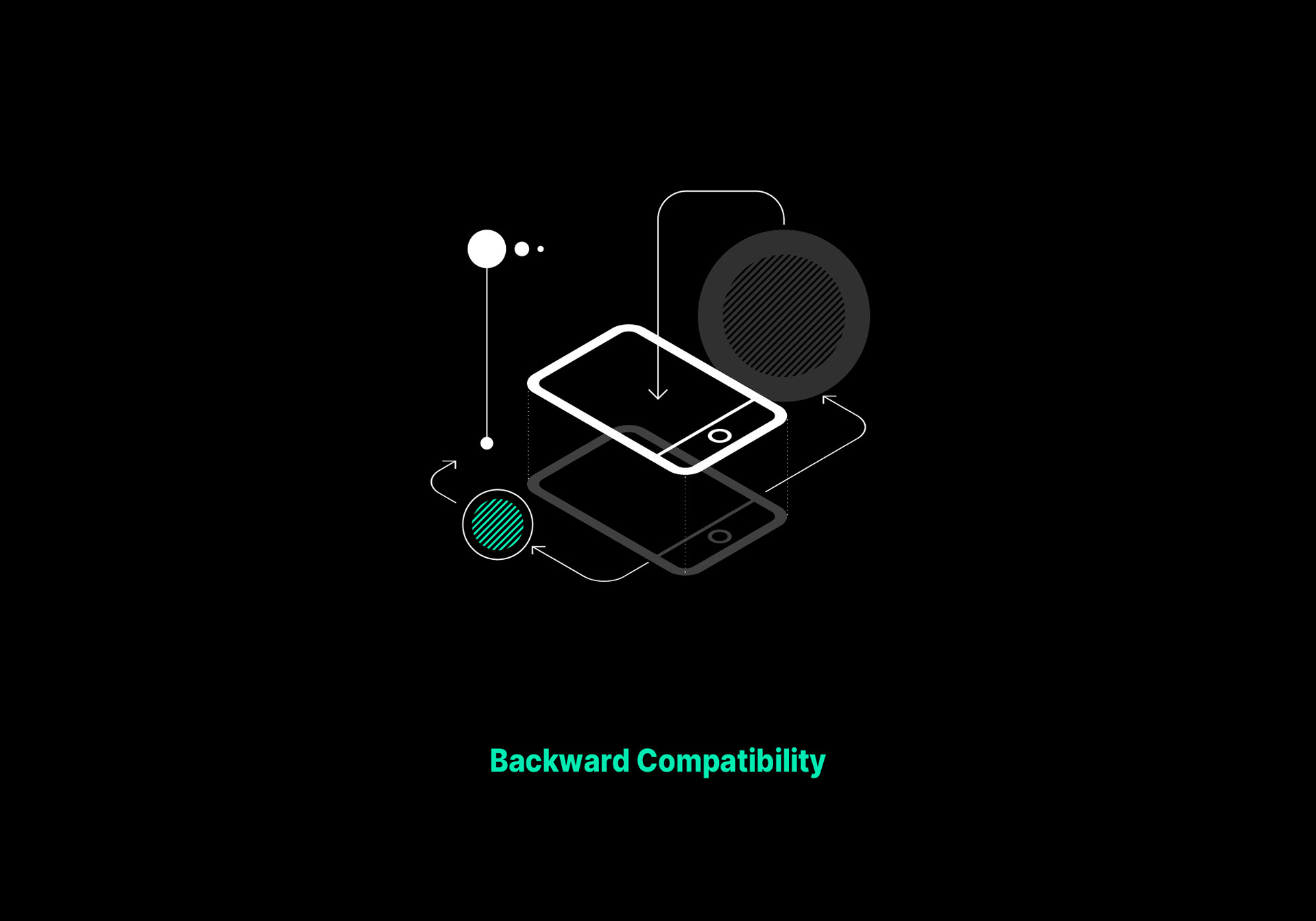
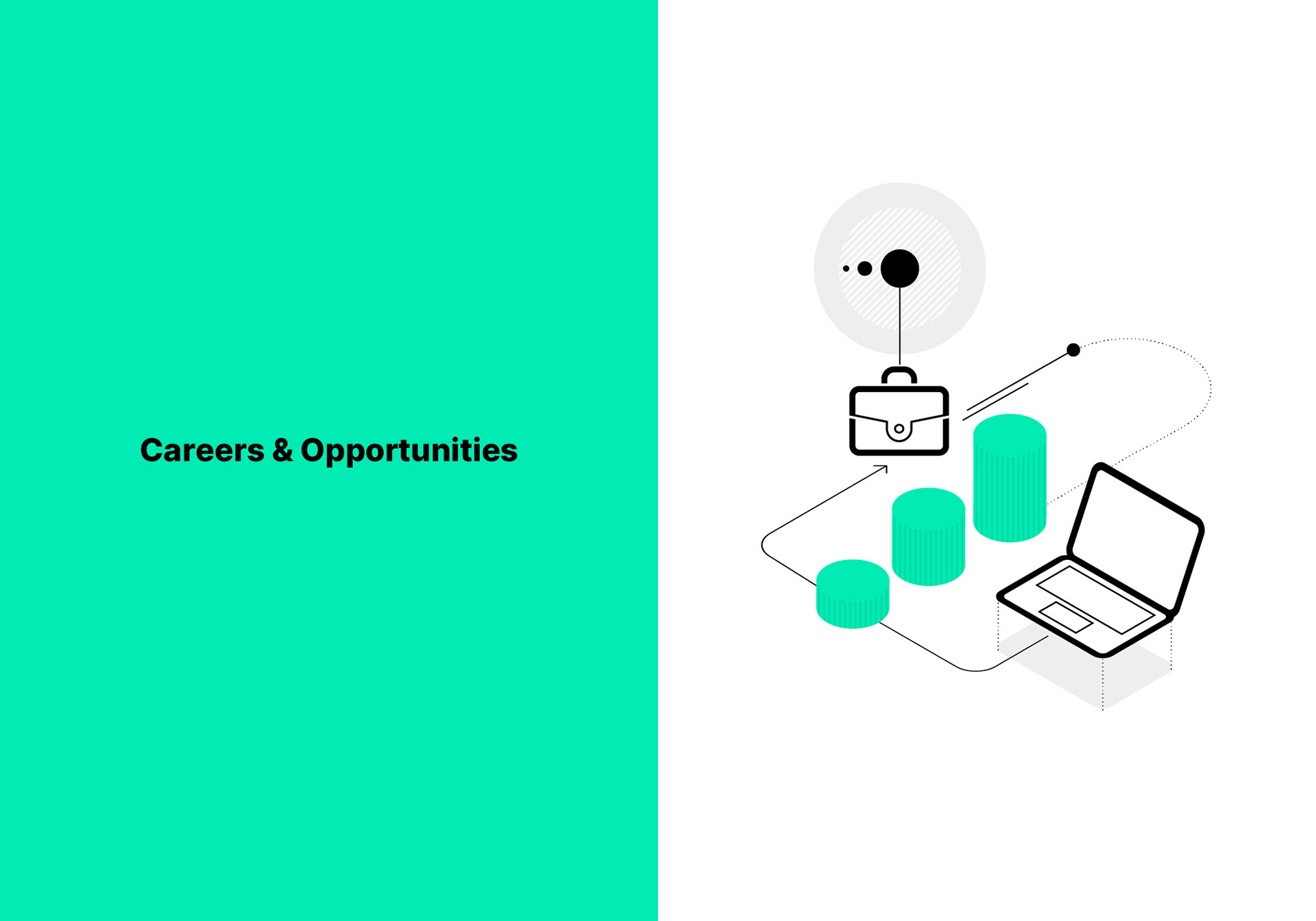
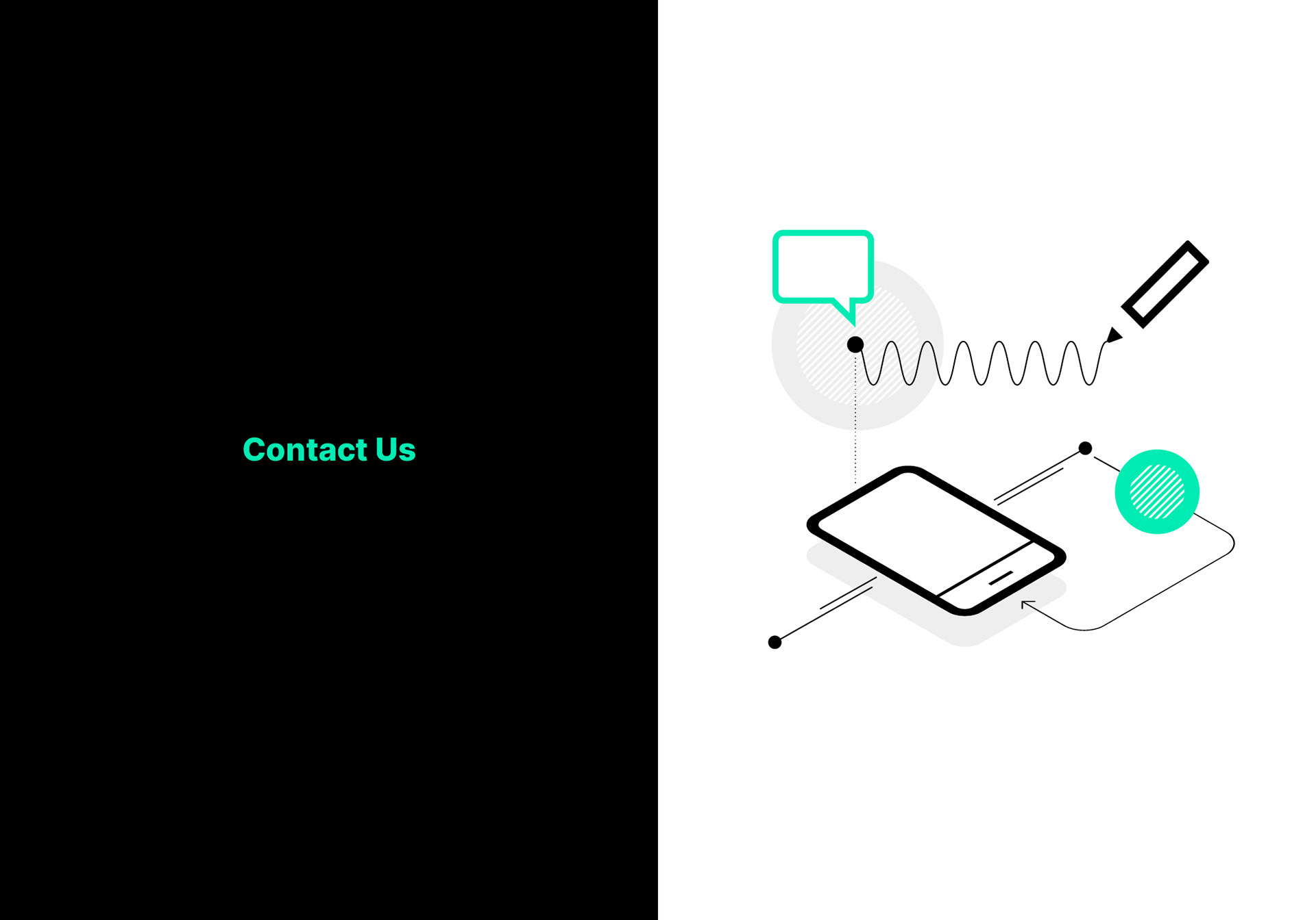
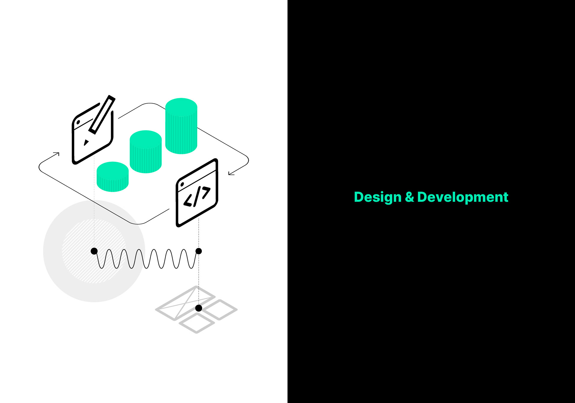
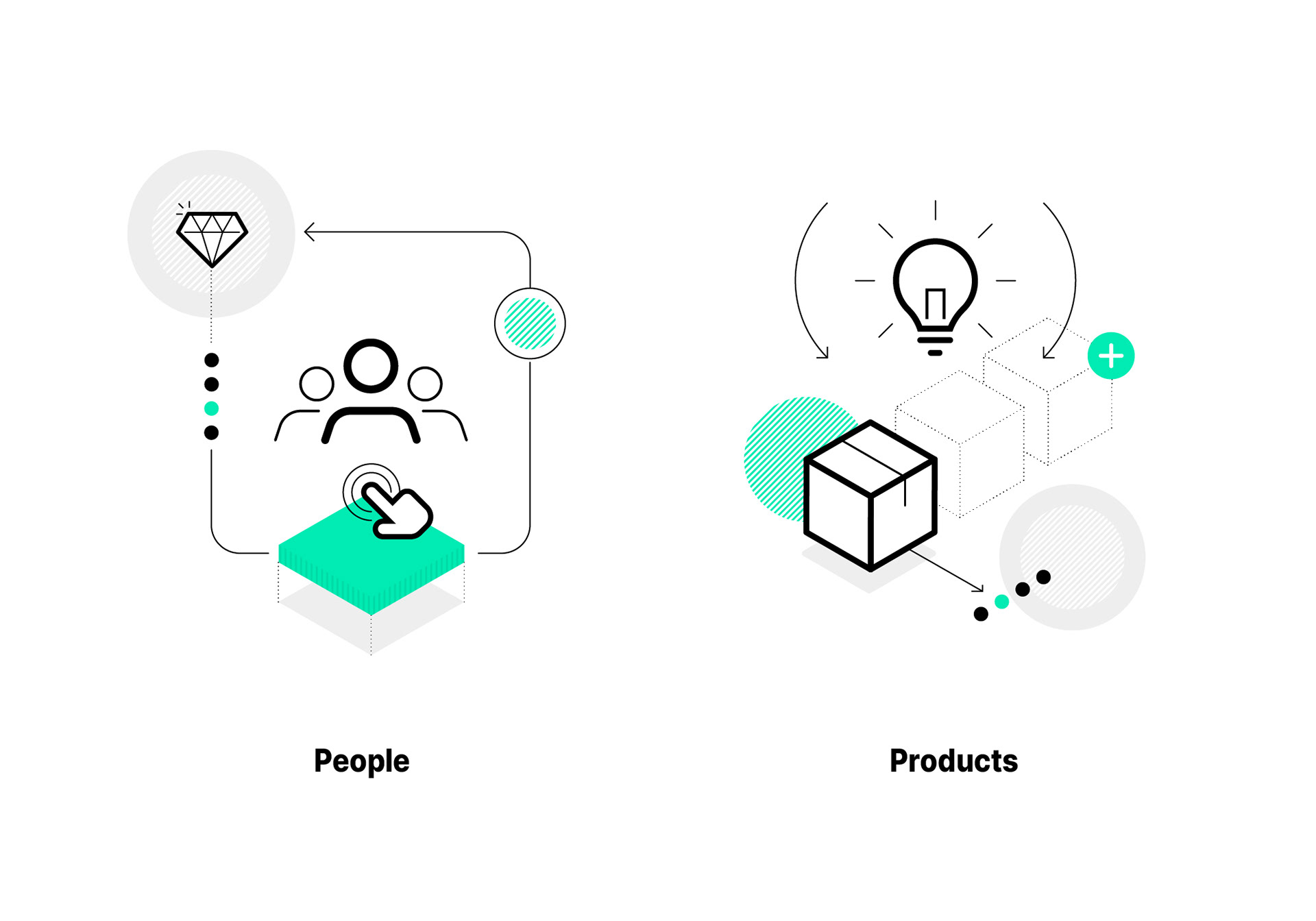
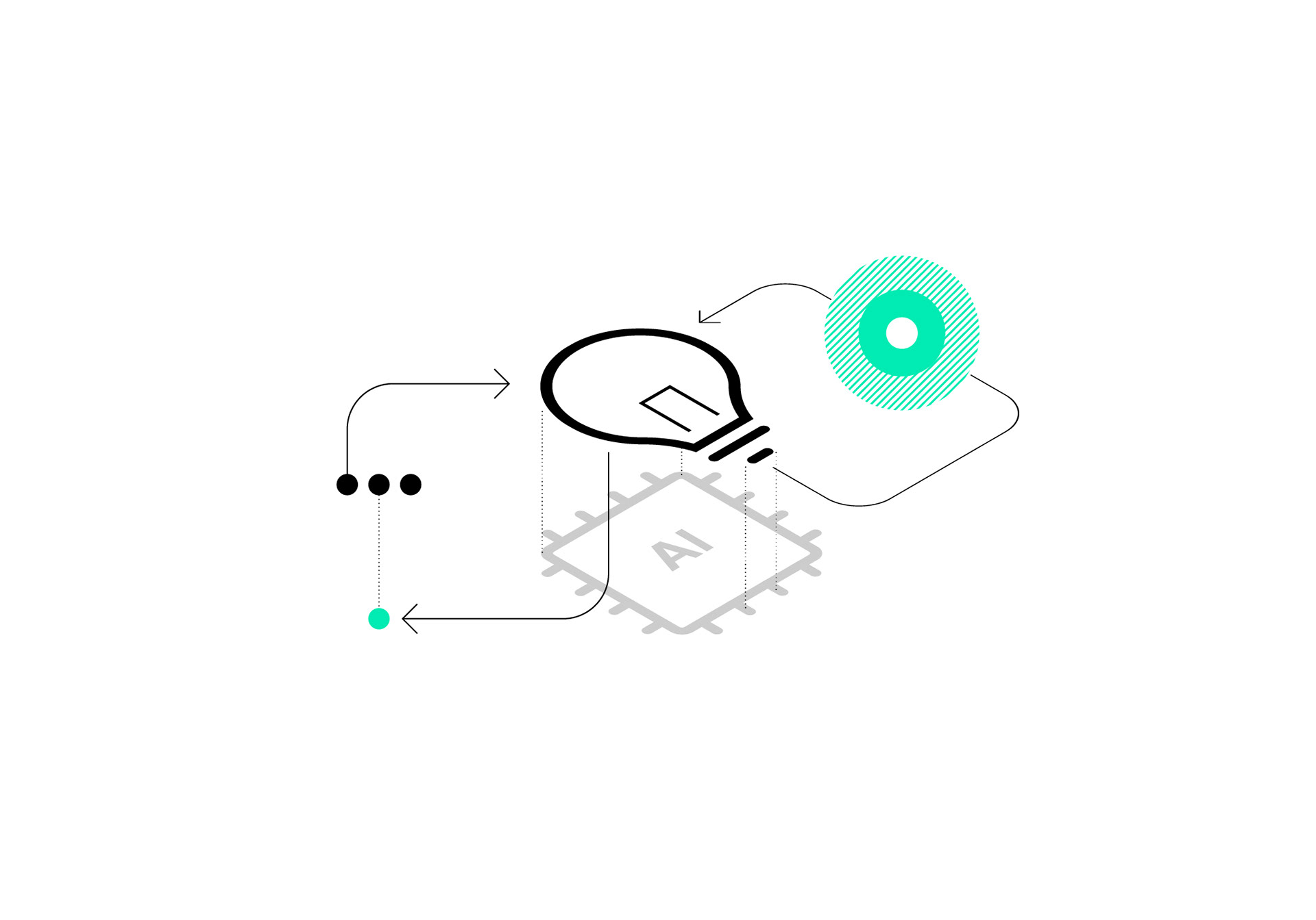
The Isometric Transition: To create a clear hierarchy between "Functional Icons" and "Brand Illustrations," I moved the 2D icon language into a 3D isometric space. This allowed me to reuse the same visual primitives while adding depth and scale for hero sections and marketing materials.
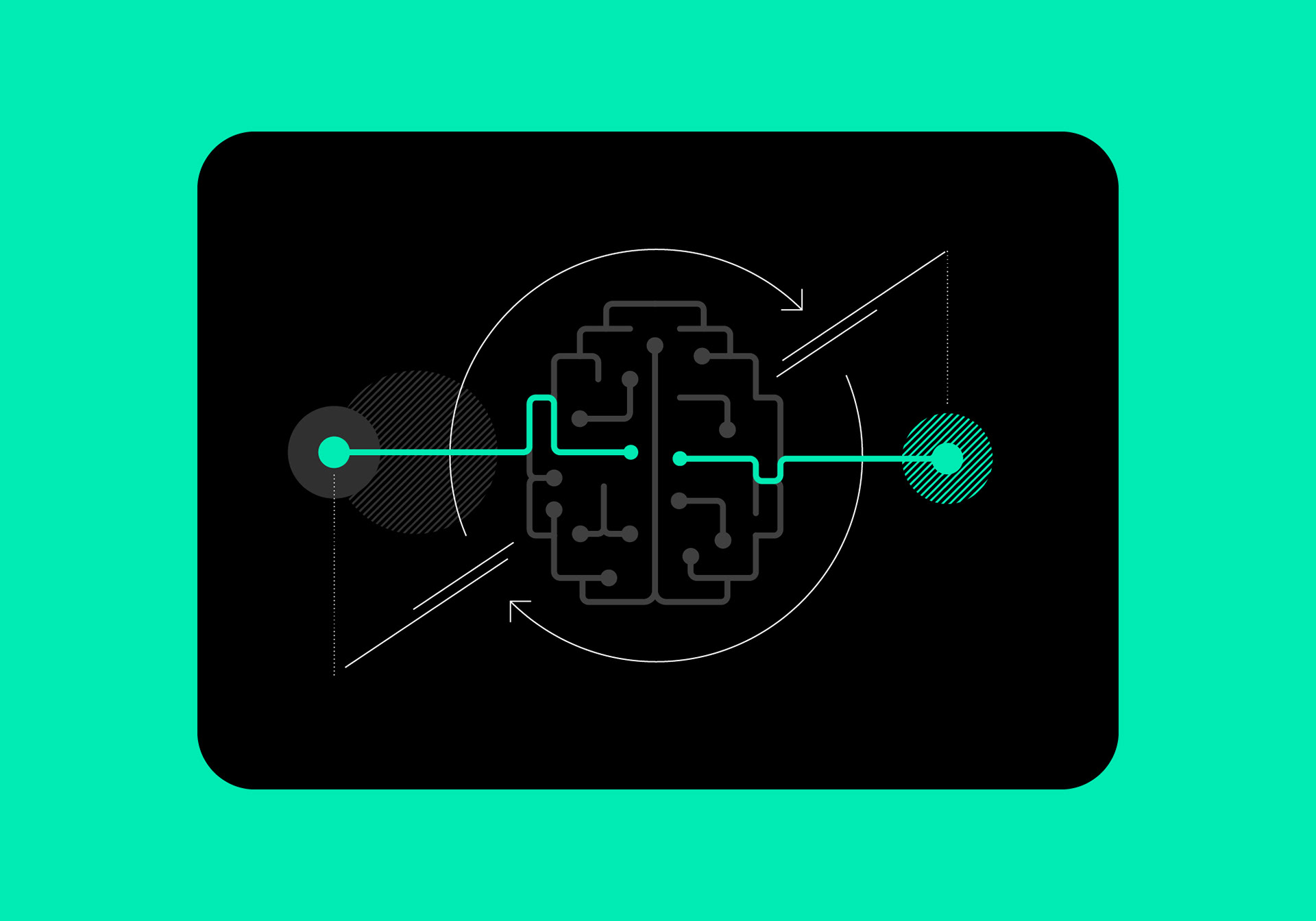
The Shading Logic: I introduced a pattern of parallel lines for shading and texture. This served as a nod to technical blueprints and vintage engineering schematics, providing a tactile feel to the digital assets.
RESULTS
A Scalable Visual Engine: The outcome is a cohesive identity that bridges the gap between software development and strategic consulting.
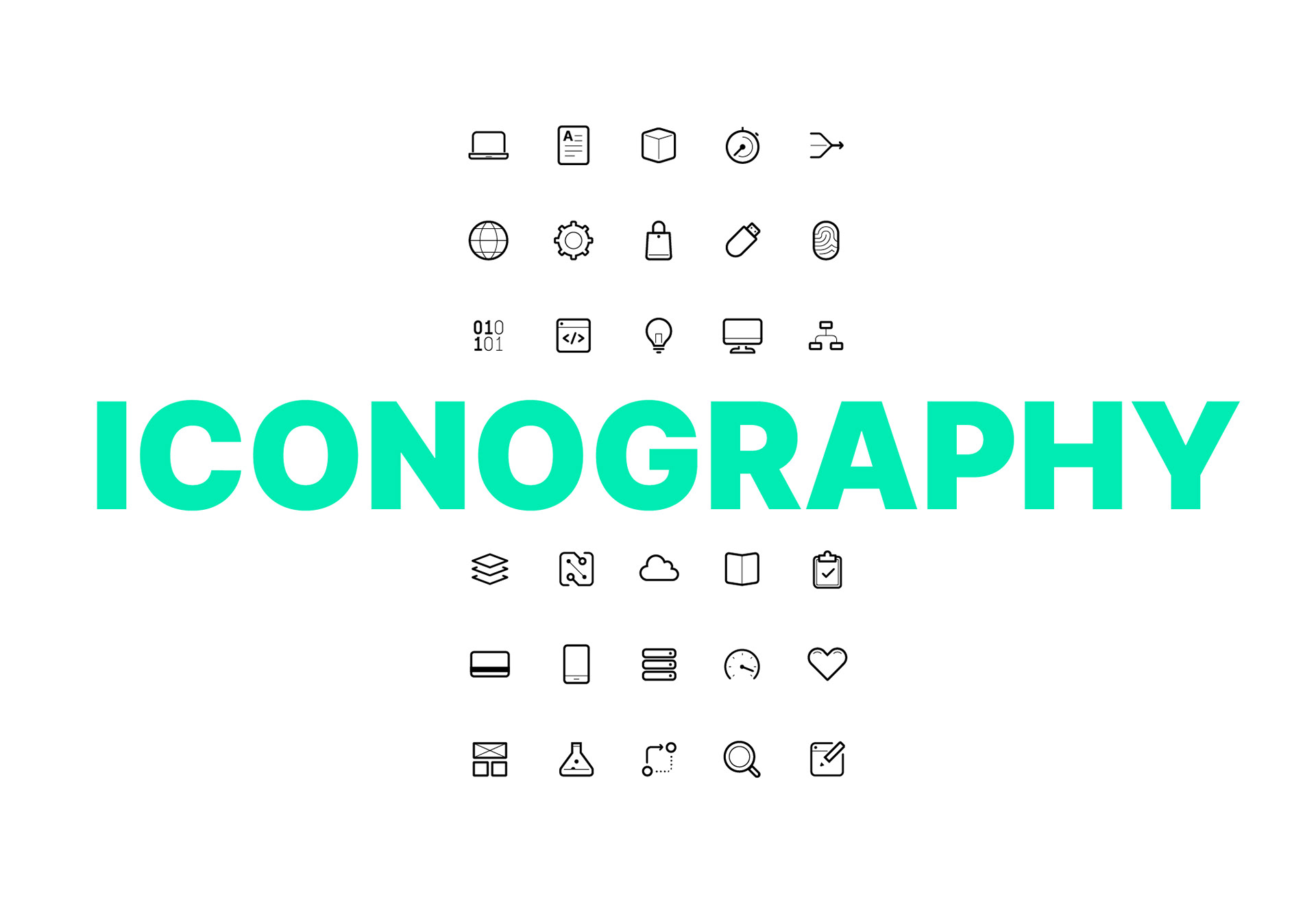
Unified Symbolism: A bespoke suite of over 100+ icons that share the same DNA as the company’s logo.
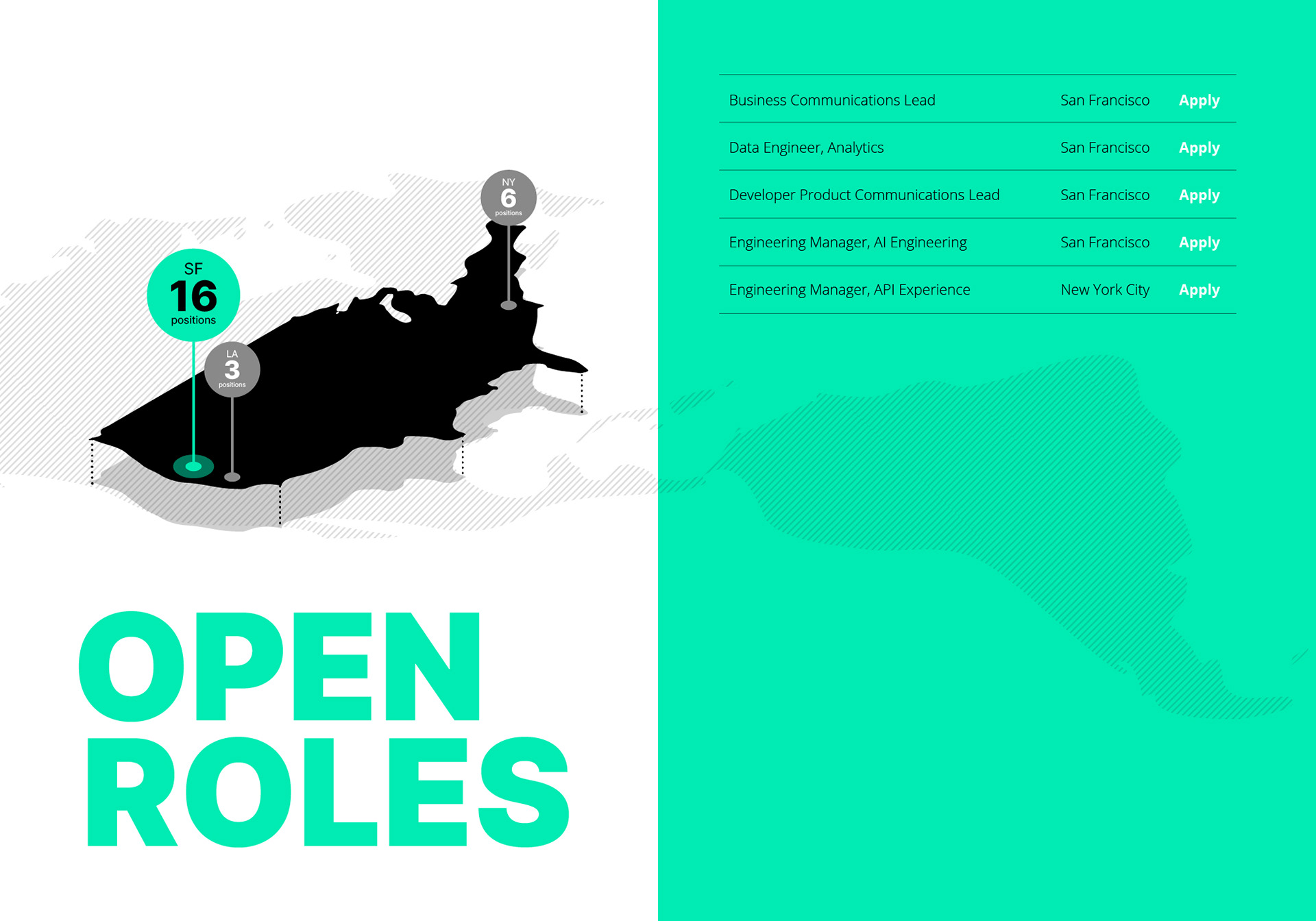
Systemic Cohesion: By utilising isometric reuse and parallel line shading, the brand now has a scalable toolkit that works across everything from dense whitepapers and animation to high-level pitch decks.