CHALLENGE
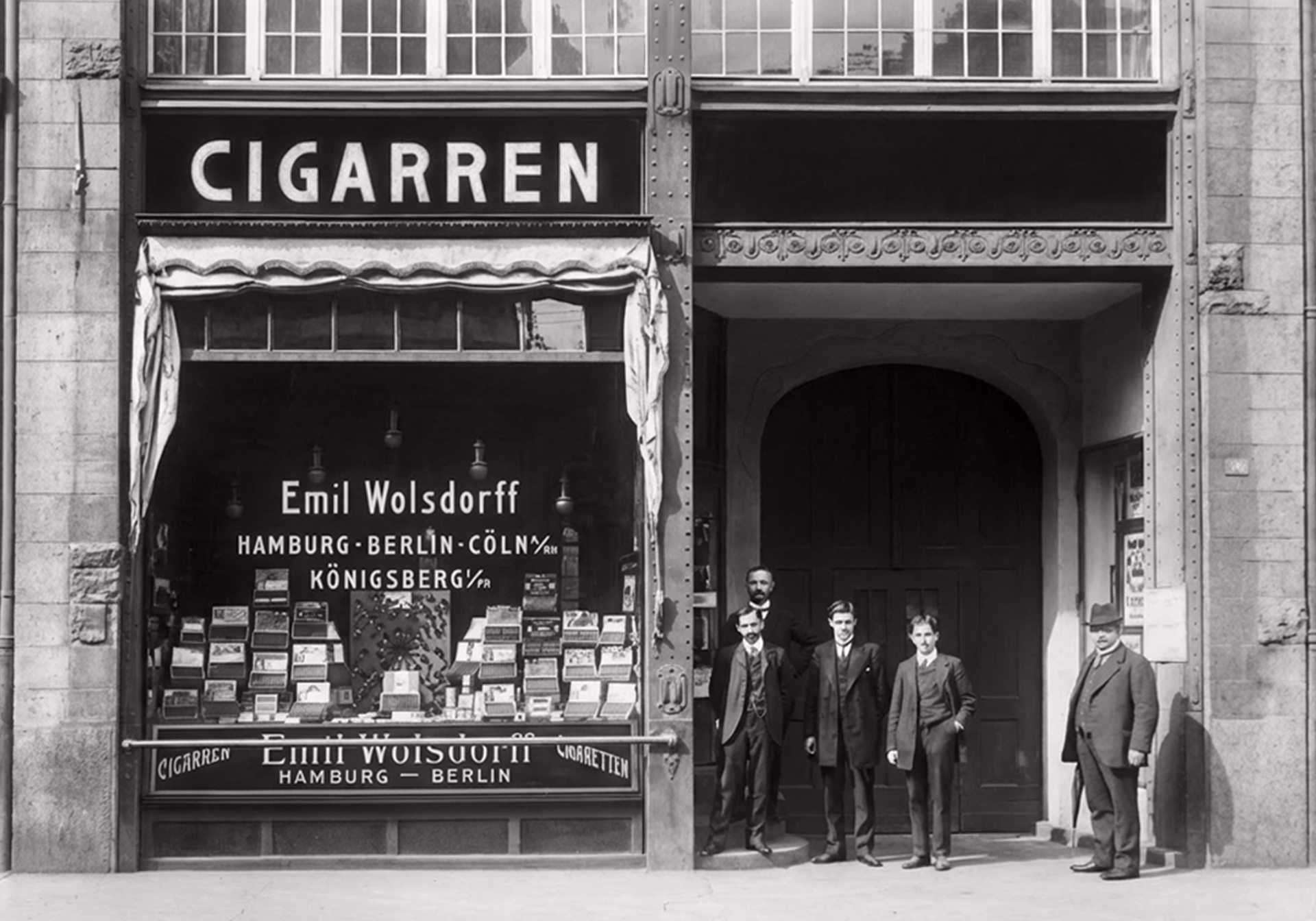
Wolsdorff, a staple of German tobacconist history since the early 20th century, required a flagship house brand for an exclusive range of pipe tobacco. The objective was to celebrate the brand's 1907 origins in Hamburg through a system that felt authentically historical yet structurally modern. They needed a visual thread that could unify five distinct tobacco blends without defaulting to superficial vintage tropes.
APPROACH
The strategy was rooted in archival research. Bypassing generic "retro" aesthetics in favour of a deep dive into Wolsdorff’s early shop photography, tobacco tins, and cigar boxes.
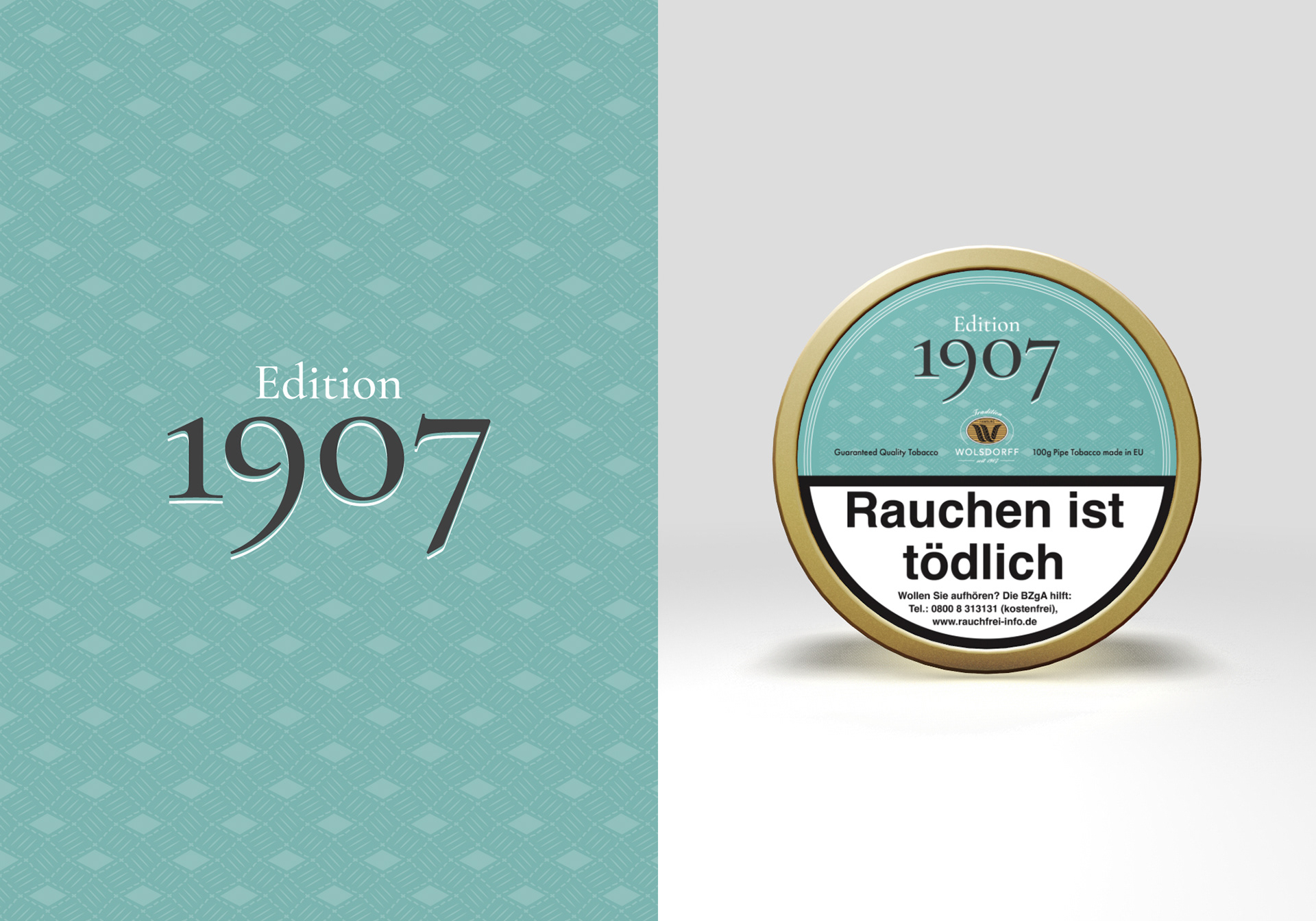
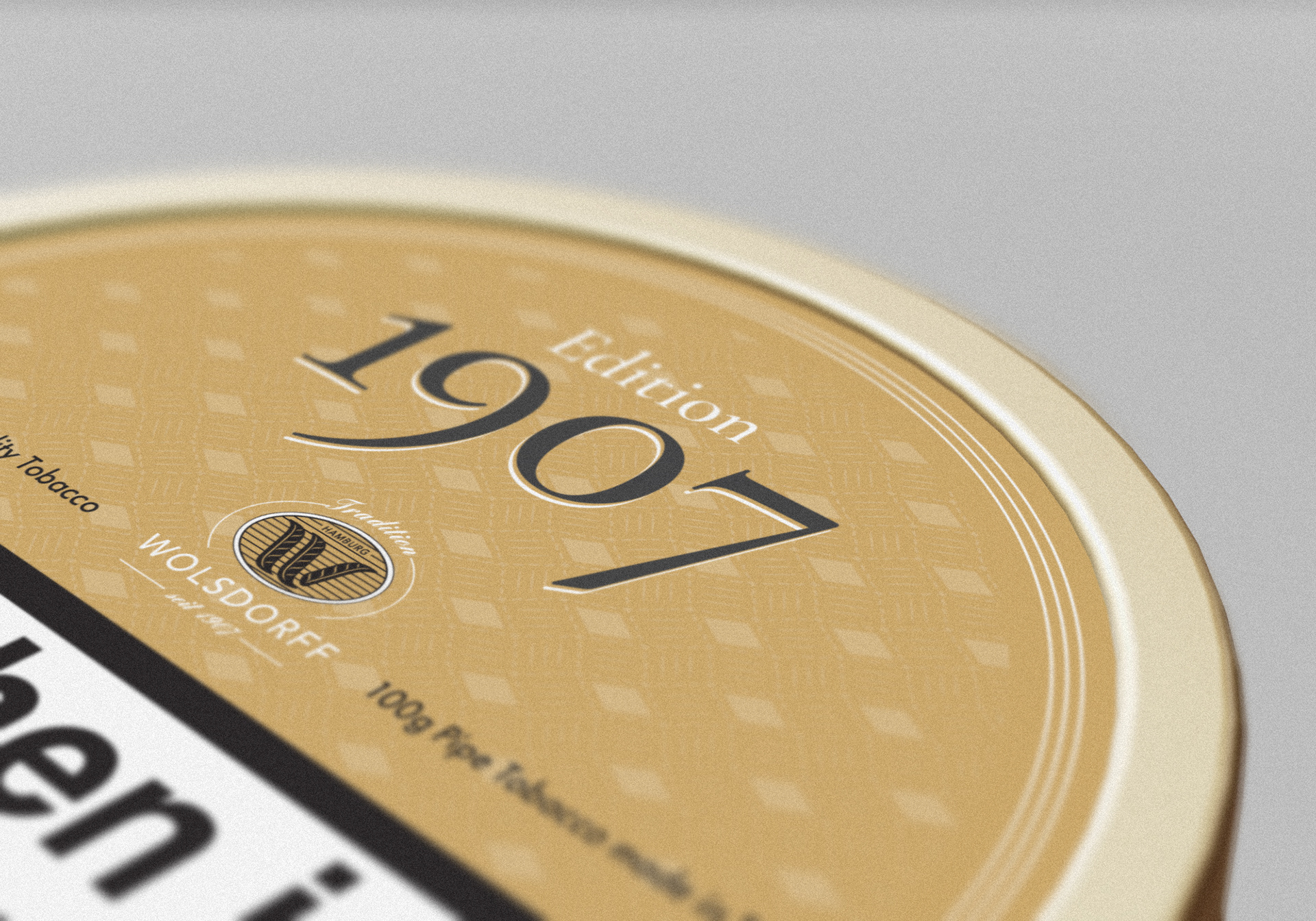
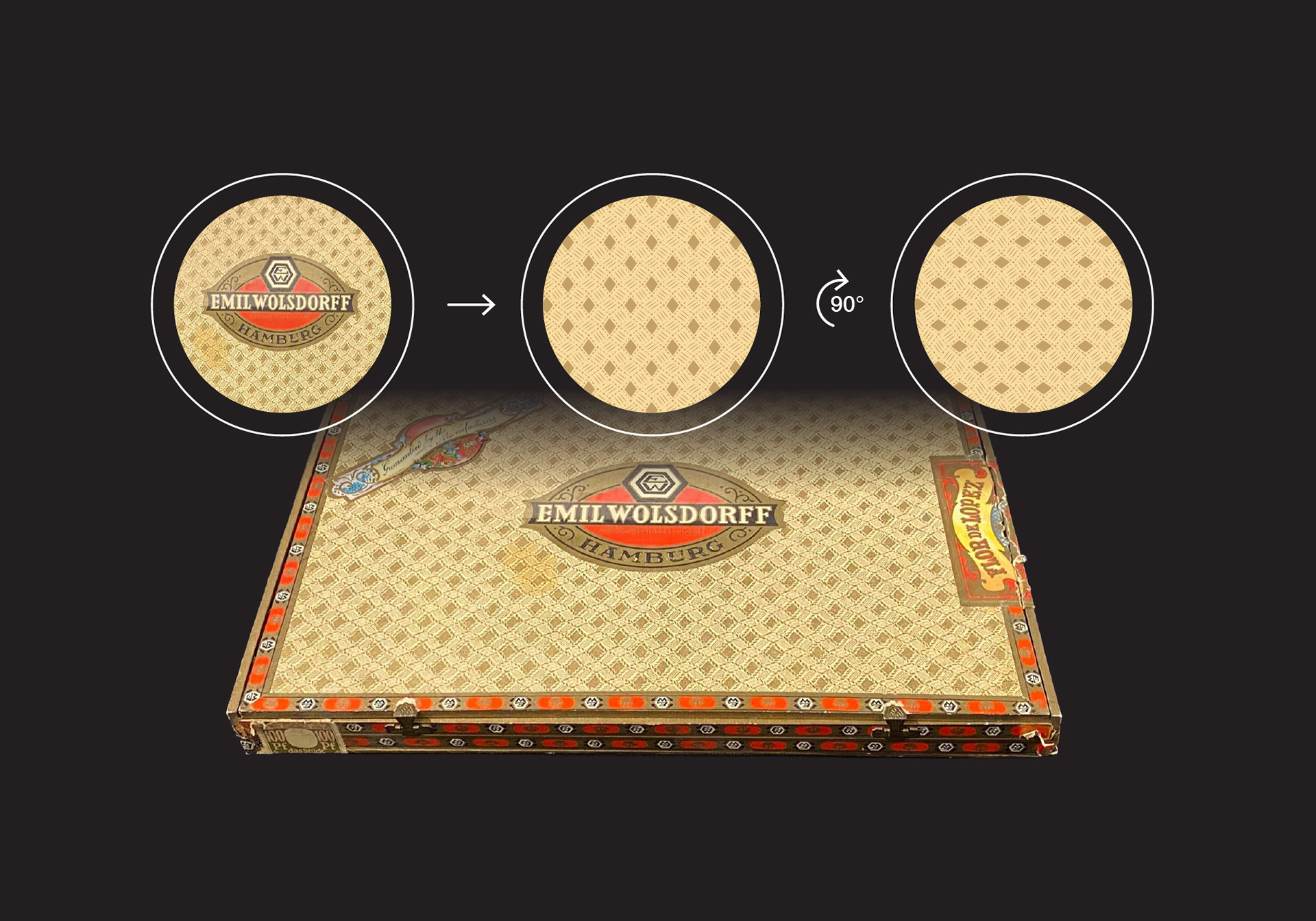
The breakthrough came from a degraded pattern found on an original cigar box. I digitally reinterpreted this motif, applying a 90-degree rotation to better suit the circular geometry of the new tobacco tins. This mechanical adjustment transformed a flat, historical asset into a dynamic, repeating texture that anchors the entire product range.
RESULTS
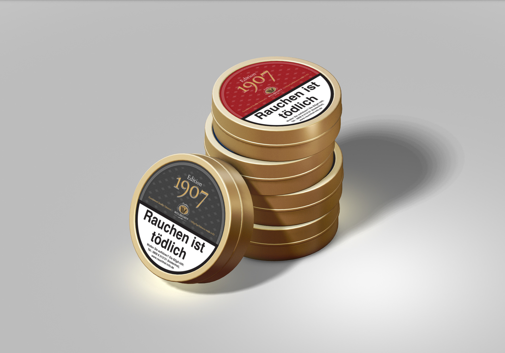
The result is a cohesive product quartet that positions the private label as a premium, thoughtful choice within the tobacconist’s portfolio.
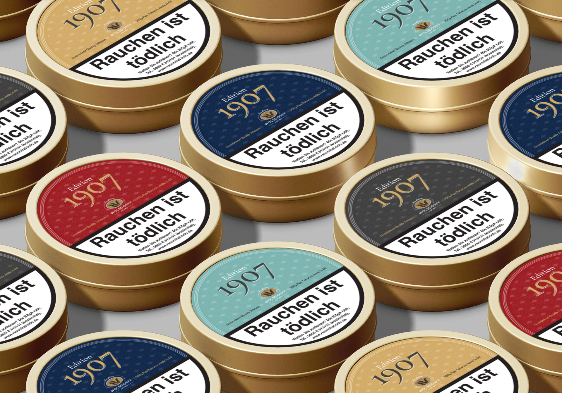
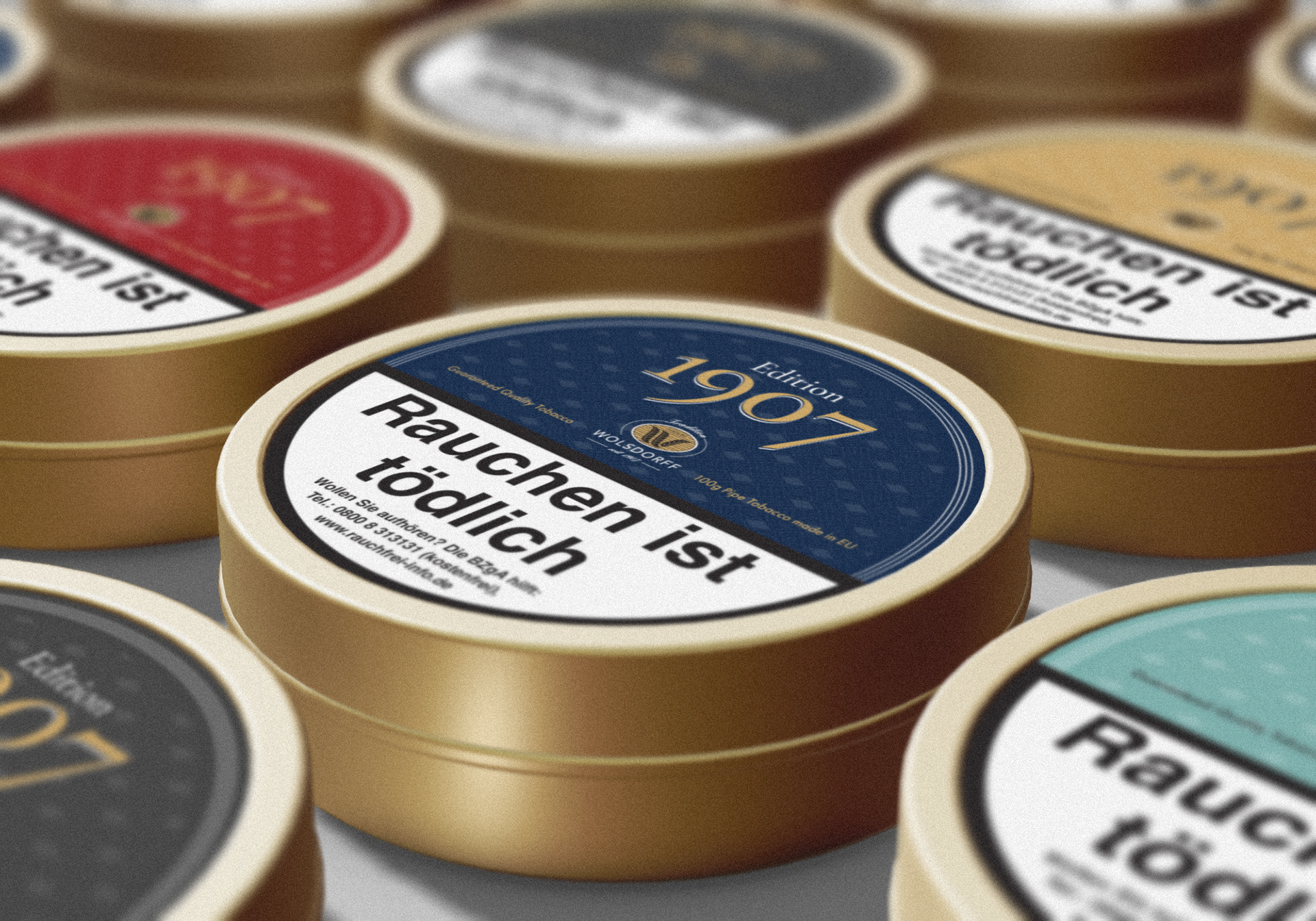
Systemic Cohesion: Five SKUs unified by a shared historical DNA, with color-coded navigation sourced directly from Wolsdorff’s earliest product palettes.
Geometric Precision: An updated version of a heritage pattern adapted for round label architecture, bridging the gap between past craftsmanship and current production standards.
Narrative Continuity: The "Edition 1907" identity successfully positions the house brand as a premium tribute to the company's founding year in Hamburg.
PATTERN ORIGIN
The foundation of the identity is a salvaged geometric motif discovered during a research phase into early 1900s Wolsdorff artifacts. Despite the original source material – a vintage cigar box – being in significant disrepair, the underlying mathematical rhythm was clear. I performed a full digital reconstruction of the pattern, rotating it 90 degrees to ensure the flow remained elegant and readable across the high-curvature surface of the round tin labels.
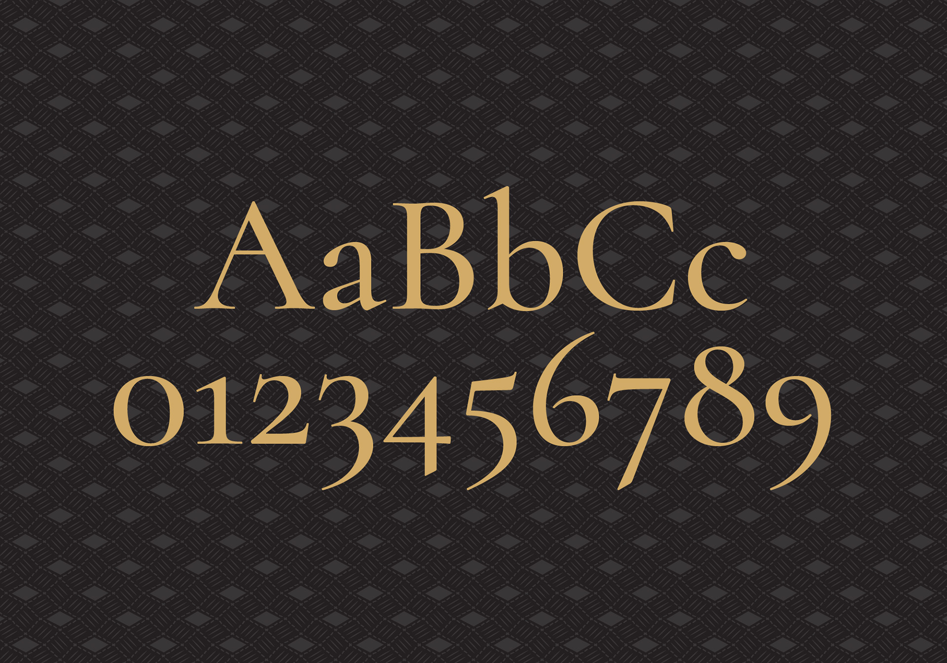
TYPE CHOICE
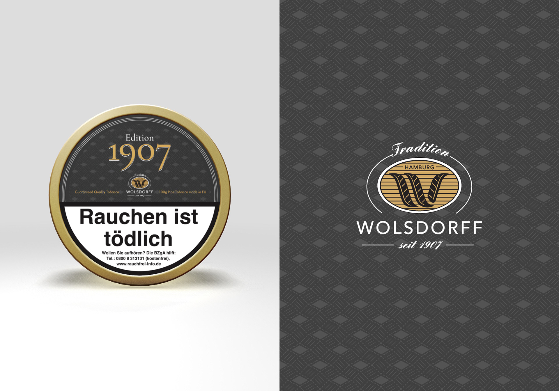
Numeric Rhythm: To anchor the "1907" brand name, we selected Cormorant, a display serif by Swiss designer Christian Thalmann. The choice was driven by the typeface's extravagant, high-contrast numeric characters. The 7 and 9, in particular, create a sophisticated visual cadence that elevates the founding year into a graphic mark, reinforcing the prestige of the Wolsdorff legacy.
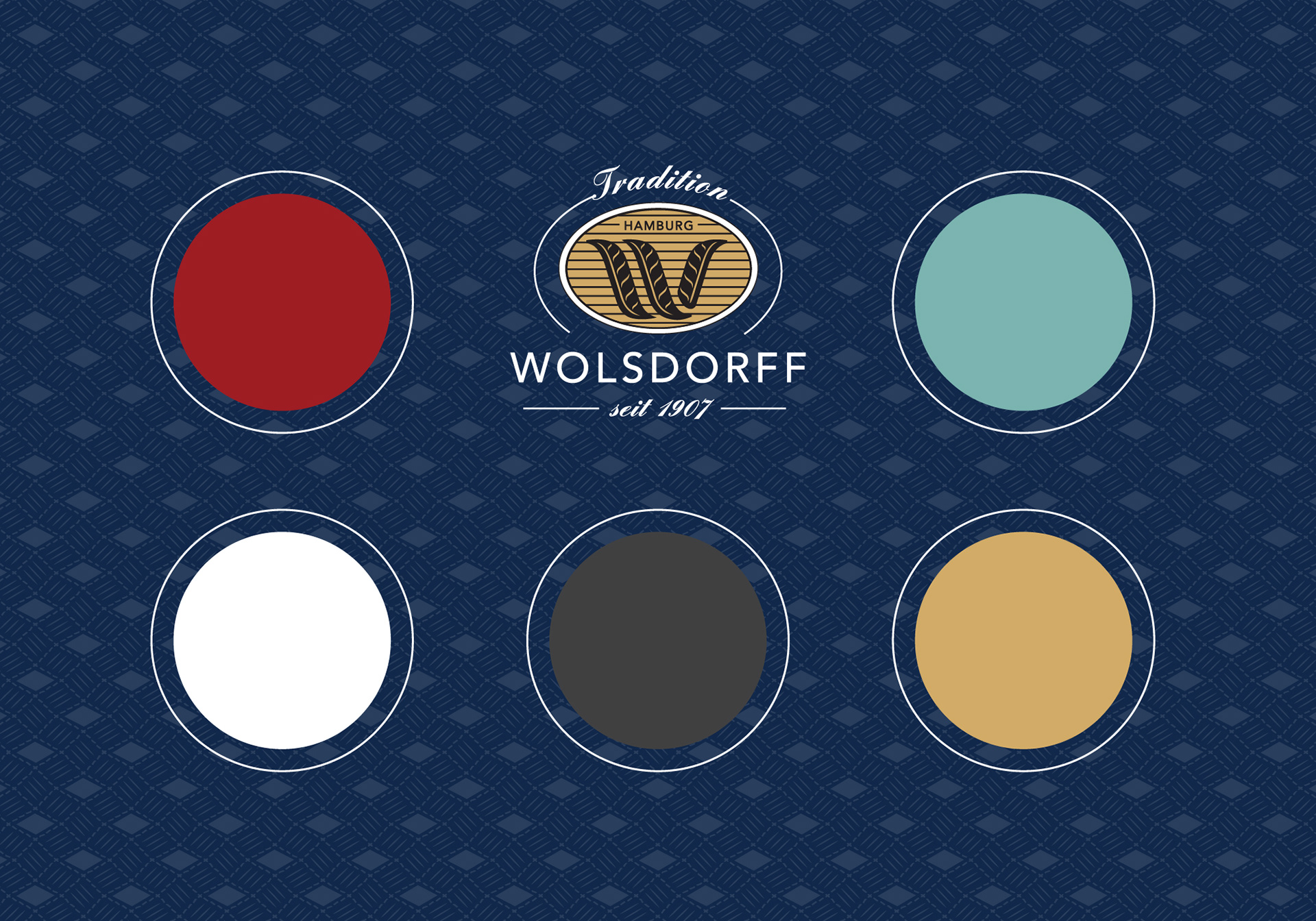
COLOUR ORIGIN
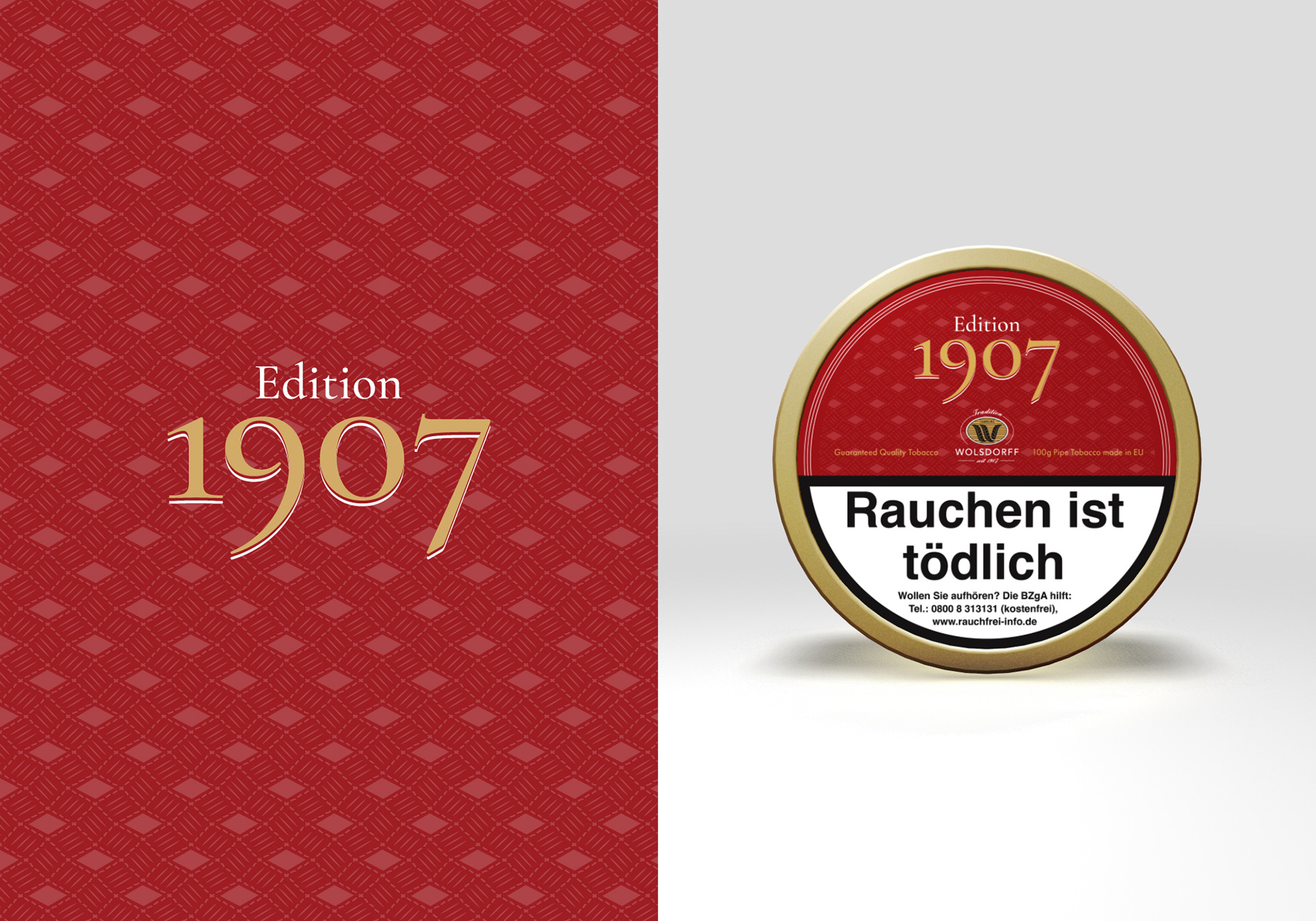
The palette for the five tobacco blends was not chosen through trend analysis, but through historical continuity. Each of the five colors – spanning from deep reds and golds to muted teals – was extracted from original Wolsdorff packaging and archival materials.
By repurposing these heritage tones, we ensured that the new product range felt instinctively familiar to long-term patrons while commanding attention as a premium contemporary offering.