CHALLENGE
The client required a "house brand" for a prominent German tobacconist that could stand independently in a crowded, tradition-heavy market. The primary hurdle was twofold: creating a unique naming convention that avoided the countless existing trademarks in the industry, and speaking authentically to an older demographic of men who value the pace of nature, sailing, and the outdoors. The client needed a system that felt like a legacy brand but functioned with modern clarity.
APPROACH
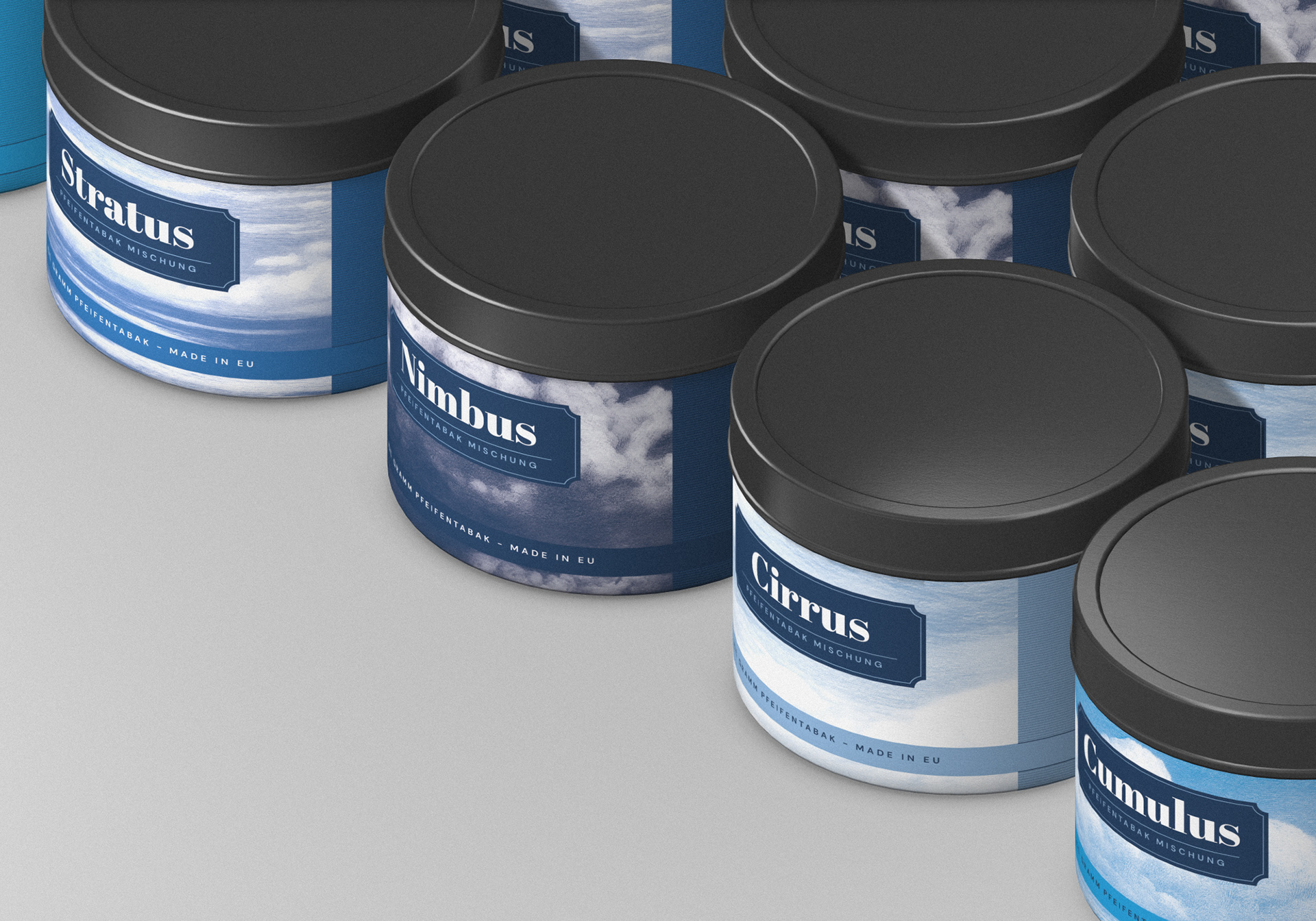
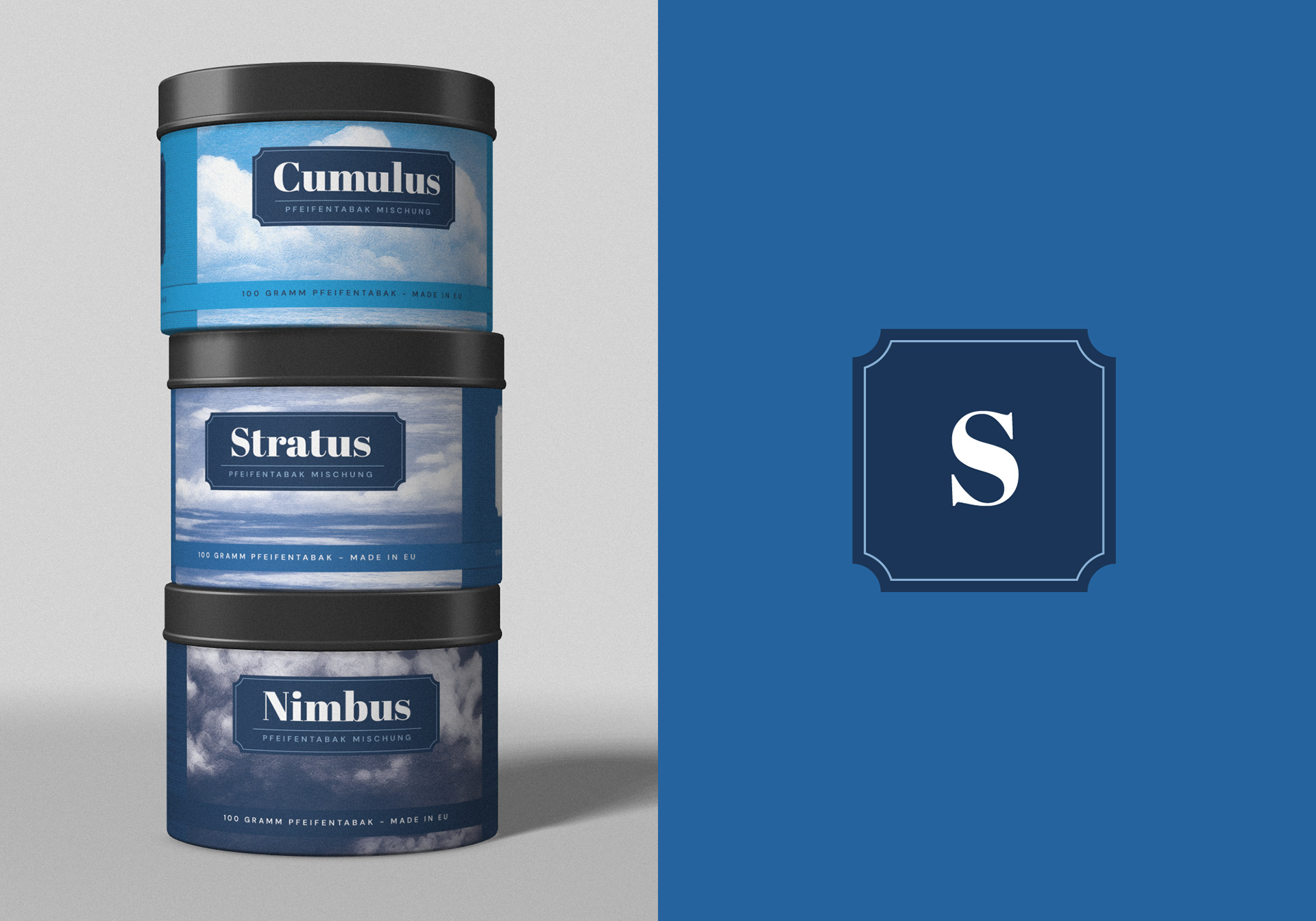
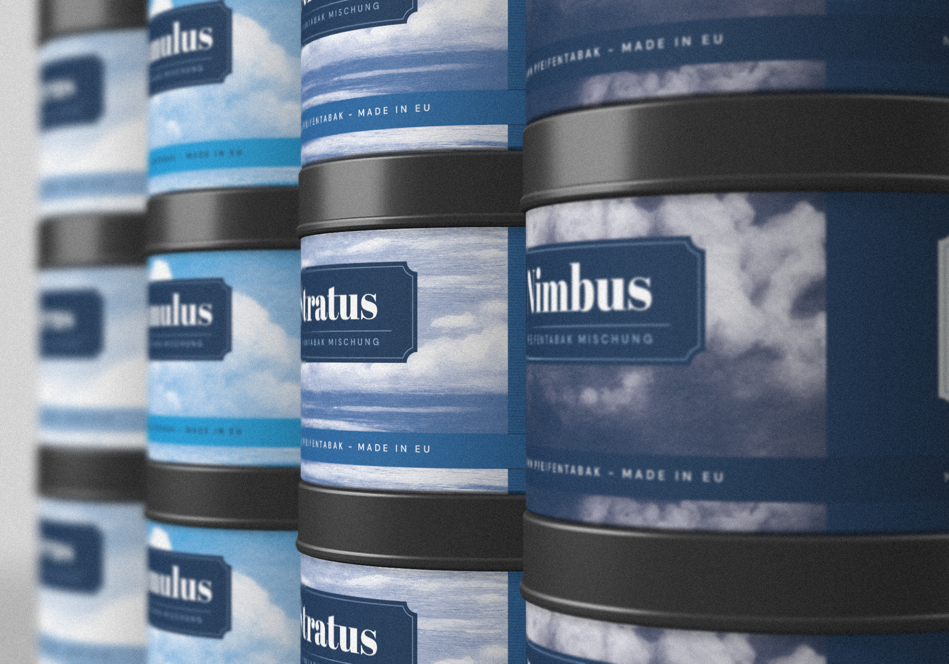
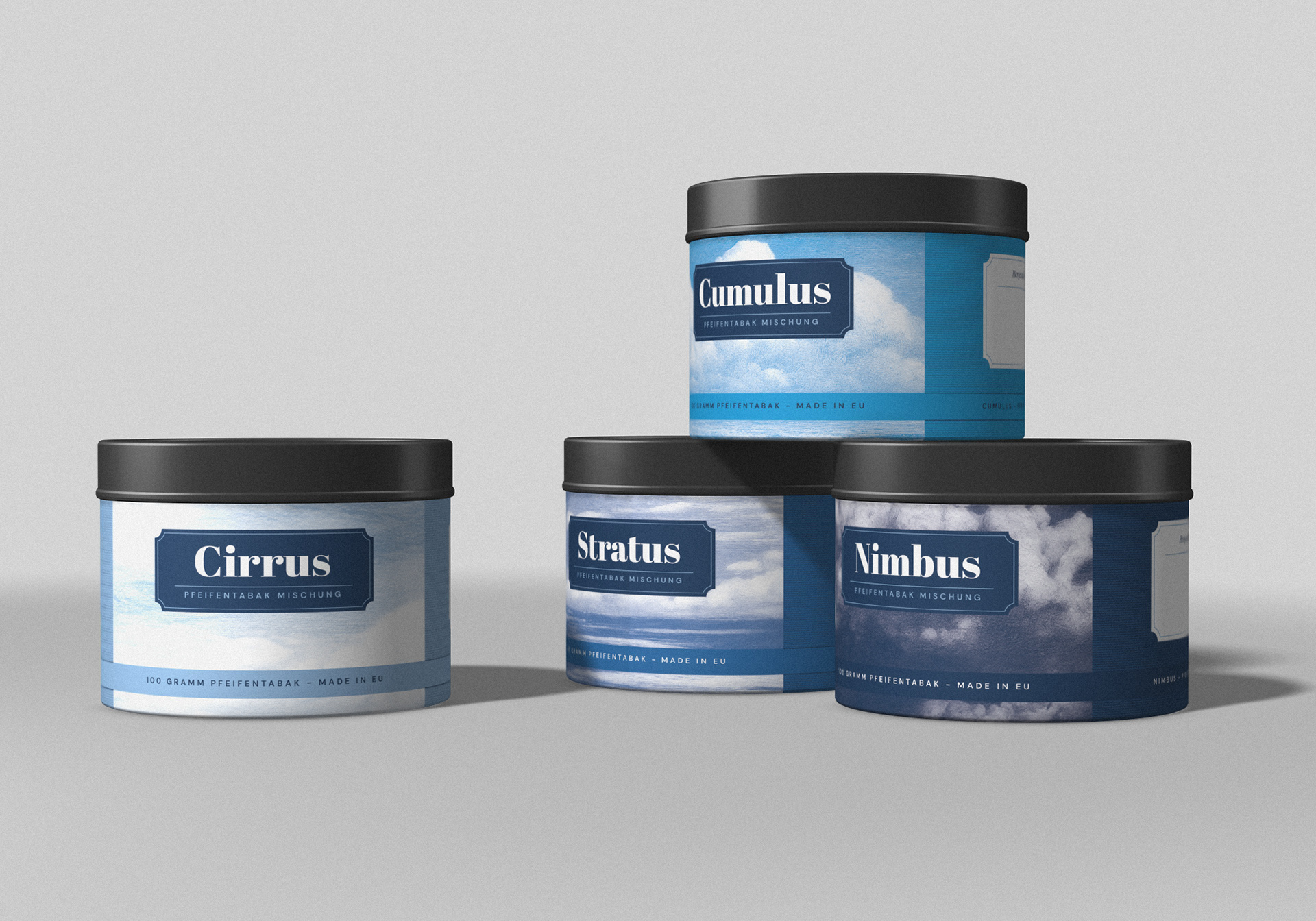
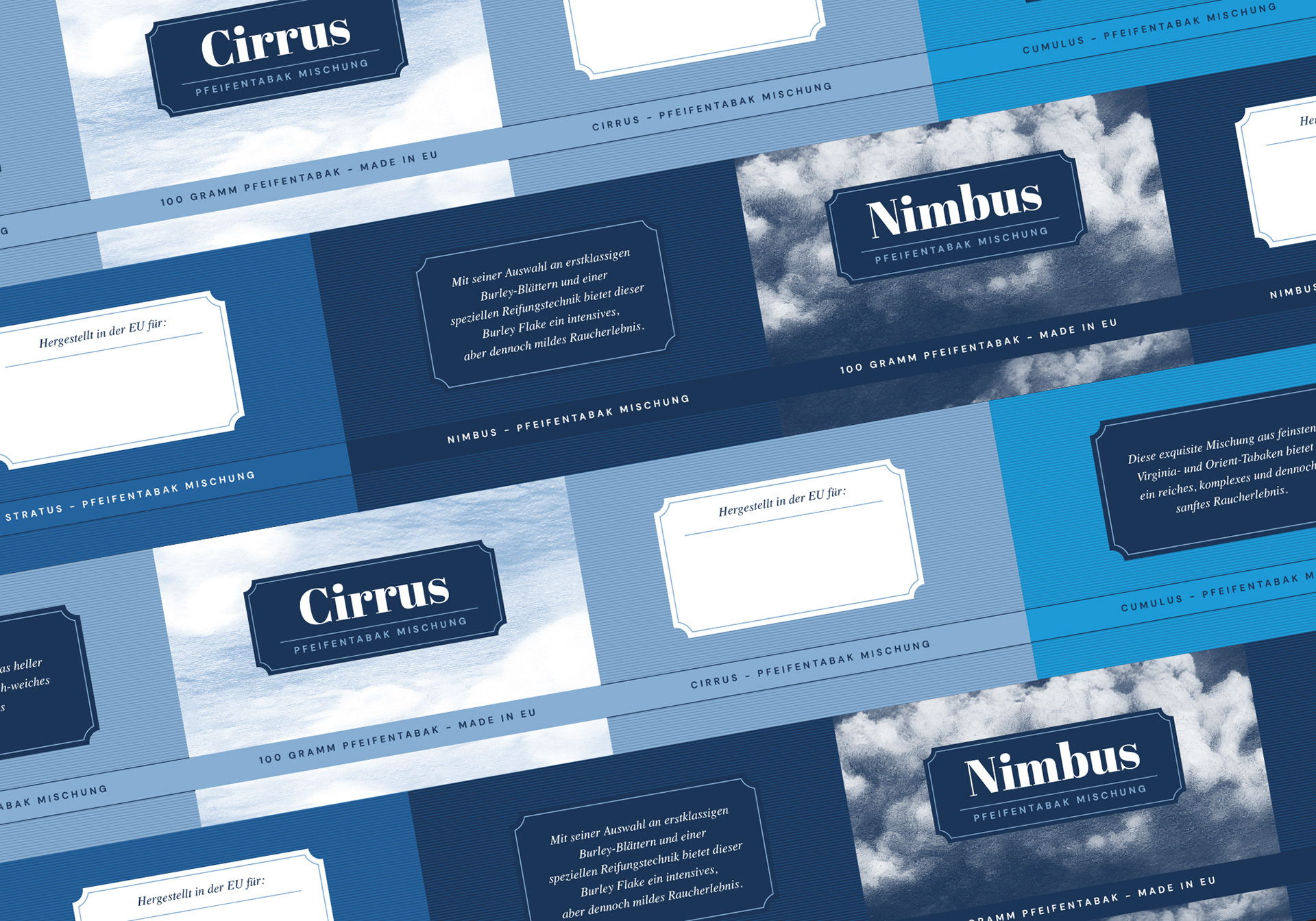
The strategy was developing a naming architecture based on Cloud Formations, creating a direct metaphor for the "clouds" of smoke produced by a pipe. This wasn't just poetic; it was functional.
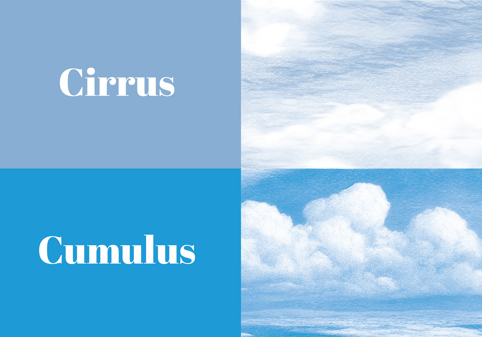
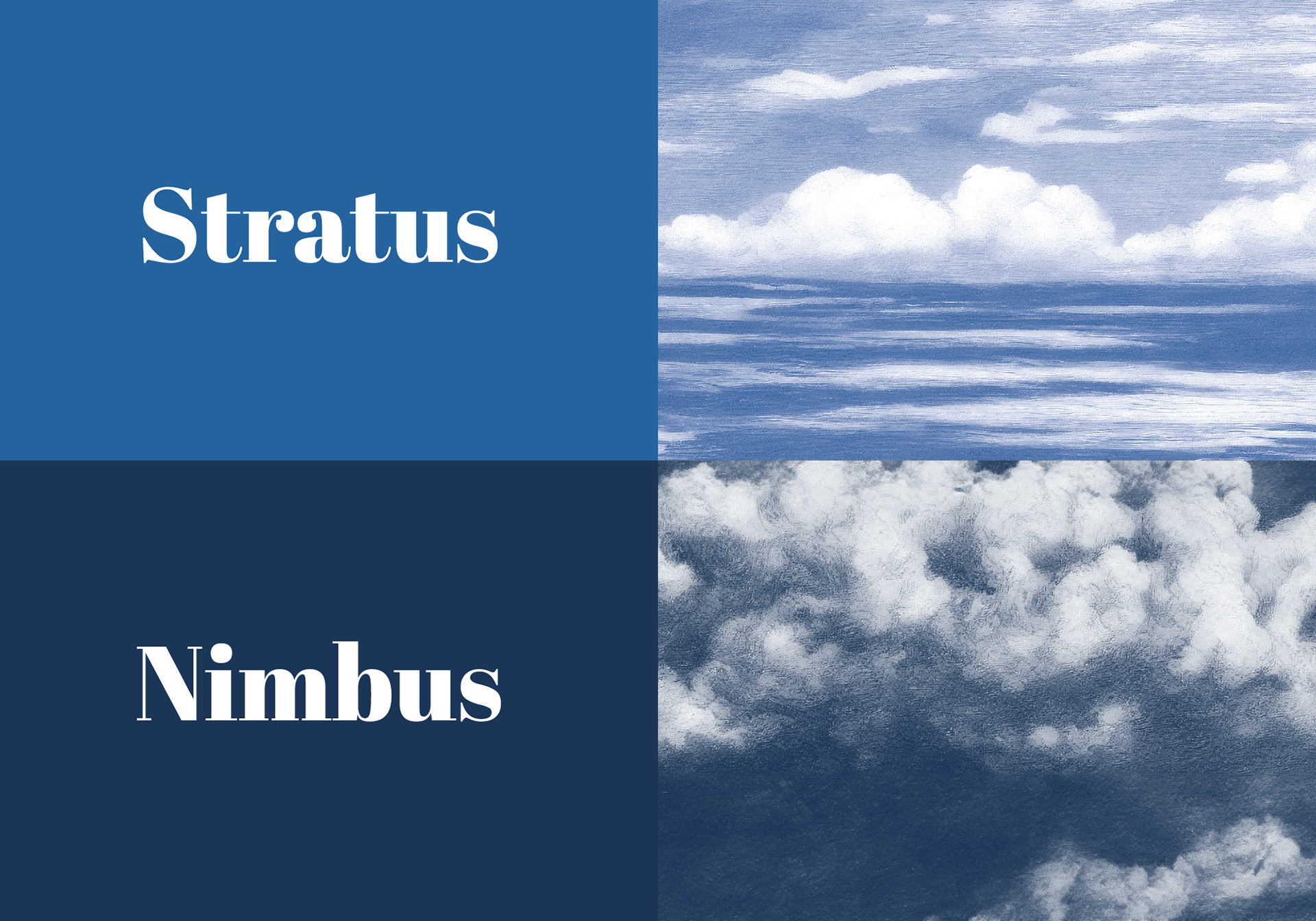
The Naming Hierarchy: I utilised cloud types to indicate tobacco strength, creating an immediate, intuitive scale for the consumer:
Cirrus: Mild / High-altitude lightness.
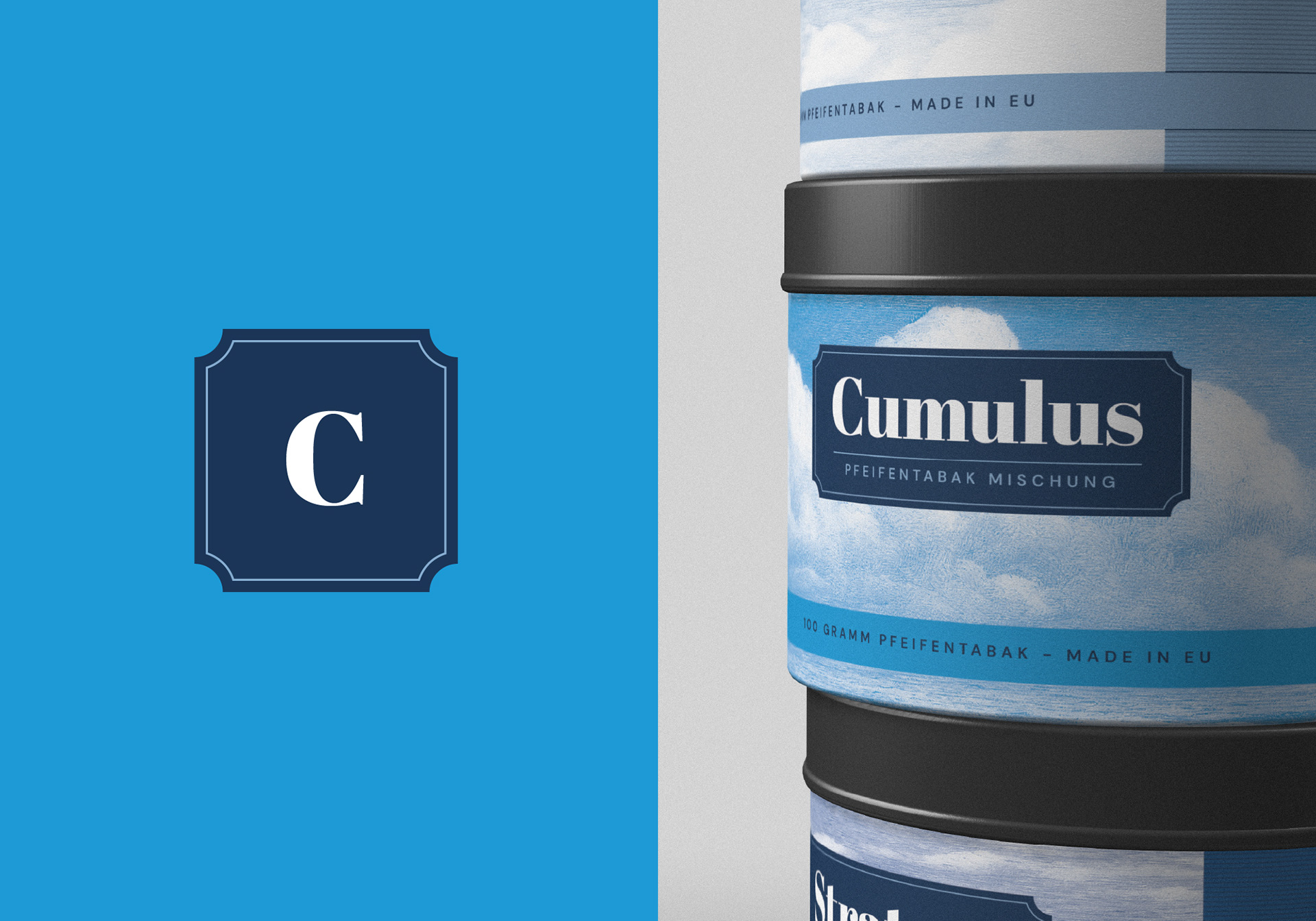
Cumulus: Medium / Balanced presence.
Stratus: Strong / Dense and grounded.
Nimbus: Extra Strong / The peak of intensity.
The Aesthetic of the Etching: To appeal to the "Sophisticated Outdoorsman," the cloud motifs were designed as duotone etching illustrations, nodding to the heritage of 19th-century scientific journals and maritime charts.
Chromatic Navigation: The design utilises four shades of blue; transitioning from a crisp, airy light blue (Cirrus) to a deep, atmospheric midnight (Nimbus). This allows for instant product recognition on a shelf without the need for intrusive text.
RESULTS
The result is a cohesive product quartet that positions the private label as a premium, thoughtful choice within the tobacconist’s portfolio.
Semantic Originality: By claiming the "Atmospheric" territory, the brand successfully bypassed cluttered industry naming conventions with a system that is legally unique and conceptually rich.
Tactile Credibility: The etching-style visuals and serif typography bridge the gap between traditional craft and contemporary design, resonating with a demographic that appreciates "the slow burn."
Functional Clarity: The color-to-strength mapping creates a seamless user experience, allowing customers to navigate the intensity of the blend through visual instinct alone.