
CHALLENGE
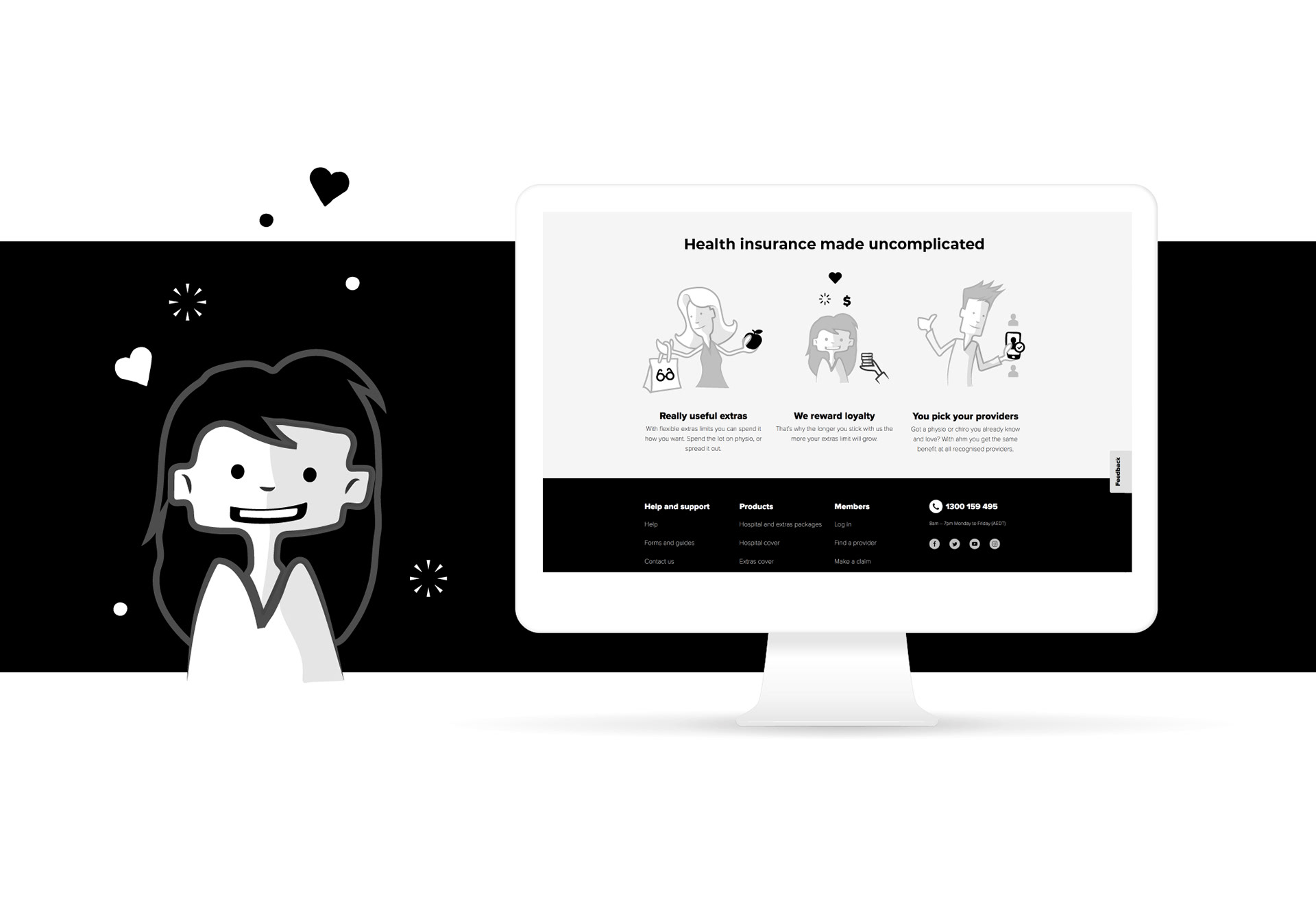
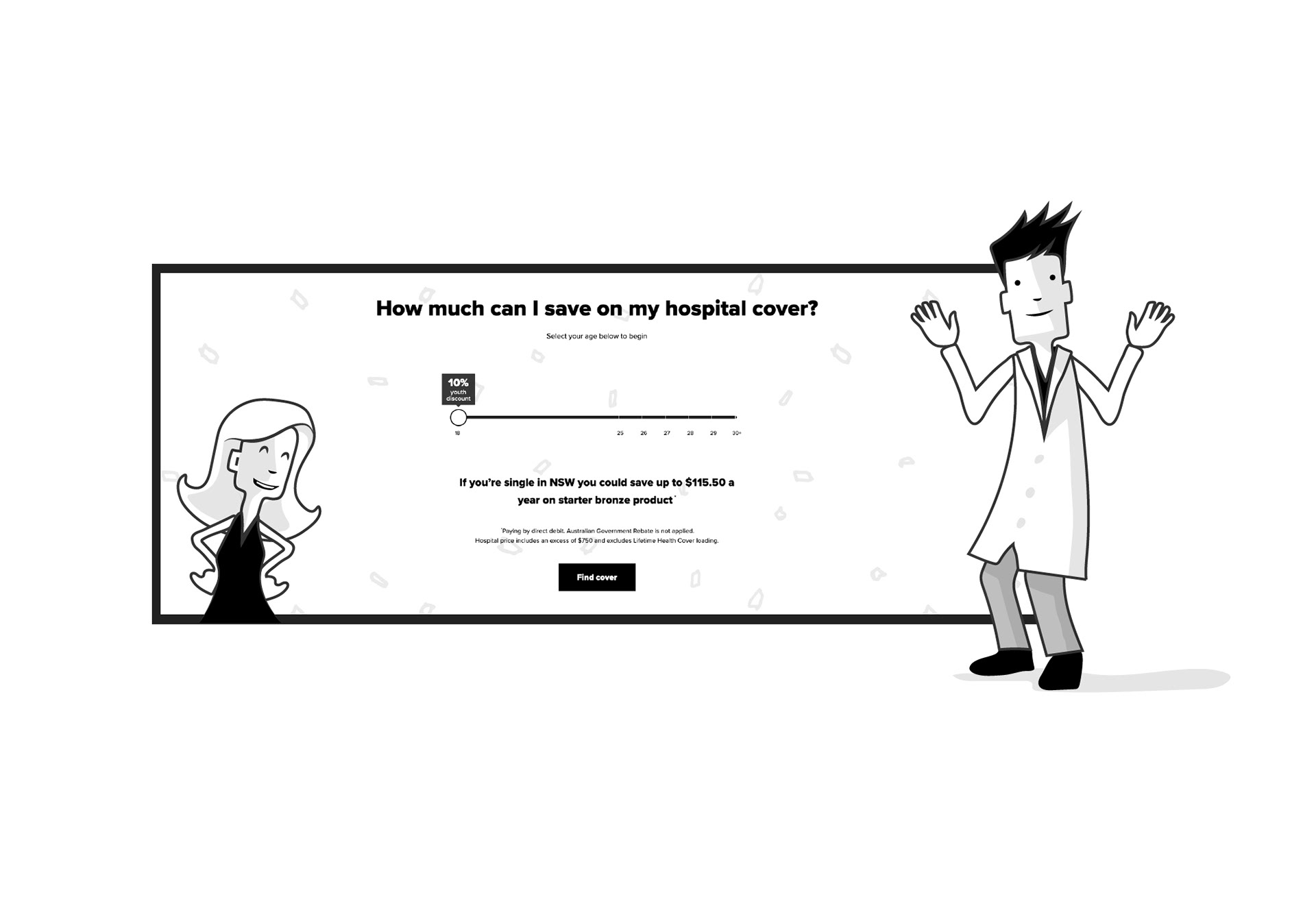
Humanising a Household Name: ahm Insurance is built on simplicity. But in a crowded market, "simple" can easily slide into "invisible." The challenge was to evolve ahm’s visual language to strengthen brand recall and emotional positioning. Collaborating with The Drawing Arm (TDA), I was tasked with exploring an illustration and character system that felt modern, approachable, and most importantly, tethered to the existing brand DNA.
APPROACH
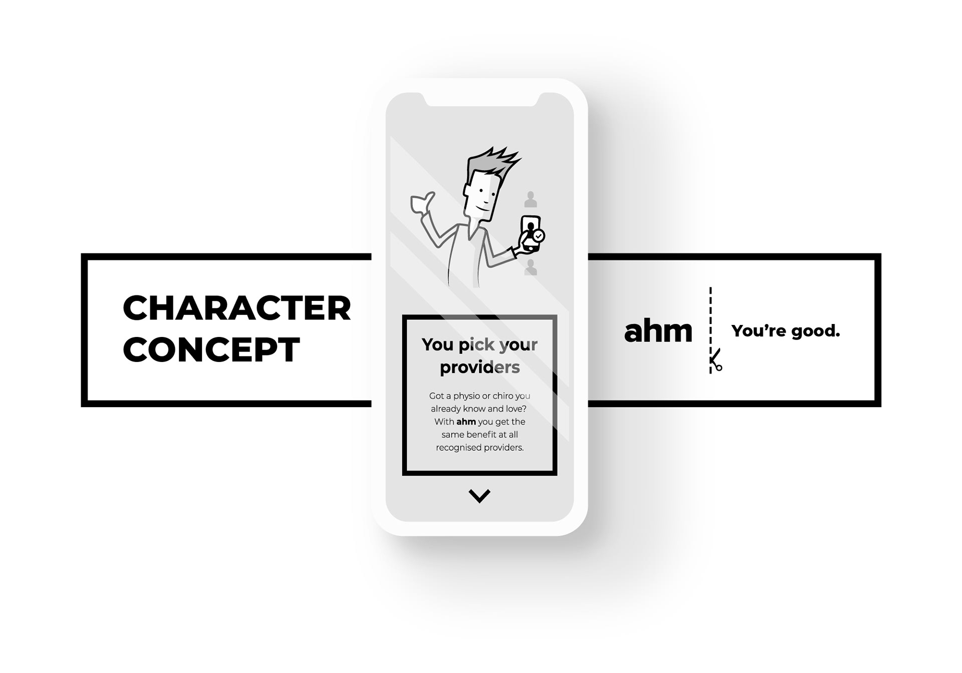
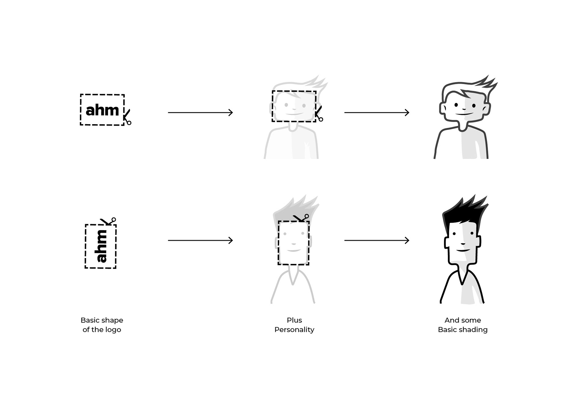
The Scissor Cut Logic: Inspiration came from an element within the existing brand. The defining feature of ahm’s identity is the "Scissor Cut" line; a sharp, rectangular graphic element. This rectangle was used as the foundational "primitive" for the character concepts. By basing the characters' anatomy on the specific proportions of the cut line, we created a subtle, subconscious link between the brand's graphic device and its new human face. The approach was Modular Minimalism: characters built from the same geometric building blocks as the UI, ensuring that every illustration felt like an extrusion of the logo itself.
RESULT
The Power of Informed Choice: While ahm ultimately pivoted toward a "rough and sketchy" illustrative direction, this exploration served as a critical strategic filter.
Validation through Iteration: By pushing the geometric system to its limit, we provided the data needed for ahm to make an informed, confident brand decision.
Future-Proofing: The exploration established the boundaries of the brand’s visual elasticity, ensuring the final chosen direction wasn't just a trend, but a calculated choice.
Strategic Clarity: This phase transformed an abstract "style search" into a definitive roadmap for ahm’s future positioning.