CHALLENGE
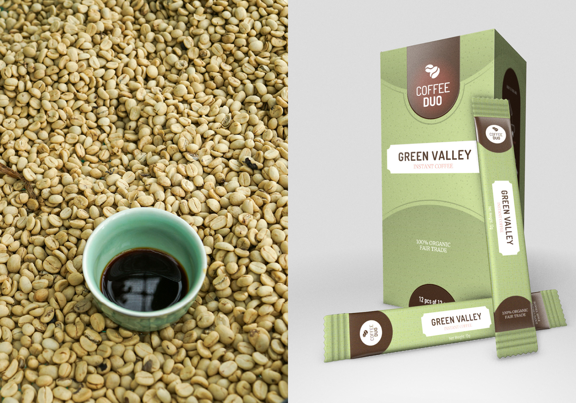
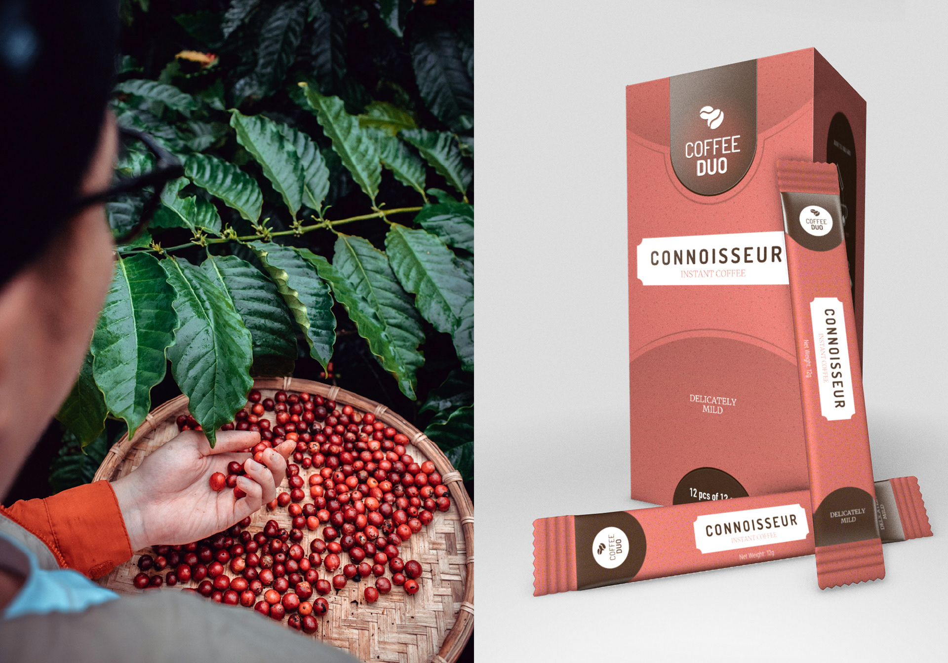
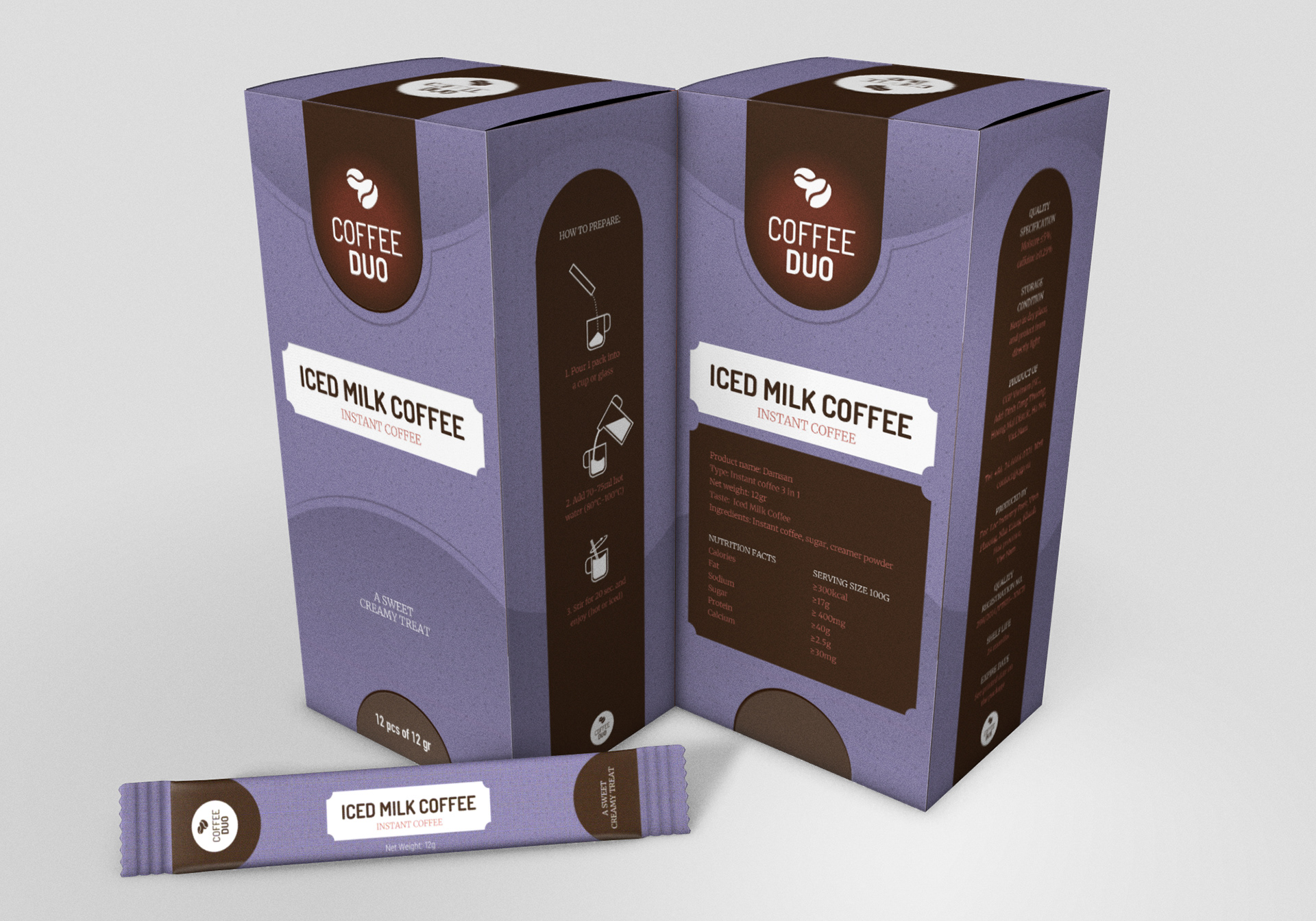
The instant coffee market is often defined by convenience over quality, frequently sacrificing brand depth for mass-market appeal. Coffee Duo approached me with a different vision: to position a Vietnamese instant coffee brand within the premium tier. The challenge was to create a visual identity and packaging suite for six distinct products that signalled high-end quality while remaining rooted in the brand’s unique origin – using 100% locally sourced Vietnamese beans.
APPROACH
The strategy was to bridge the gap between the "instant" nature of the product and the "slow" artisan process of coffee farming.
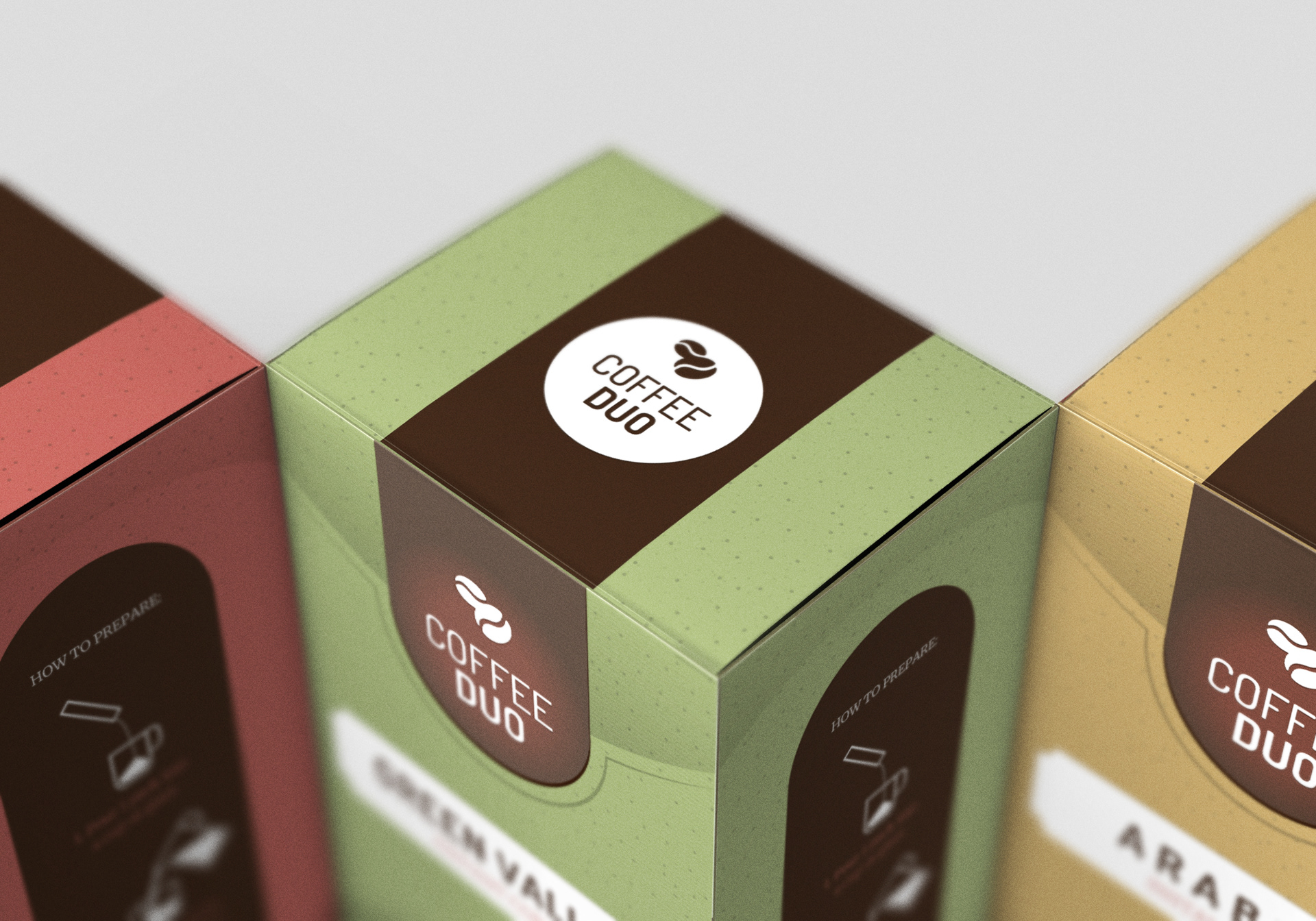
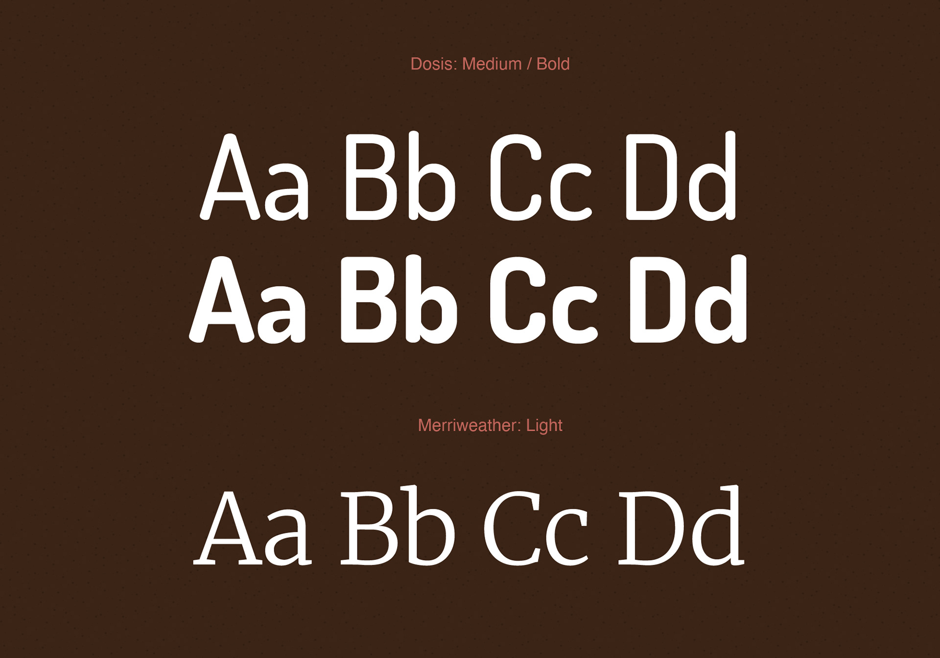
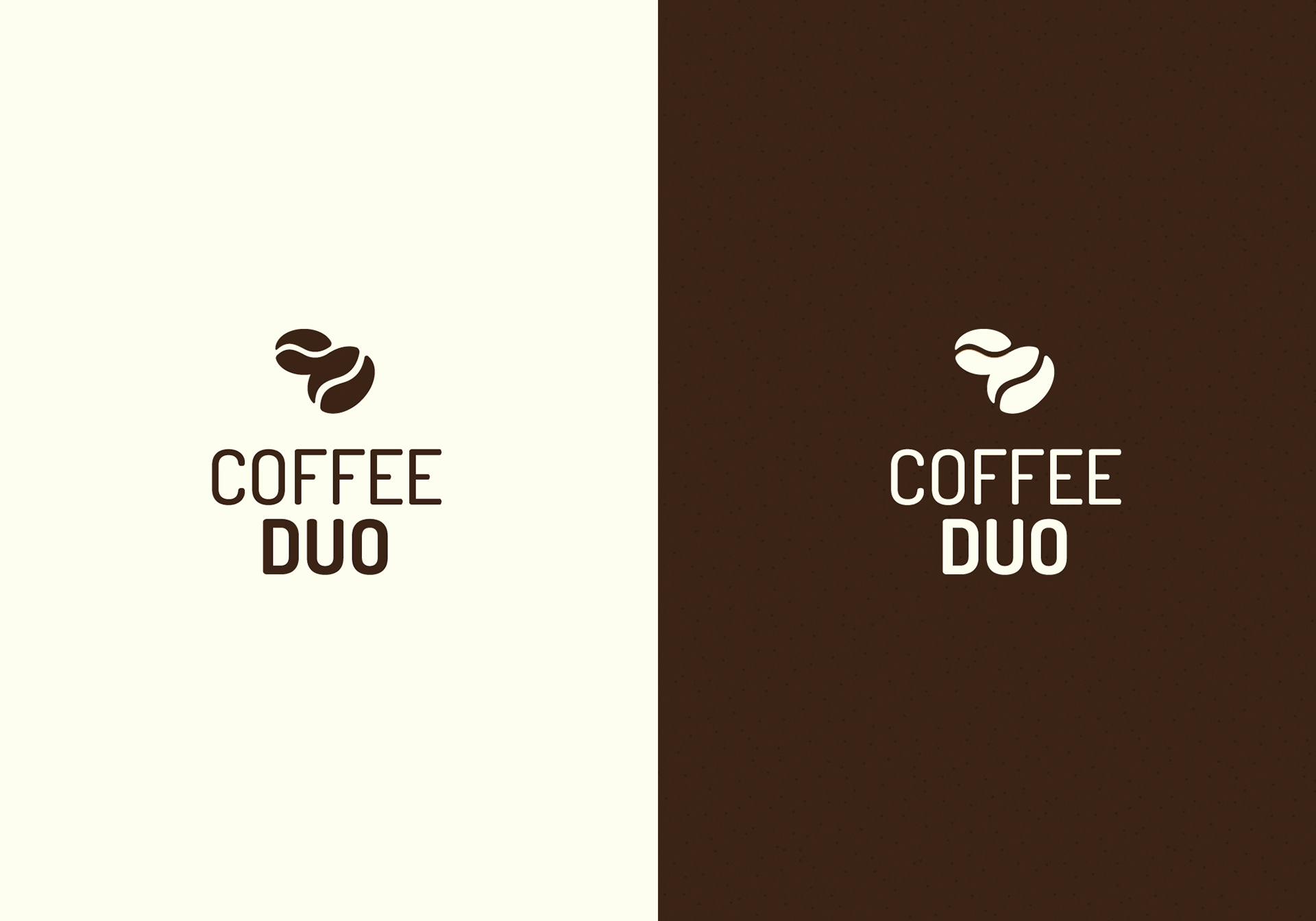
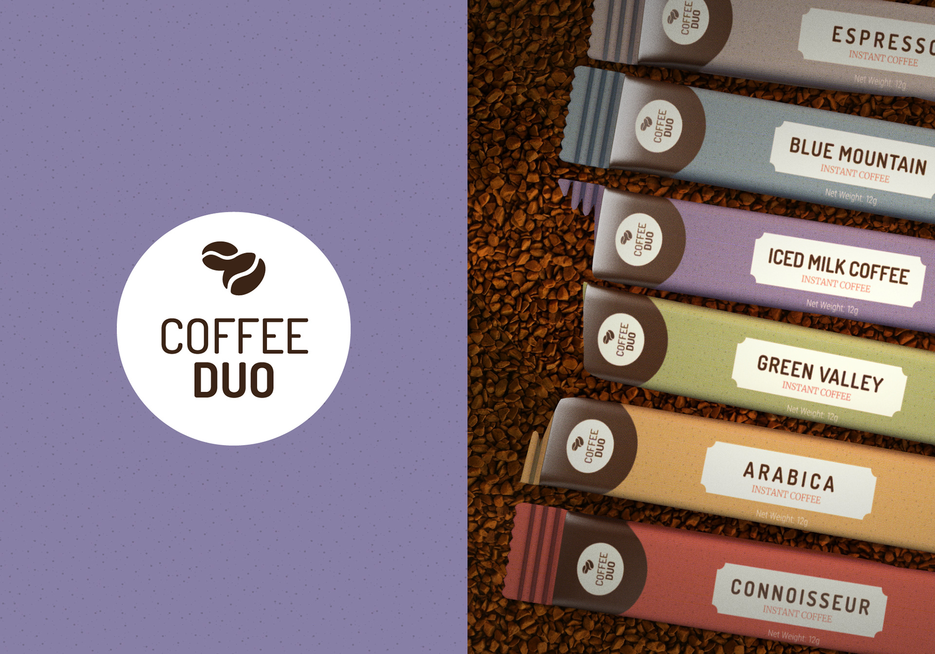
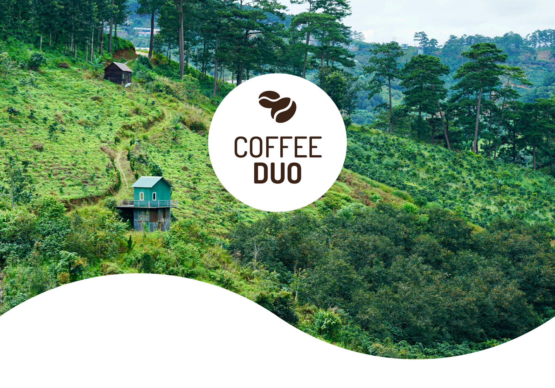
Identity & Symbols: I developed a minimalist logo mark consisting of two coffee beans. Placing one bean horizontally and a larger bean at a 45-degree angle, created a sense of movement and balance, while being a subtle hint at the rolling mountains, and curved pathways found on the clients primary plantation in Vietnam.
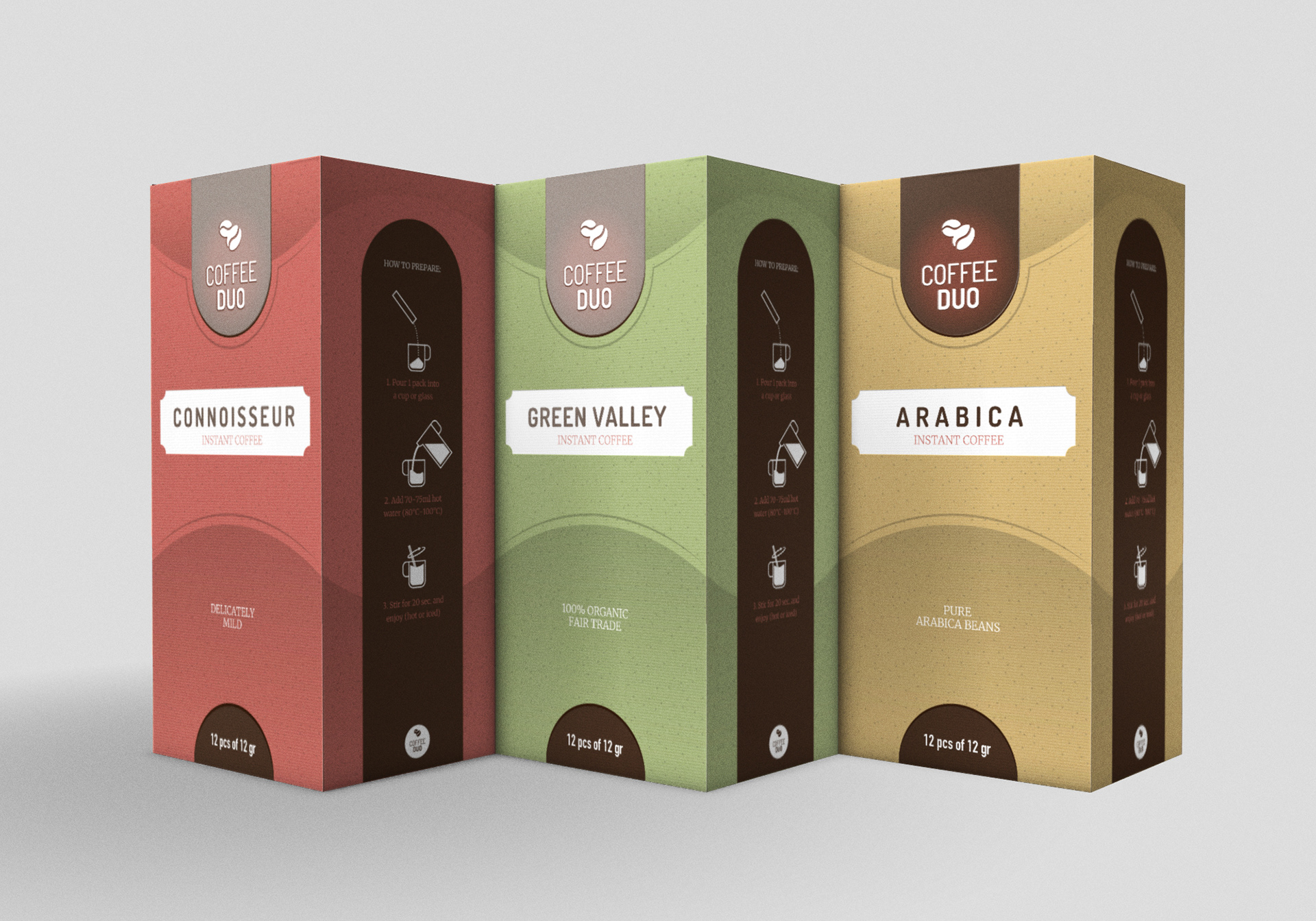
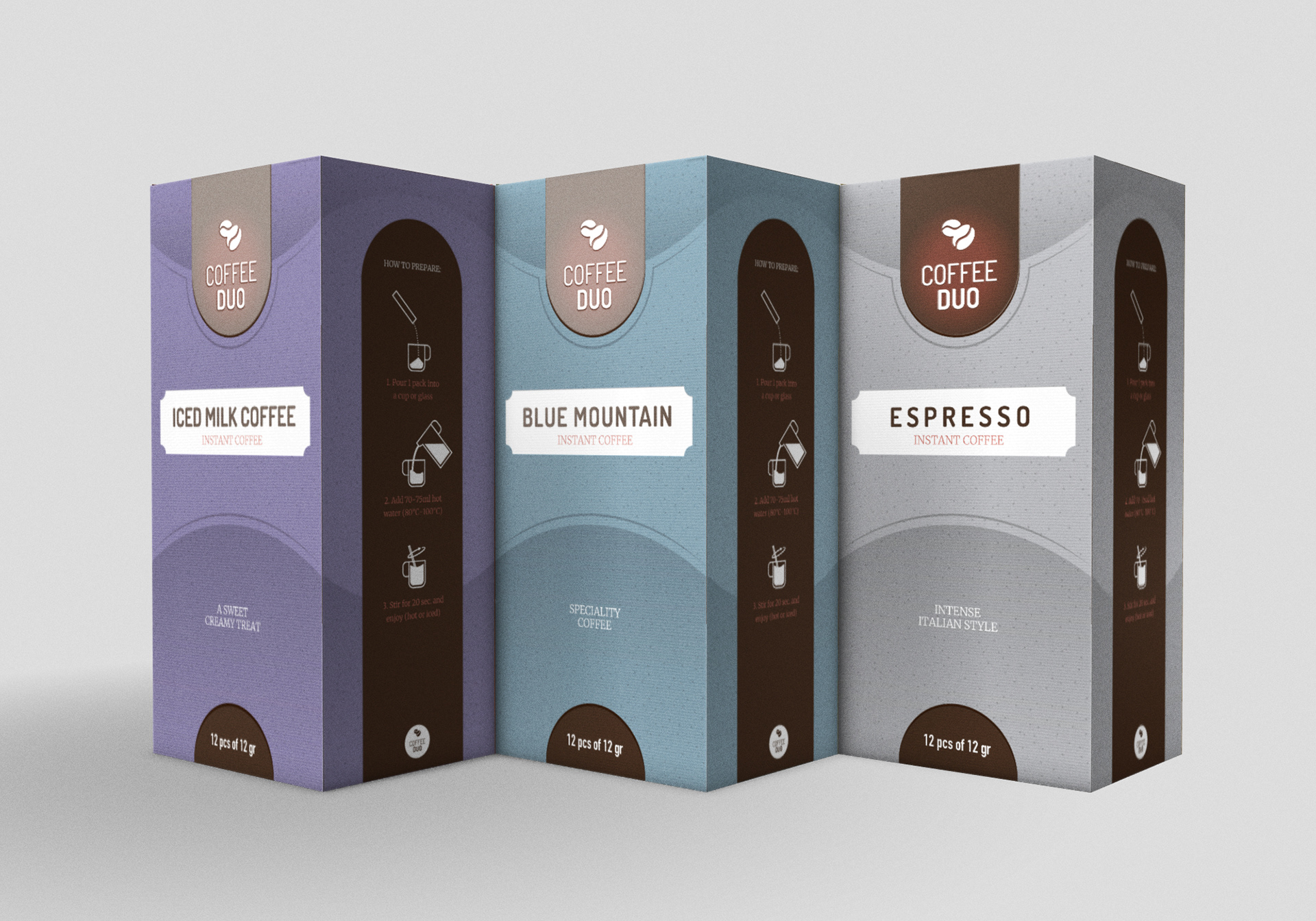
Landscape as Layout: The core design element of the packaging is a seamless, rolling wave that wraps around each box. This element ties back to the logo mark, and the wavy nature of the landscape from which the coffee beans originate from. Creating a subtle and elegant link to the "roots" of the product.
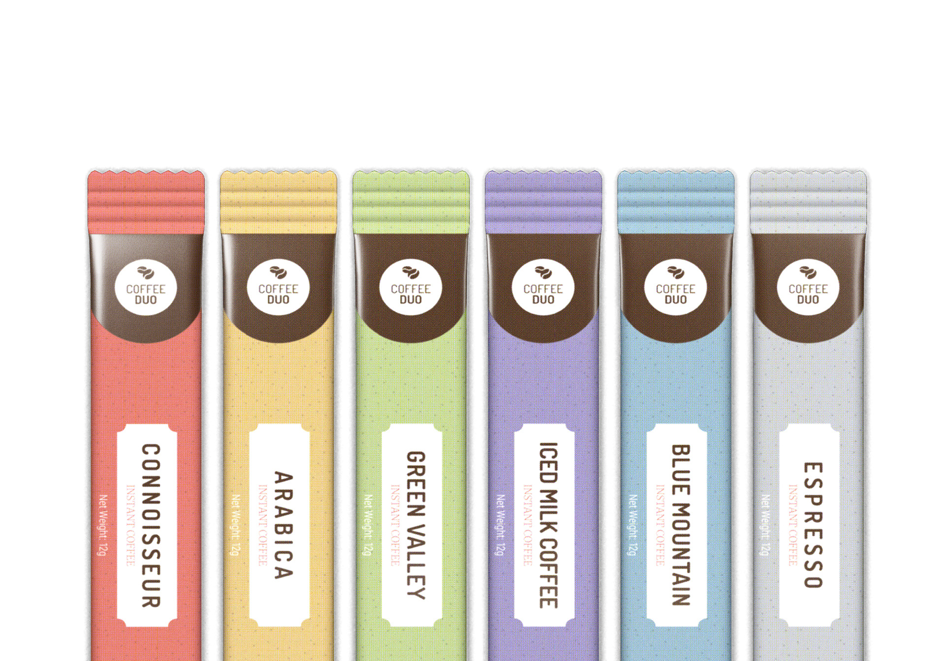
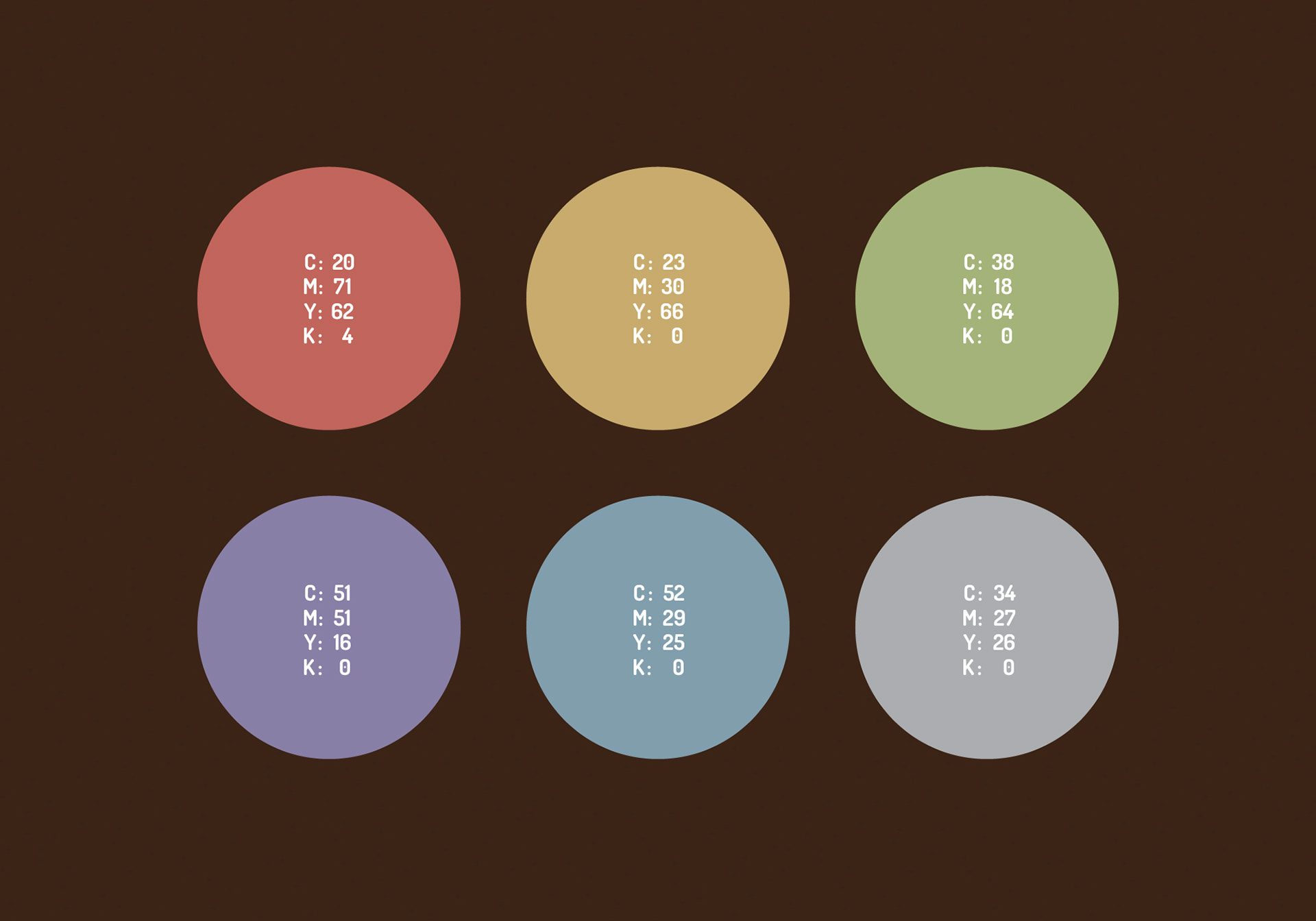
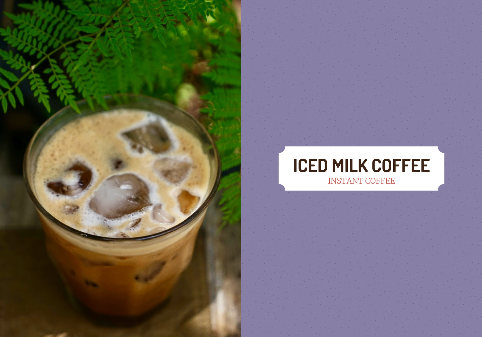
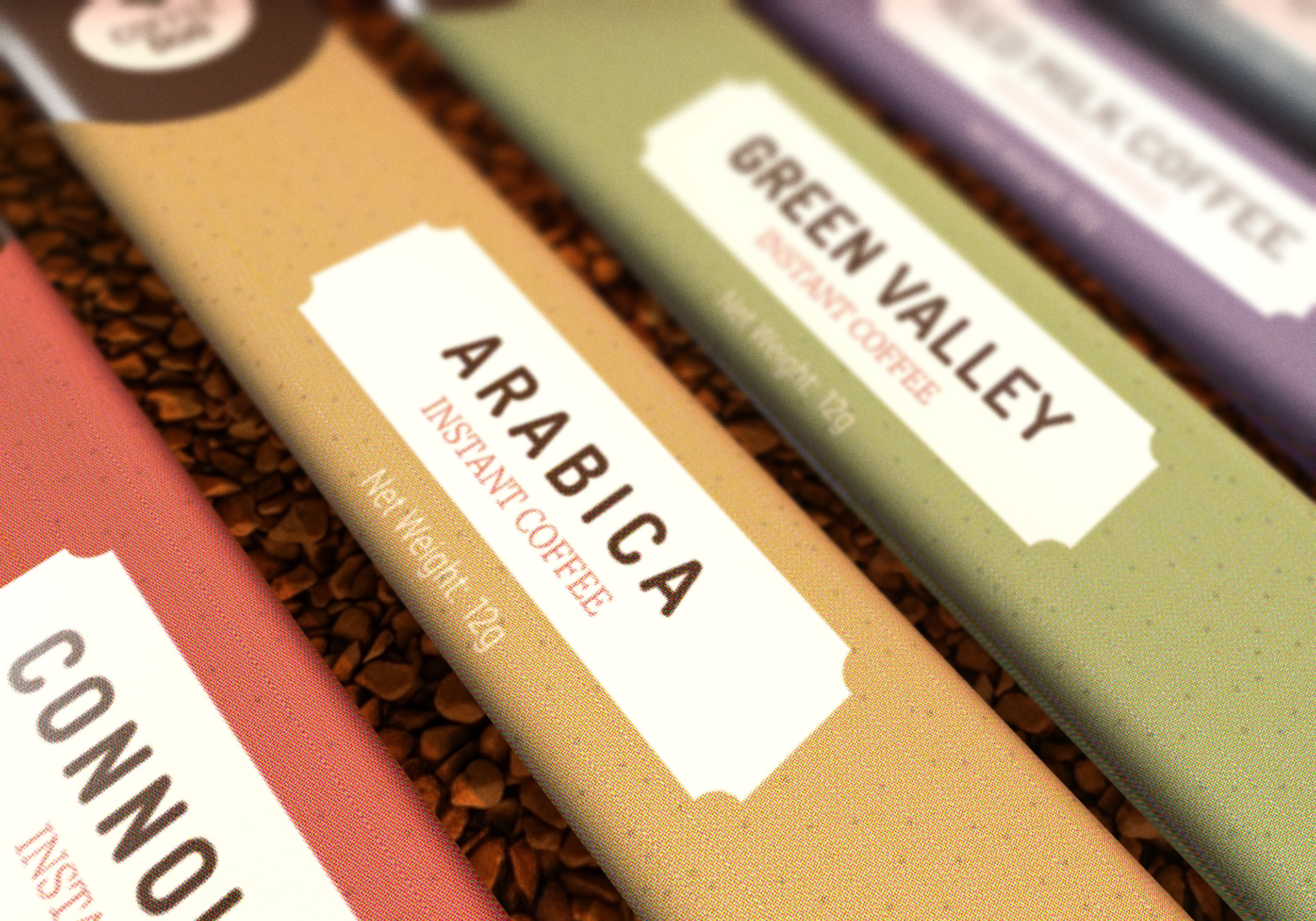
Colour & Versatility: To differentiate the six product lines, ranging from the delicately mild Connoisseur to the organic Green Valley, I utilised a palette of muted, earthy tones. This allowed each SKU to have its own identity while maintaining a cohesive family look when displayed together.
RESULTS
The final delivery for Coffee Duo redefined the expectations of the instant coffee category. The packaging transitioned the brand from a utility to a lifestyle choice, appealing to consumers who values both efficiency and origin.