
CHALLENGE
The Danish micro-brewery market was reaching a saturation point, with brands aggressively competing on price to secure supermarket real estate. For Stensbogaard, a boutique operation led by a brewmaster focused on quality over quantity, competing on volume was a non-starter. The challenge was to carve out a niche that allowed for a premium price point while maintaining a "sustainable scale" for the owner – positioning beer not as a commodity, but as a peer to fine wine.
APPROACH
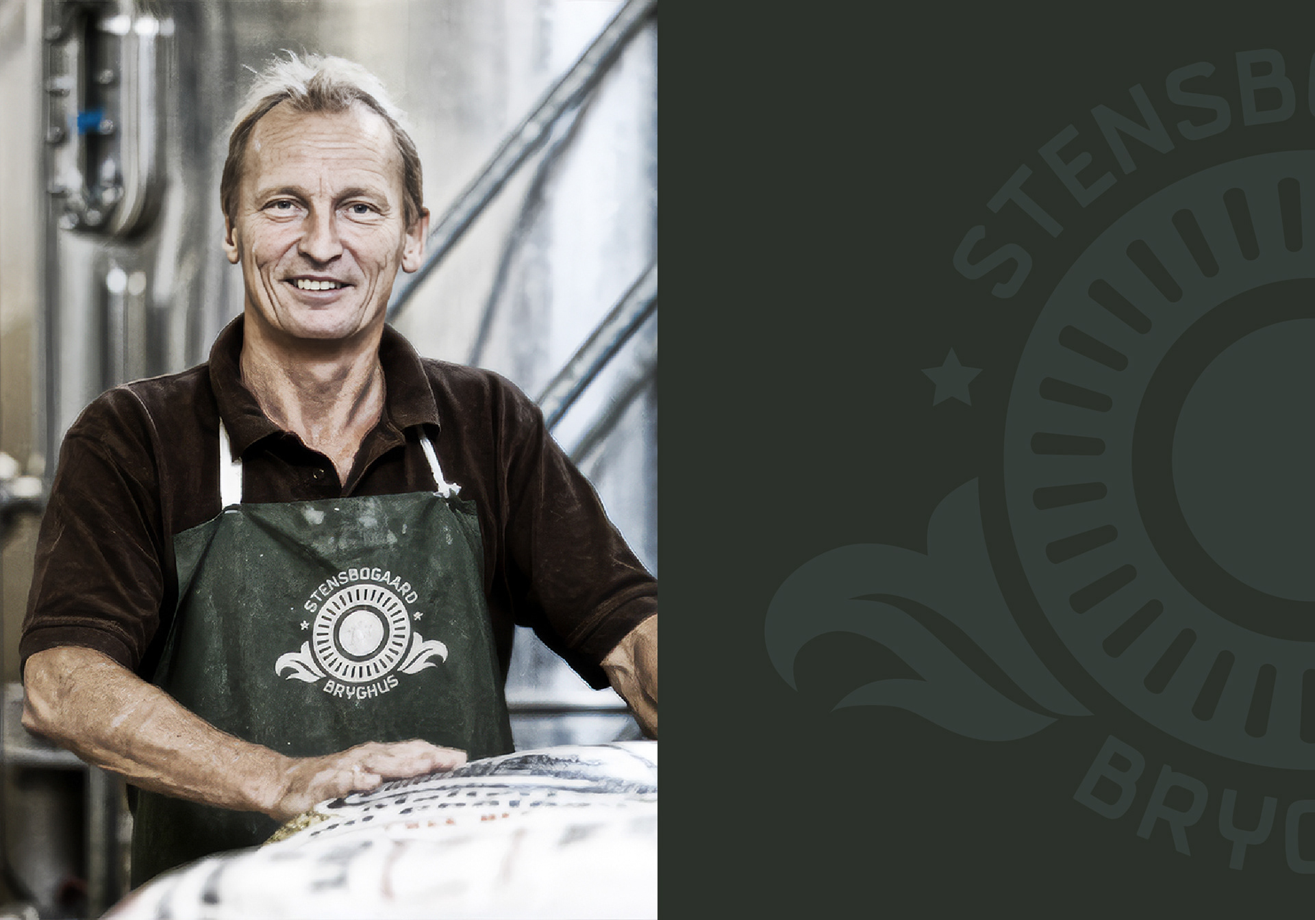
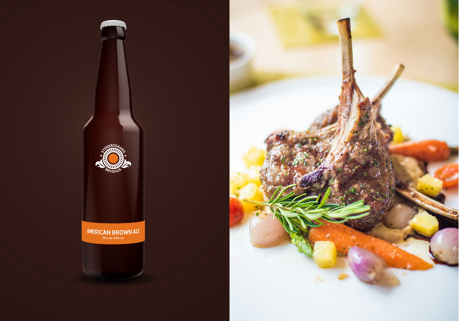
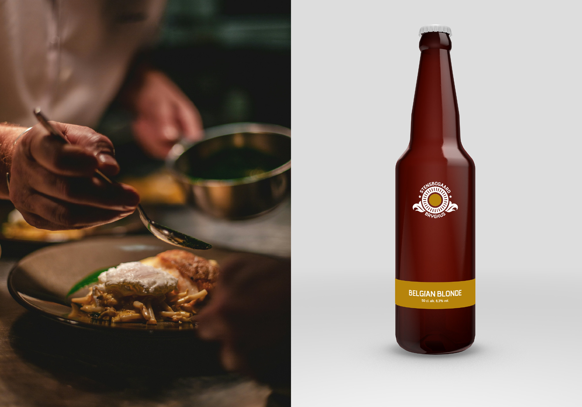
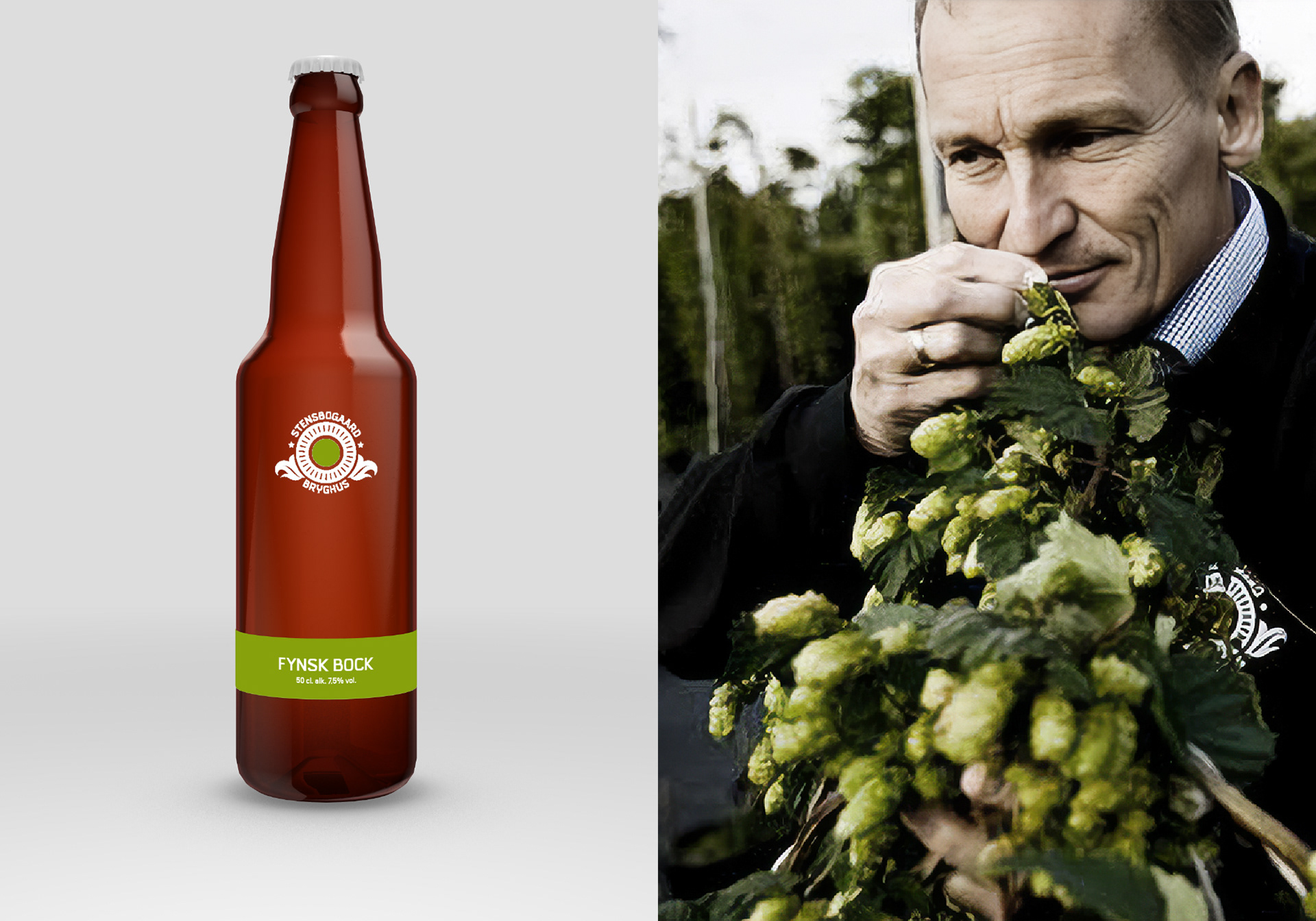
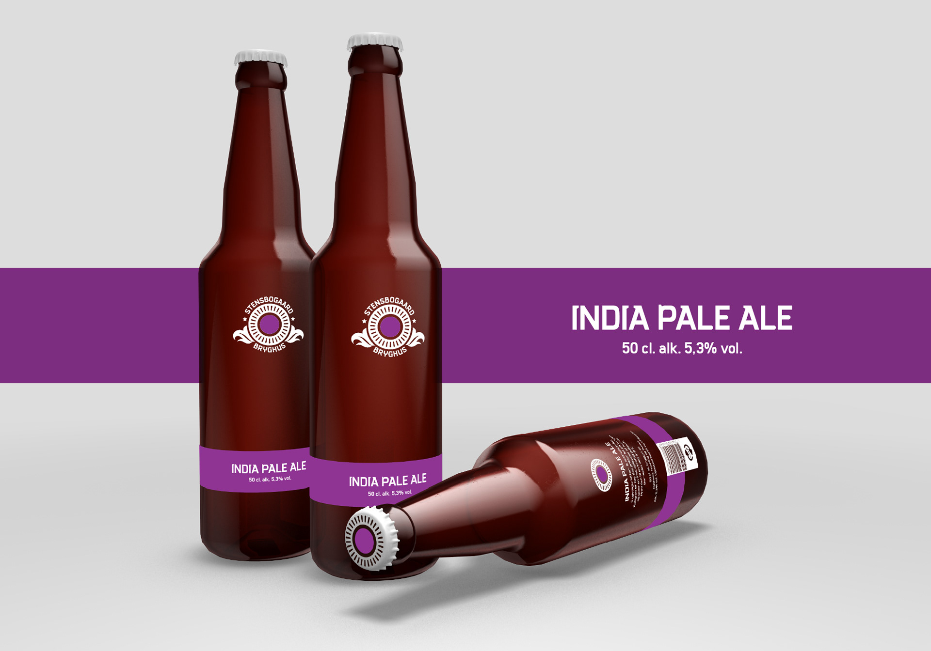
The Anatomy of the Vessel: Our strategy was to find beauty in the industrial. The central motif (a stylised, sun-like crest) is a geometric interpretation of the knurled pattern found on the base of standard glass beer bottles. By elevating this utilitarian detail into a premium brand mark, we created a visual language that literally honors its container.
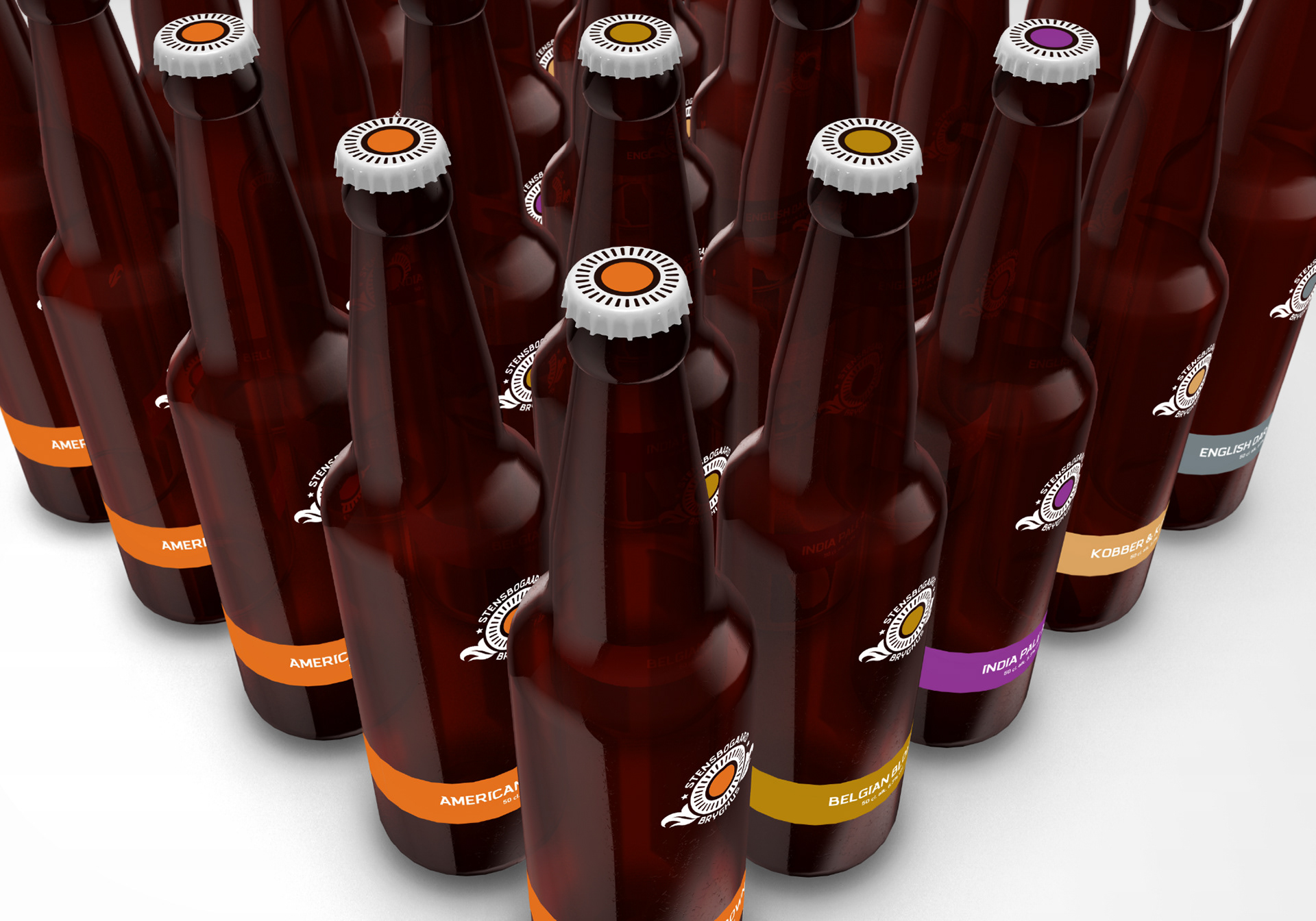
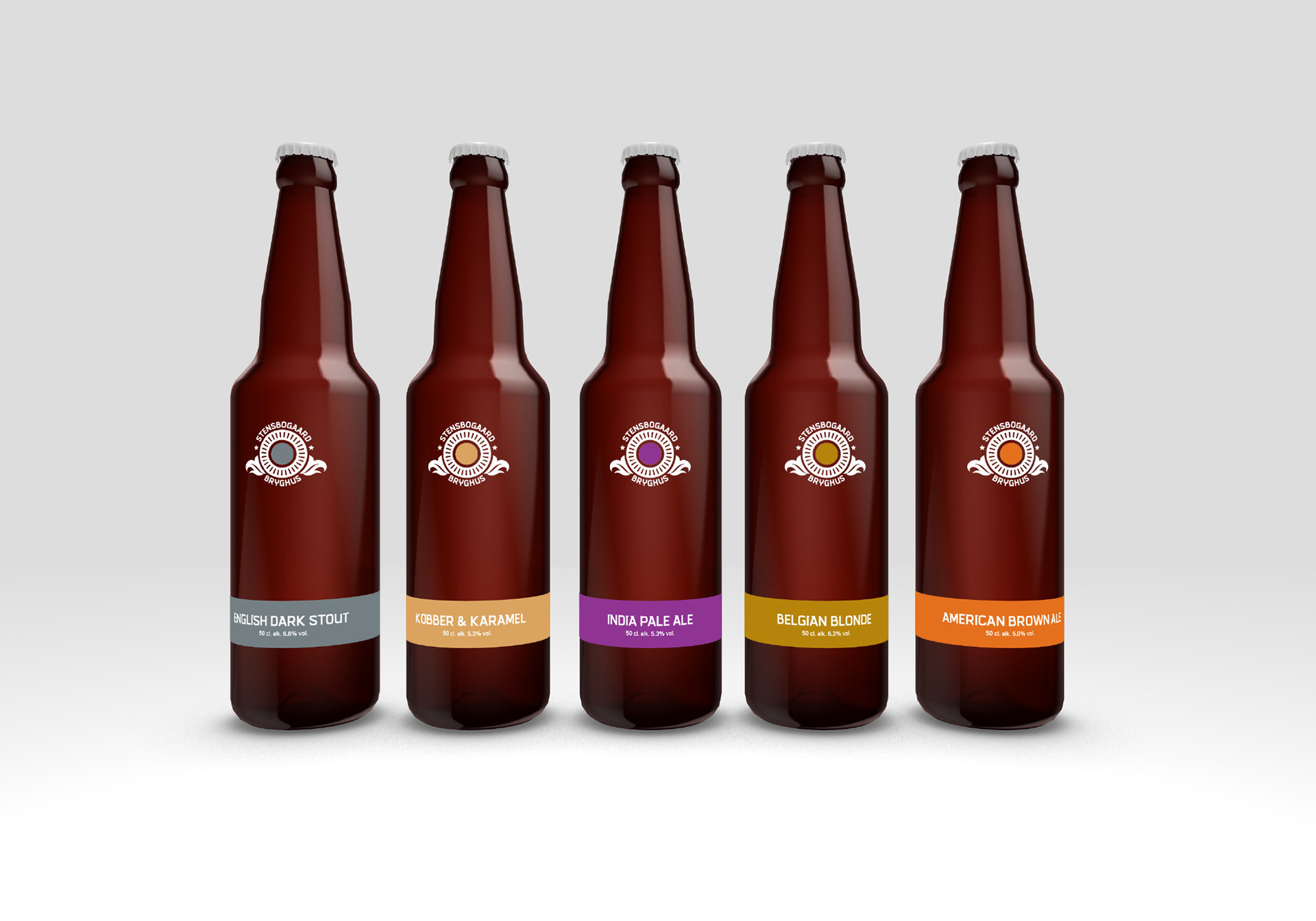
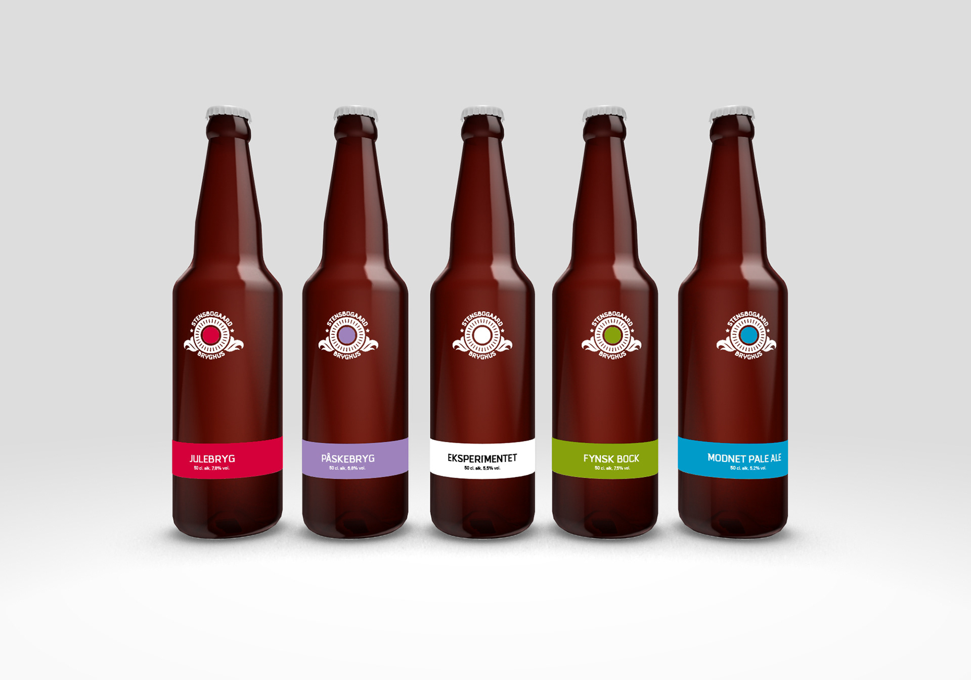
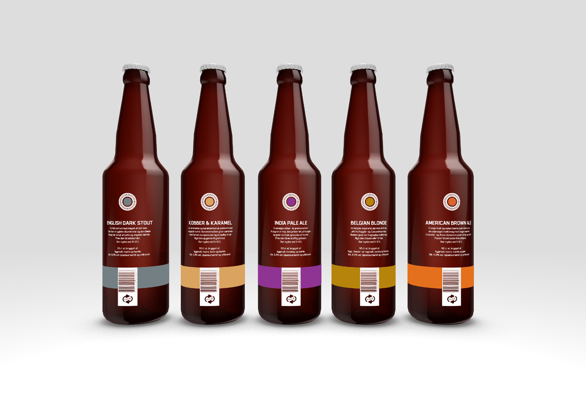
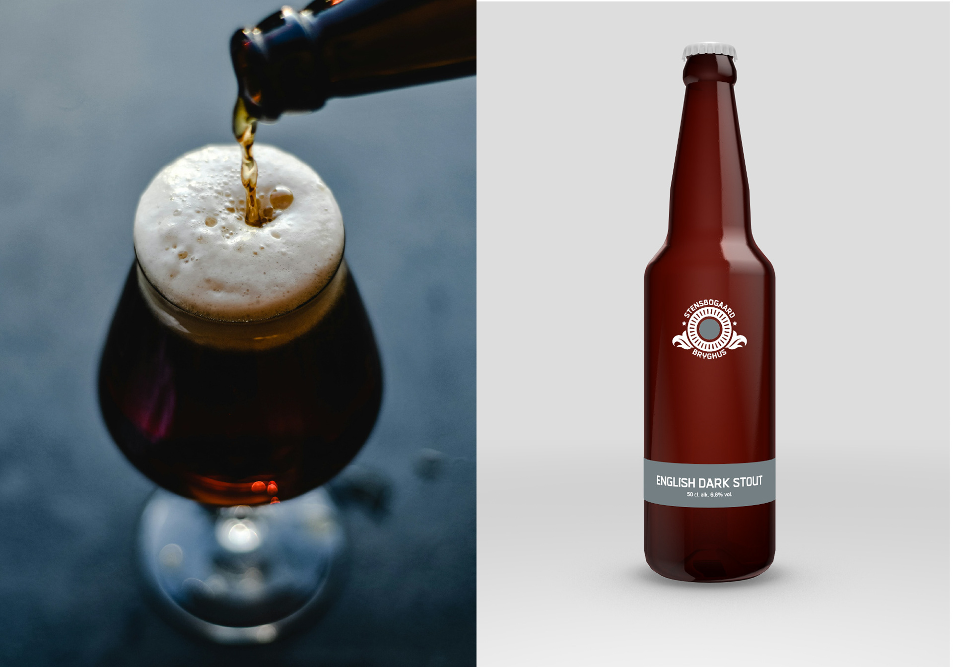
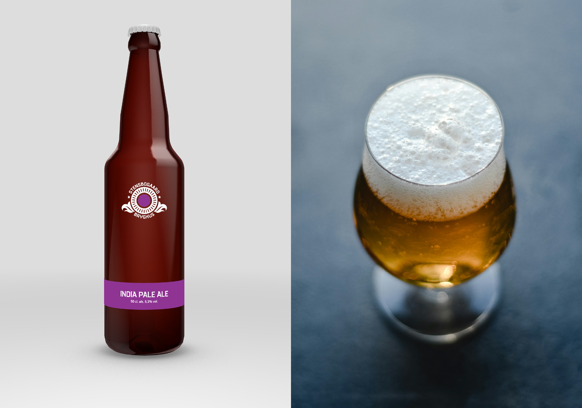
360° Operational Logic: We developed an "Omnidirectional Navigation" system. A bold, horisontal band and a central "Core Dot" act as the primary differentiators. Because the dot is mirrored on the bottle cap, the brew is instantly identifiable from any angle; whether standing in a rack, lying in a display, or viewed top-down in a service cooler.
Minimalist Sophistication: We stripped away the loud "craft beer" tropes in favor of clean typography and structured color blocks. This "Wine-Pairing" aesthetic allows the bottle to signal high-end craft through restraint, ensuring it complements rather than distracts from a curated dining experience.
RESULTS
Prestige as a Pull Factor: The "Gastronomic Pivot" transformed Stensbogaard from a local project into a high-status restaurant staple.
Operational Clarity: The color-coded system reduced service errors in high-paced restaurant environments.
Strategic Market Entry: By winning over sommeliers and chefs first, the brand built a reputation of quality that transcended price points.
Organic Retail Growth: The success in the hospitality sector created a "halo effect." Premium supermarkets eventually sought out the brand, requesting shelf space based on its established prestige.
A Sustainable Legacy: The brewery operated with high profitability and a clear brand voice until the brewmaster’s planned retirement; proving that quality, and strategic minimalism can be a winning factor in a crowded market.