LUMOSITY
Brand Identity, Iconography & Illustration
Over several years, addSoul design studio collaborated with Lumosity (Lumos Labs), refining the logo mark and developing bespoke iconography and illustrations to connect the brand identity with its evolving digital experience.
CHALLENGE: Evolving an established brand identity
Lumosity had built a recognisable identity around its brain-training games. As the company expanded its research-led activities and explored new applications for cognitive training, the visual language needed to reflect greater scientific credibility without losing its approachable character.
The challenge was not to reinvent an established identity, but to identify where refinement could make the greatest difference.
APPROACH: Connecting logo, iconography and illustration
The original orange badge featured an upright head with a rounded, bubble-like brain. I refined the symbol into a more streamlined, forward-leaning form, introducing a subtle sense of movement and progress.
A deliberate geometric relationship connected the updated symbol with the refreshed Lumosity logotype: the angle running through the neck and spinal cord aligns with the descender of the letter y.
This same angle became a recurring detail throughout much of the bespoke iconography and illustration work developed for Lumosity.
Combined with consistent proportions and simplified forms, it helped establish a recognisable visual language across brand communications and digital products.
The objective was to make complex cognitive concepts easier to understand, balancing scientific credibility with the playful character of Lumosity's games.
RESULTS: A more coherent and adaptable visual identity
The refined logo retained Lumosity's established recognition while introducing a clearer sense of direction.
Together with the bespoke iconography and illustrations, it helped connect the brand's visual elements into a more consistent and adaptable system.
The underlying geometry also proved useful beyond the original work. The distinctive diagonal was later incorporated into a new interface icon system developed by Lumosity's product design team, extending the visual relationship into another generation of the platform.
A relatively small refinement became a foundation for greater consistency across the brand experience.



GAME ICONS: Distilling Each Game into a Symbol
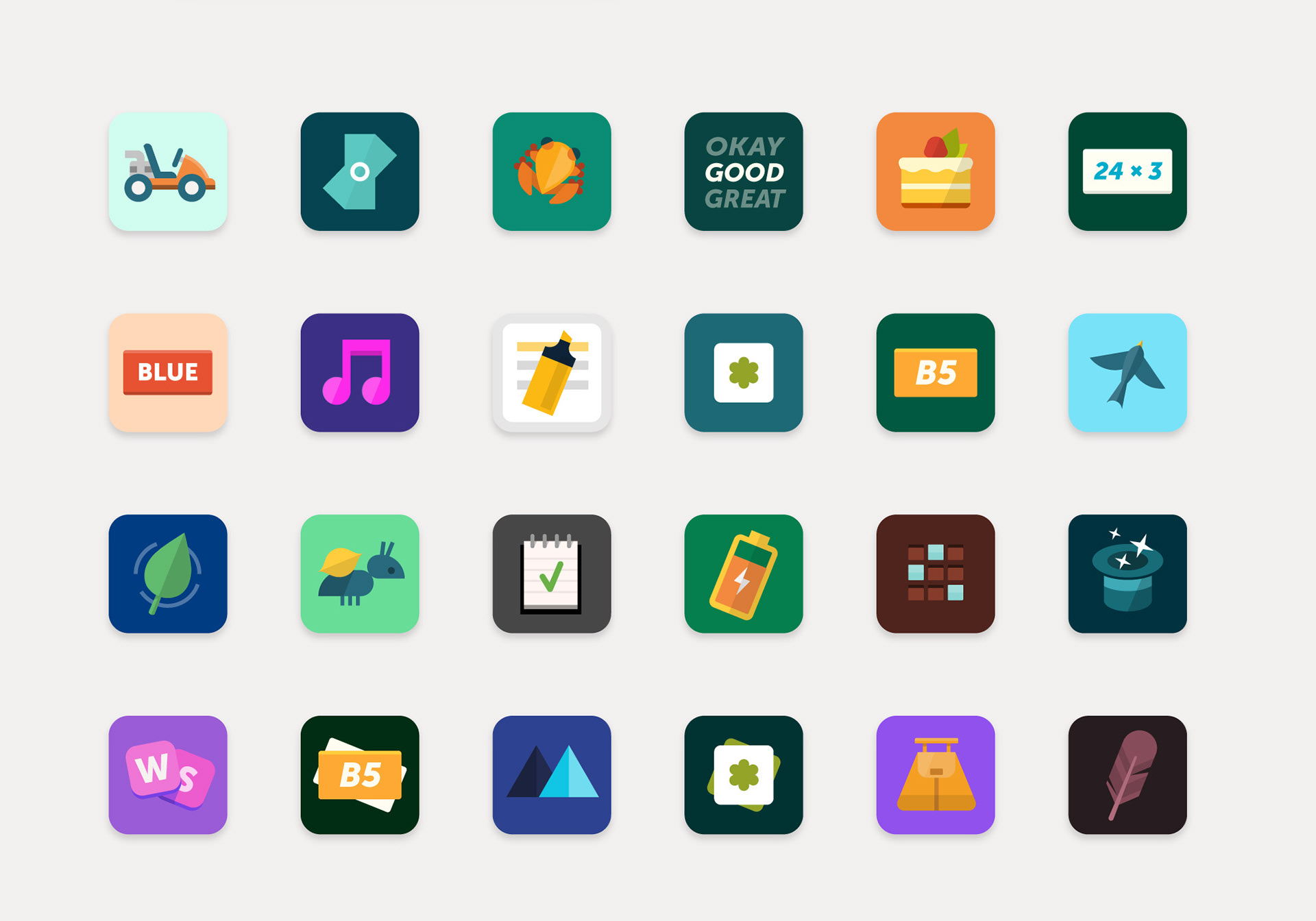
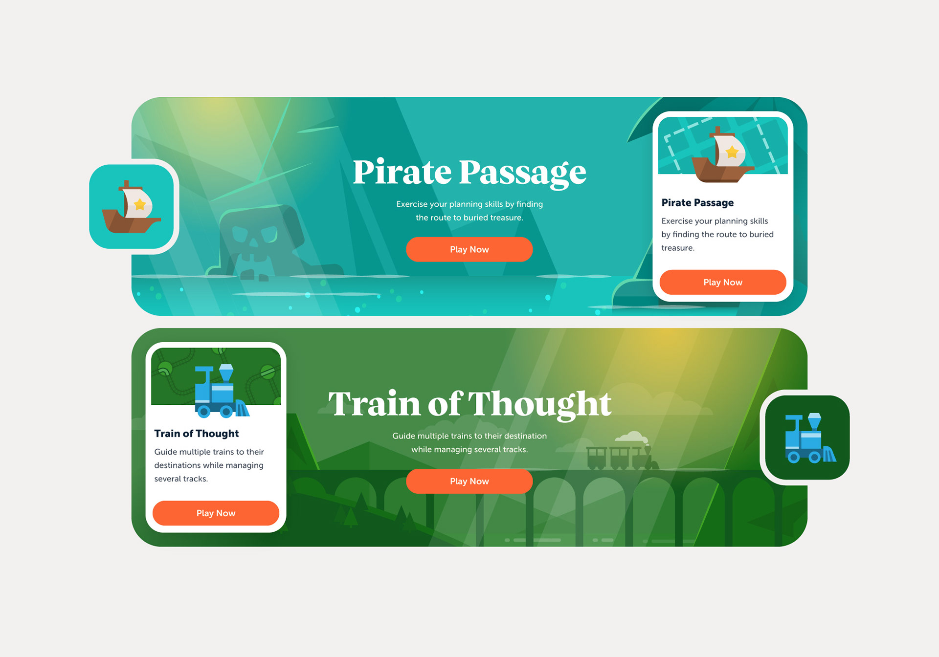
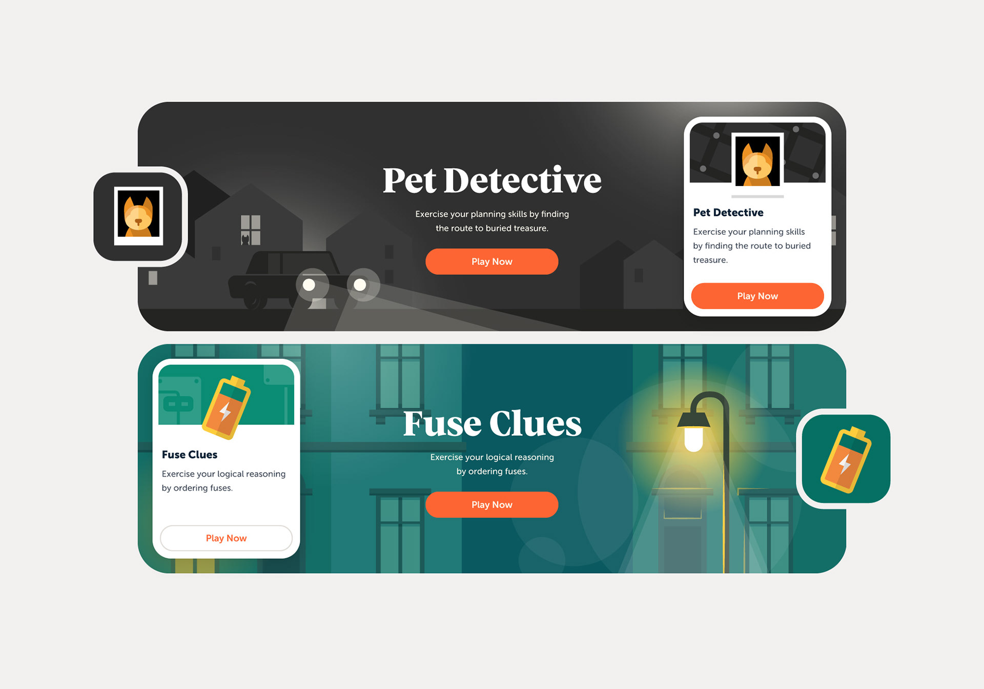
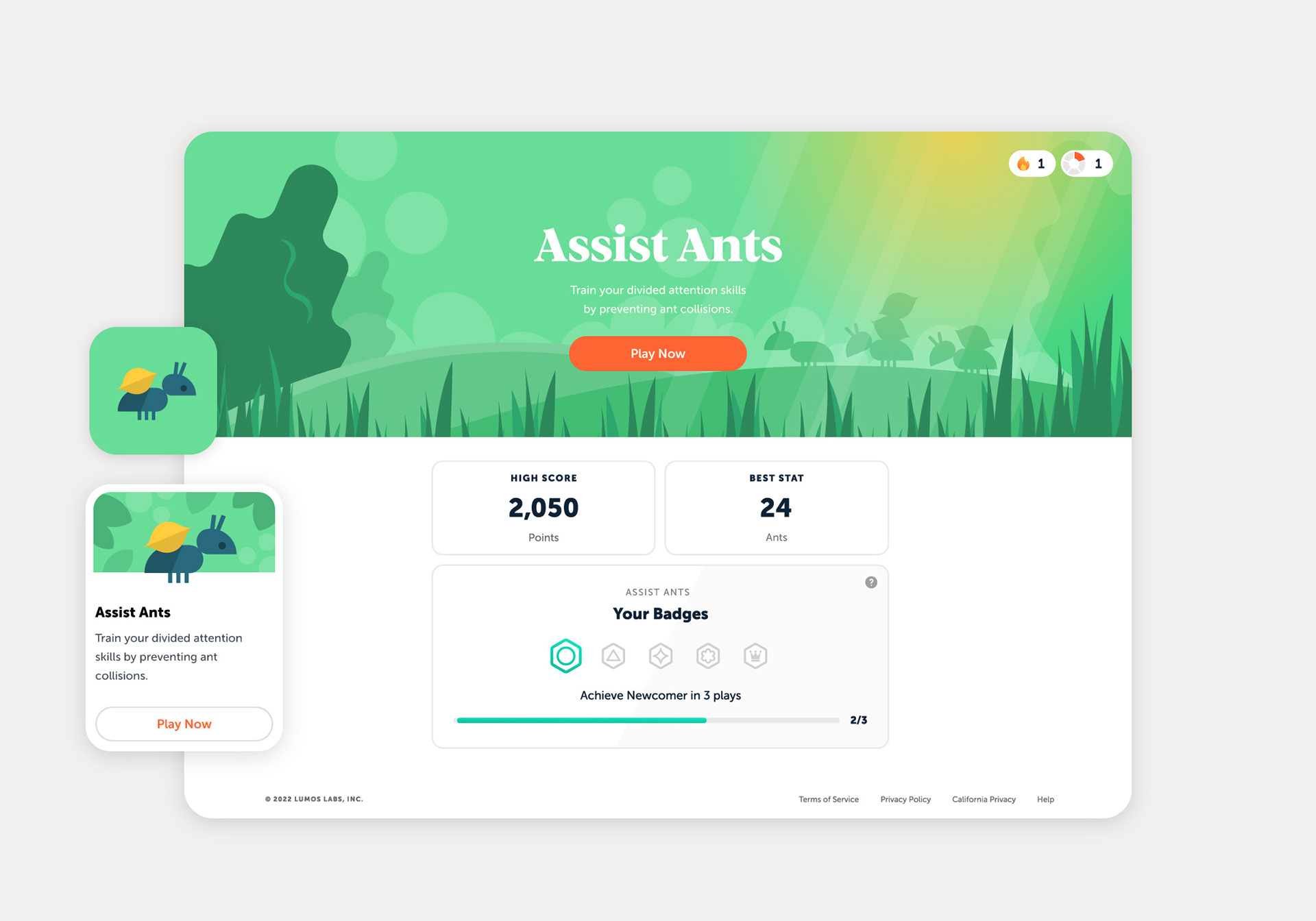
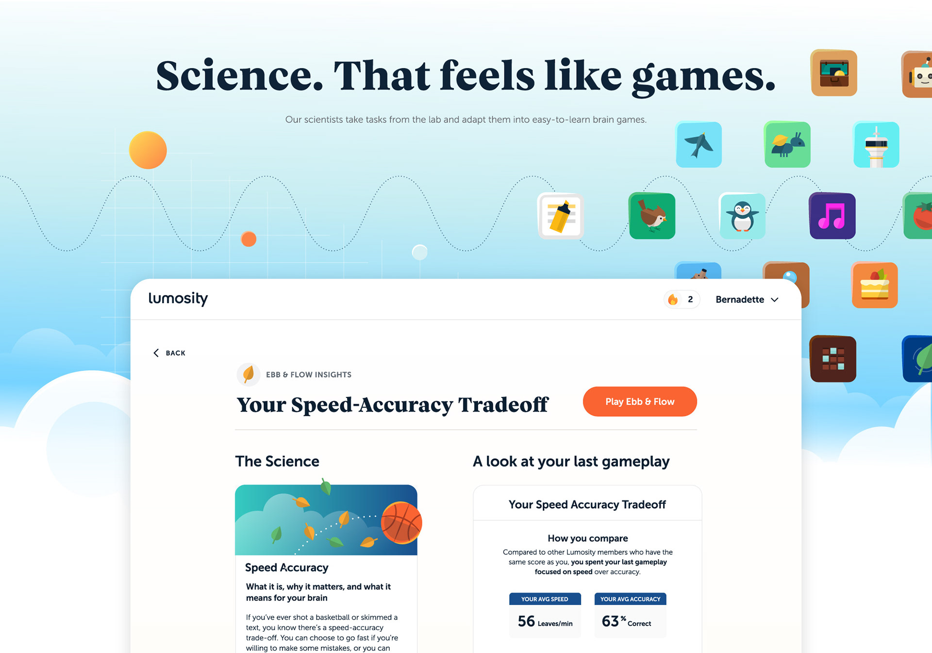
Over 40 bespoke game icons were created for Lumosity's brain-training games, each capturing the essence of a game in a simple, recognisable symbol. Drawing on visual cues from the gameplay, the icons give players a sense of what to expect, while subtle references to the Lumosity logo connect them to the wider brand identity.
The result is a coherent collection of distinctly Lumosity icons; building recognition and adding to the brand's unique visual intellectual property.


GAME HEADER ILLUSTRATION — Setting the Scene
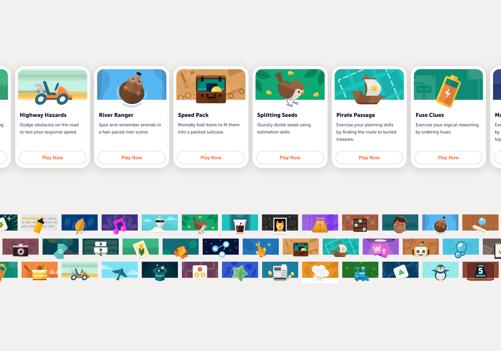
Each game features a dedicated header illustration designed to establish its mood before play. Rather than reproducing in-game graphics, these illustrations suggest the atmosphere and character of the experience ahead, helping players engage with each game while maintaining a recognisable visual style across the platform.






SPOT ILLUSTRATIONS — Connecting Content and Identity
A series of spot illustrations was developed for Lumosity's website, articles, emails and onboarding. Diagonal lines and circular forms carry elements of the refined identity into everyday communications, with molecule-inspired details subtly referencing the scientific visual language of Lumos Labs. Designed to work on both light and dark backgrounds, the illustrations bring clarity and character to a wide range of topics.


PROJECT REACH
• 120M+ Subscribers
• 195 Countries
• 40+ Games
• 9B+ Game Sessions
• 195 Countries
• 40+ Games
• 9B+ Game Sessions
RECOGNITION
• 4.8 Star Rating - Google Play (324k)
• 4.7 Star Rating - Apple App Store (129k)
• Editors' Choice (Apple App Store)
• Apple - App of the Day (August 2026)
• 4.7 Star Rating - Apple App Store (129k)
• Editors' Choice (Apple App Store)
• Apple - App of the Day (August 2026)
PROJECT SCOPE
• Logo design / refinement
• Icon & Illustration Guidelines
• 50+ Game Icons
• Icon & Illustration Guidelines
• 50+ Game Icons
• 50+ Header Illustrations
• 500+ Brand & Marketing Illustrations
• 75+ Animations
CREDITS
Nick Ruzhnikov / Jennie Bowers: Design Director(s)
Francesco Belvedere: Product Design Lead
Bo Virkelyst Jensen: Brand Illustration, Game Iconography, Brand mark.
Francesco Belvedere: Product Design Lead
Bo Virkelyst Jensen: Brand Illustration, Game Iconography, Brand mark.